Free High Converting WordPress Theme for Affiliate Marketing- Customize in 3 Minutes
Could your blog theme be costing you money each and every day?
After getting hundreds and millions of visitors to my websites and blogs, I’ve found out that most people’s themes are actually causing them to lose money!
YOU SEE THEM ALL THE TIME.
THE BIG IMAGE THEME. The one that has that giant image up top and then you have to scroll down to get to the rest of the content. This does not work because as a marketer, you’re gonna notice that your most valuable real estate is above the fold. This big image takes up all the screen space at the top that leaves no room left for you to make money, unless they scroll down which very few people do. This adds to your bounce rate and stops your ability to make profit.
THREE-COLUMN THEME. This where you have a blog that set up where the content goes down the middle with columns on the sides. This is where people put some ads on the right column, links on the left column and ads on the bottom part. This makes it very difficult for your visitor to read and locate something very easily. As a marketer, you want to locate something at the drop of the hat so they can click it and get you paid. This three-column theme is out. That does not work.
THE FUTURISTIC BLOG THEME. This is a theme where people go through and they have all the kinds of fancy buttons and things that pop up and scroll and images slide in from anywhere. This doesn’t work either because it takes the user a lot of work to get to the things that they really need.
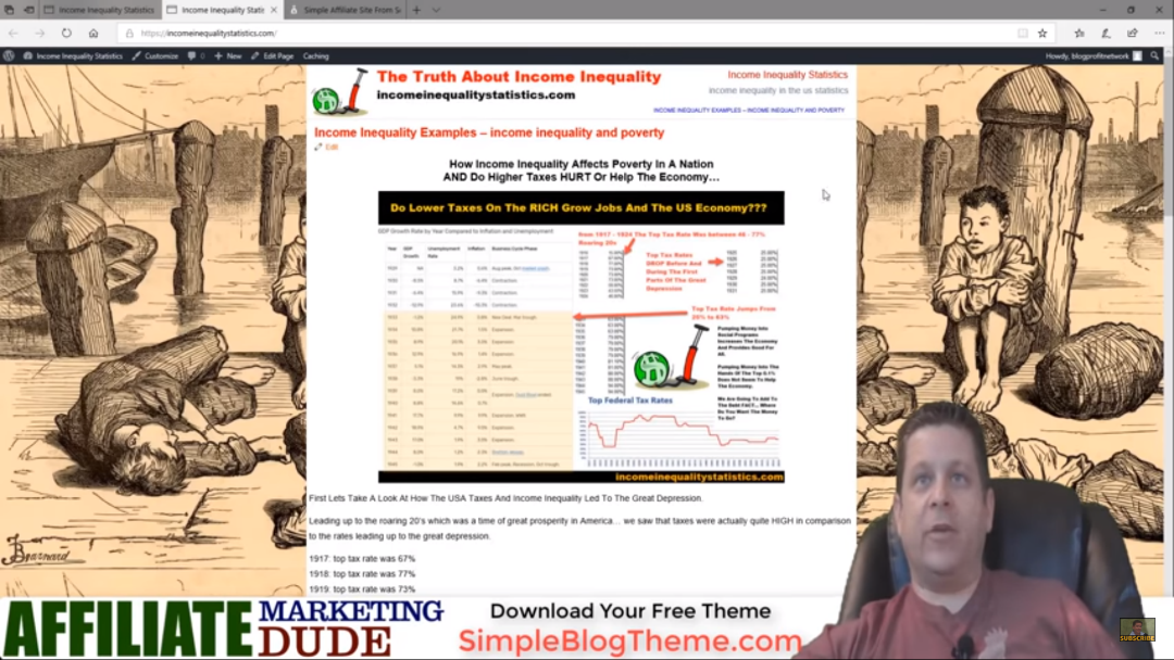
What I found that works good is a simple theme that looks like this.
It works on mobile and it works on computers as well. This can either be a one or two-column layout. A one column layout looks like this with all the text everything in the middle and a header image at the top. A two-column layout is a column down the right side. I like to keep the column kind of hidden so it looks like part of the theme so we don’t usually have an actual border. So we put the video content and then the text content. This makes it easy for people to read.
Remember, most of the people are going to read right to left. That’s why the other don’t work because it’s all jumbled up, makes them scroll down to find what they’re looking for, and the other is way too complicated.
We want to keep everything really nice and easy. Image on the top, content on the left hand side, sidebar on the right. You can have in your sidebar like a little opt in box, some ads, other links and stuff as well.
This has been proven as the most money possible per visitor.
If you are interested in making the most money possible per visitor, I’m gonna show you how to customize this theme for your site in less than 3 minutes!
Let me show you how easy this is to do.
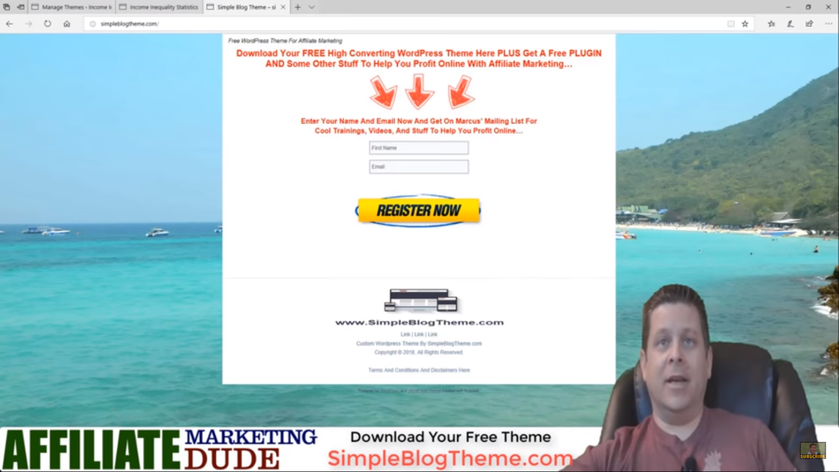
- Go to SimpleBlogTheme.com

- Put your name and email address in the box.This is gonna take you to the download of the theme.
- You can watch the instruction video here and simply download this theme by clicking and hitting save target ads.
- Download this to the desktop.
- Once it is downloaded, you can notice the downloaded blog theme in a zip file.
- Go ahead and right click then hit extract all. This is gonna prompt you to extract the blog theme. Once it is extracted, you’re gonna have a bunch of files. Just ignore all the others and click on the images folder.
- Now you are going to edit two things. First, the header image. Second, the background image. The first image is named header, while the second is named page.
- It is important that you overwrite these with your images.
- Next, I’m gonna use my editor program to make an image or logo. Make sure it is 1000 x 100.
- Once you have the image the way you like it, you’re gonna go file save as, save it in your desktop, to your simple blog theme images folder.
- Overwrite the header, replace it, you’re done!
- After that, locate a nice background image.
- You can get it from clipart.com. Download the one with the highest resolution. Save it and replace the page file.
- Then go back to the beginning. Highlight everything.
- Click send to compressed folder and name this after your blog. For example, I would name it income for my “Income Inequality Statistics” website.
- Upon going to the website, you can notice that you still have to scroll down far to actually get the content.

- With this, we’re gonna go to manage themes on our blog. Click on upload theme then browse the theme we just created in the folder. Install the theme then activate it.
Now you can see we have a beautiful two-column and one-column theme based on what I’ve been using for years to get results that make money.

Go ahead and try this out!
Hop on to SimpleBlogTheme.com. Download your free theme. Customize it in minutes. Upload it. Then start converting your visitors. I’m Marcus and I hope you enjoyed this video.
Subscribe and click the notification bell to check out the next video!