Best AdSense Placement Tips – Size Matters
Hey guys! It’s Marcus here from blogprofitnetwork.com.
Today in this special video,
I’ll show you the difference between certain ads, some sizes, colors and settings to get you the most profit.
For people who have known me for a while and been to blogprofitnetwork.com, you guys know that I’ve made millions of dollars online and hundreds of thousands of that from AdSense.
I want to show you guys how this works because you’re gonna notice on this sample template site here, you’re gonna see that I have content.
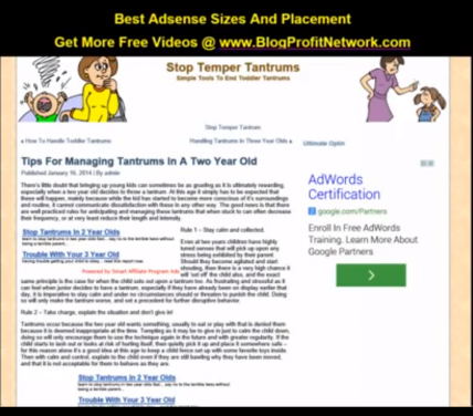
You can see the content here in form of text. You can see the sidebar here. This is our main portions. Up here is our header, our sidebar and our content area. As we scroll down, you can kind of see what it looks like there. Notice how I have these ads placed strategically throughout the content so that it looks like actual links. That’s the same thing that we want to replicate with AdSense.
Let’s go ahead and dive in and talk about where the different placements would go, where they look best and where you’re going to get the best click-through rate, because the more clicks you get, the more money you’re going to make.
So let’s say we have this site here.
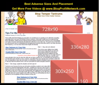
Now there’s several major Adsense sizes.
One of them the most popular is 160 by 600. It looks like this. Here we could probably have two of these in the sidebar if we wanted to. You’ll notice in the sidebar here, what I do have instead of this big guy, is I have a 336 by 280 which fills up that spot right there.
Now what we want to do is we want to look at this 336 by 280 and this is in fact the highest converting AdSense size that I have found. It’s very versatile.
- You could put it in the sidebar here which obviously looks better than this because it’s taking up more space and it looks good.
- You could also put this over here in your content if I was to replace this and put the content around it.
- You can center it in your content like this or you could put it you know basically wherever you want to make it look like part of the site.
It’s very important that your ads look like part of the site. So the 336 by 280 is, in my opinion, the highest converting one and that’s what I’ve seen over time as well.
Next up, again we talked about the 160 by 600 which is the skyscraper looking ad. That’s another one and these are actual size so you can see how they look on a page.
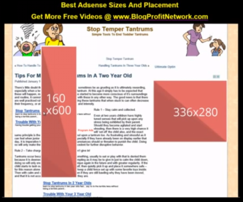
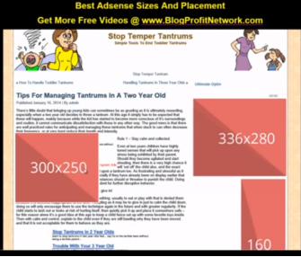
Another one is very similar to the 336 which is the 300 by 250.
What you’re gonna notice is a little bit smaller. So if you’re crunched for space or you have a smaller sidebar, you could go with this one as well or you could put this in the content here as well if you have images or something it works nicely because you could put it side-by-side. Very very cool. Very easy to use. It’s definitely also one of the better sizes.
Another one that you’re going to notice is one of the banner type sizes.
The banner sizes, this one converts pretty decent. It is a 728 by 90. The best place for 728 by 90 is usually if you have space in your heading here or if you have something on the bottom. As you’ll see it’s pretty big for in content. So if we go down to the bottom we could place it somewhere like here and just kind of try to scrape some money off of the people who scroll all the way down. So that’s where you could use that. I don’t use this one too much unless I’m using a static site. Now we’re doing this demo in WordPress so I probably wouldn’t use it too much. Let’s go ahead and put it back up the top so you guys could see it as well.
Another size which I don’t believe I have a pink box for but I do have this one which is a 468 by 60.
You can see that this one’s very good as well. You could put it like right dead center in the content so it looks like actual part of the site and that’s the goal that we’re going for is making this look like part of the site. This is also a very good one for your ads as well because it blends in, it’s a good size, everything like that. That is a 468 by 60.
Now these are your major sizes. You could see here which is 728 by 90, 336 by 280, 300 by 250, or 160 by 600. Of course in your account, you can play around with the different sizes as well.
Now let’s talk about placement.
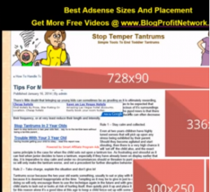
Placement is very important because you’re going to notice that people search the web in a F-type pattern. That means that when they look, that’s your site they’re basically looking at it in this area. So the pink areas that you see here is where most of their eyes go. You could look at this by different charting tools and things like that but basically this is how they look. They’re reading left to right, starting here and coming down. This kind of stuff doesn’t stand out as much so you might want to put other things in your sidebar to try to get them because the sidebar is one of the places unless you’re highlighting it that gets the least amount of clicks. So let’s go ahead and take a look at now that we know the placement. Let’s take a look at colors and different things like that.
Now you’ll notice that a lot of regular AdSense stuff is going to look like this.
Basically has a blue border around it, blue text, green link or green URL and a black text. So the blue is the highlighted area that you want them to click on which is good because people are accustomed to clicking on blue which is very important.
Now what you’re going to notice, by default, Adsense is going to have a border around it. We don’t want this border because the border actually makes it look like ads. It looks like okay here’s your content and bam here’s some ads here. It doesn’t look like actually part of the site. So what we want to do and I want to show you the difference here. The difference here would be, if I had these in my content with the box around them versus if I had this here. You can see here how this looks like part of the site and this one looks like something else. We want to get rid of that border and we want to keep those links blue and everything. This again is the 336 by 280 AdSense block which is a very very high converting one.
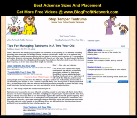
Another one, we talked about is the smaller one here like this, where we could put this here in your content if we were to put it like right here. Again, look at how the border makes a difference. The border makes a huge difference in saying, “hey this is an ad; this is an ad” rather than having it look like part of the site, like my links do here.
So again, you definitely want to get rid of that border and look at how nicely that looks! It basically looks like part of the content. So obviously since Google’s going to target this, they’ll put ads about temper tantrums and BAM now it looks like part of the content. Same kind of thing with links up top. You can play around with different links and things like that. It may be up here right below this so it looks like kind of like a like a menu where they’re seeing different content and stuff like that. Very very important.
Again, play around with the different ad sizes. We have a really killer video on AdSense and placement and how to make money with AdSense on blogprofitnetwork.com.
You can click the link in the description of this video and get that very very good stuff.
Again, remember, make it look like part of the content.
Don’t point at it.
Don’t tell people to click at it.
Don’t put big images by it that say click here or anything like that.
Don’t do any bait-and-switch.
If you use these tactics which are well within the guidelines of the Adsense TOS or Terms of Service or whatever, you’re gonna do really really well because that’s basically what they want. They want people to click on things they’re interested in and you can see here just by looking at how good this looks right.
If I had a black site I’d probably make the background of the ads black and then different colors and things like that but normally I like to stick to white background, blue link, black text, green URL. Play around with different sizes, different places like this and watch your Adsense income go through the roof.
I’ve seen mine as much as quadruple or more just by adding these simple tactics so have fun with it.
Go to blogprofitnetwork.com. Play around with it and I will see you in the next video. Thanks again for watching!
.
.
.
.