How To Make High Converting Instagram Images And Youtube Thumbnails SUPER EASY
Hey guys, Marcus here from affiliatemarketingdude.com.
Today, we’re going to learn on how to make a thumbnail that’s going to reel in views and clicks for your videos, blogs, and Instagram posts!
Advertisements are very important in being profitable!
If you want people to notce your banners, thumbnails, ads, and posts , you need to start knowing what catches the eye of your market and what makes it stand out from the rest!
So how do you make it stand out from everything else on social media or on any site?
No worries! I’ll walk you through some really important steps!
When it comes to creating good thumbnails, there’s two major softwares that I use that’s very simple and inexpensive to use:
- Creator – you can get this program, you can get this program at affiliatedude.com/creator
- Snaggit– this is a snipping tool that you can get for 50$ that comes with a landing page course.
My advice for you is that having one of these programs is well and good, but having both will make your life a whole lot easier!
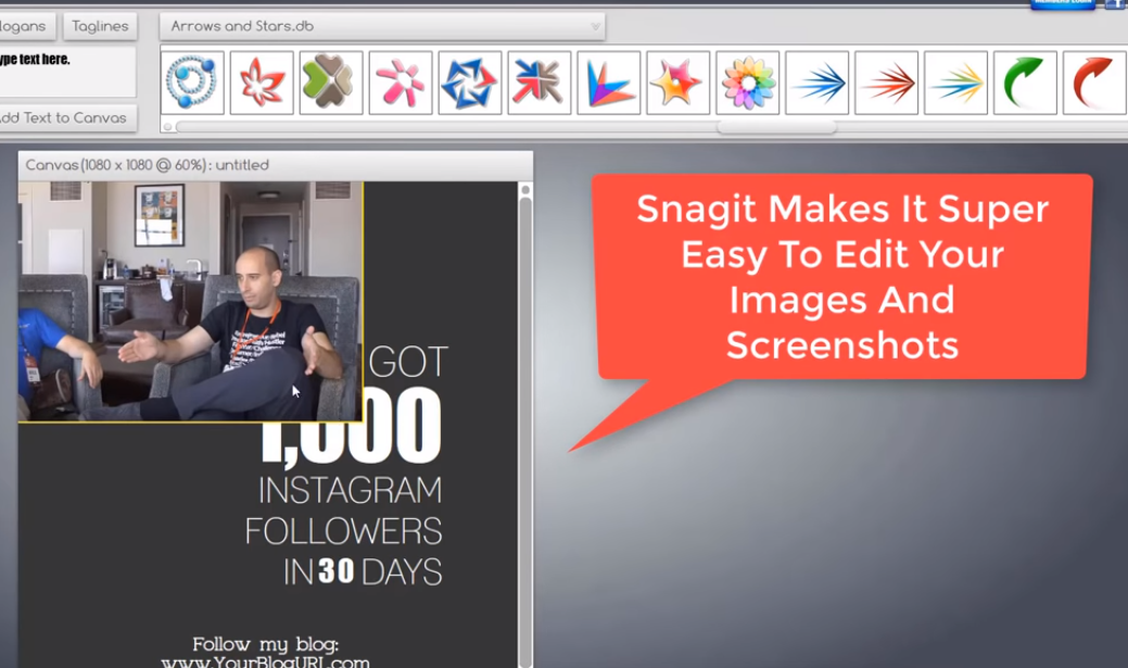
This is what the UI (user interface) of Snagit looks like! It’s actually very simple to use and self-explanatory. You won’t have any problem navigating since it’s got the same model as MS paint and Photoshop.

So what we’re going to do now is that we’re going to make a thumbnail for one of our videos
It’s super simple!
- First, you have to know what the theme of your thumbnail is. So if you’re making a thumbnail for a video on youtube or for a post on Instagram, you need to do your research on what fits!
- Once you now have a plan on your thumbnail and what theme you want it to be, you can choose from a list of pre-created thumbnails from Creatorandx choose which thumbnail fits your niche well!
You don’t have to worry about sizing since it’s perfectly sized for you!

- What we’re going to be using is one of the Instagram templates since we’re making an Instagram post. So we will be using snagitto edit the image to our own liking!
- We’ll be deleting some of the unnecessary parts of the image and we’ll be placing a screenshot of one of our videos on it.
- One of the key ways to make your thumbnail stand out is by using large yellow texts since it has been proven for years in advertising!
- You can use a black or a white background – this depends on how it contrasts to the colors that are on the image.
This is the final product. It should actually be very simple since the product is very self-explanatory. Deleting and moving images or textboxes around is as simple as dragging and dropping in the same way that you do in MS paint.
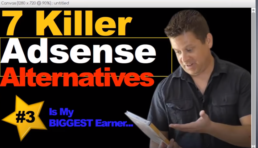
If you’re also looking for a thumbnail that works well with Youtube videos, Creator has those pre-created templates that has the perfect resolution for your Youtube videos!
NOTE – Having a good title that will make your customers more curious (like “#3 is my biggest earner)
A Youtube Video thumbnail should look like this:

And there you have it! Use these tools and your own thumbnails, posts, and even ad banners in just a few minutes!
If you want more thumbnails and images
CHECK OUT AFFILIATEDUDE.COM/IMAGE
We have lots of sample banners that you can work on!
Got a lot of cool videos and everything else for you!
Check it out and I’ll see you on the inside

