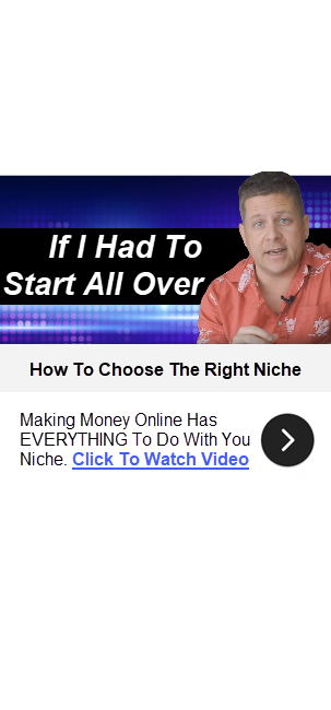
AI Traffic War: I Used ChatGPT & Gemini Images To Rank #1 (The $0 SEO Secret)
Using Ai Images To Get Website Traffic – Chatgpt 1.5 VS Gemini
AI images have changed how people approach traffic, but most marketers still misunderstand their real purpose. The goal is not to impress or entertain. The goal is to get someone to stop scrolling and click.
In affiliate marketing, clicks come before everything else. You can have the best offer, the best copy, and the best funnel, but none of it matters without traffic. Images play a major role in whether that click happens or not.
Many people assume that better design automatically leads to better results. Clean layouts, modern styles, and visually pleasing graphics feel like the right move. In reality, those choices often blend into the background and get ignored.
What consistently works is clarity, curiosity, and speed of understanding. A person should know what the image is asking them to do within a second or two. If the message takes effort to figure out, the opportunity is already lost.
This is where most AI image tools fall short. They are trained to create attractive visuals, not necessarily effective marketing assets. Without guidance, they default to safe designs that look good but do not convert.
When AI is used with a direct response mindset, the results change dramatically. Instead of starting with visuals, the focus shifts to proven patterns that already generate clicks. The image becomes a tool for communication, not decoration.
Another important idea is letting go of personal taste. What you like is rarely what performs best in high volume traffic environments. Decisions need to be based on behavior, not preference.
Testing plays a huge role in understanding what actually works. Small changes in wording, layout, or contrast can create massive differences in click through rates. AI makes this testing faster, but it does not remove the need for clear thinking.
This is about using AI images with intention. It focuses on how different tools approach image creation and why some outputs perform better than others. Every section ties back to one simple outcome which is more clicks that lead to real affiliate sales.
Before diving into specific platforms and techniques, it helps to reset expectations. AI does not replace marketing fundamentals or guarantee success. Used correctly, it can accelerate learning and help you get closer to what already works in the real world.


ChatGPT 1.5 vs Gemini Nano Banana vs Manus AI
When comparing AI image tools for affiliate marketing, the most important metric is not visual quality. The real question is whether an image earns a click. Each tool approaches this goal very differently.
ChatGPT 1.5, Gemini using Nano Banana, and Manus AI can all generate images. What separates them is how naturally they align with direct response thinking. Some require heavy guidance while others nudge users in the right direction automatically.
- ChatGPT 1.5 is powerful but unforgiving. Without precise prompts, it tends to create images that look fine but fail to convert. This makes it better suited for users who already understand what makes a banner work.
- Gemini with Nano Banana shows stronger instincts for traffic driven graphics. It produces cleaner layouts and clearer messaging earlier in the process. This reduces the amount of correction needed before testing.
- Manus AI stands out by slowing the user down in a productive way. It asks questions before generating images, which forces clarity of intent. That structure leads to stronger outputs, especially for beginners.
Rather than relying on long explanations, the differences are easier to understand when broken into key behavior patterns. These patterns directly affect clicks, testing speed, and affiliate revenue. Below is a breakdown of how each tool behaves in real usage.
How ChatGPT 1.5 Behaves in Practice
- Requires switching into image creation mode to generate real assets
- Produces generic visuals unless guided by research based prompts
- Tends to overdesign with extra elements that dilute focus
- Works best when the user already knows winning banner structures
- Slower iteration when making small changes
ChatGPT 1.5 does not fail because it lacks capability. It fails because it assumes the user wants something attractive rather than effective. This makes it less forgiving for marketers focused on traffic.
How Gemini Nano Banana Behaves in Practice
- Understands banner simplicity better by default
- Responds well to prompts referencing top performing ads
- Balances clarity with enough visual interest to feel clickable
- Produces usable images faster than ChatGPT with less setup
- Still needs direction to avoid branding style outputs
Gemini feels like a middle ground tool. It is strong enough for experienced marketers and forgiving enough for newer ones. Its biggest advantage is consistency when testing.
How Manus AI Behaves in Practice
- Asks clarifying questions before generating images
- Emphasizes calls to action and curiosity triggers
- Makes refinements fast without restarting the process
- Produces extremely simple banners that convert well
- Reduces overthinking and design distractions
Manus AI behaves like a built in conversion assistant. It steers users away from aesthetic mistakes. This makes it especially effective for arbitrage and affiliate banners.
Another major difference between the tools is how they support testing. High performing affiliate marketers test dozens of variations quickly. Tools that slow iteration cost money.
ChatGPT 1.5 makes testing slower due to repeated prompting. Gemini allows faster testing with moderate adjustments. Manus supports rapid iteration with minimal friction.
The tools also differ in how they handle curiosity. Images that reveal too much perform worse than those that hint at value. Manus and Gemini handle this balance better by default.
Another factor is visual simplicity. Clean white backgrounds consistently outperform busy designs. Manus and Gemini lean into this more naturally than ChatGPT.
The choice between these tools depends on user experience. Advanced users can make ChatGPT work. Most marketers will see faster results with Gemini or Manus.
Below is the retained comparison table summarizing the differences clearly.
Comparison Table
| Feature | ChatGPT 1.5 | Gemini Nano Banana | Manus AI |
| Default Image Quality | Visually polished but generic | Clean and balanced | Simple and conversion focused |
| Understanding of Clicks | Requires heavy prompting | Moderate understanding | Strong built in understanding |
| Ease of Use | Medium to difficult | Easy | Very easy |
| Prompt Sensitivity | Very high | Moderate | Low |
| Direct Response Readiness | Low by default | Medium by default | High by default |
| Iteration Speed | Slow | Moderate | Fast |
| Beginner Friendly | No | Somewhat | Yes |
| Banner Simplicity | Often too complex | Generally simple | Extremely simple |
| Call to Action Clarity | Inconsistent | Usually clear | Very clear |
| Refinement Tools | Limited | Moderate | Strong |
| Best Use Case | Advanced users with experience | General affiliate use | High conversion testing |
| Overall Traffic Potential | Variable | High | Very high |
What You Need to Know to Make Graphics That Get Clicks
Images that get clicks are not trying to explain everything. They focus on one idea and communicate it instantly. If someone has to think about what they are seeing, the image already failed.
The most important rule is speed of understanding. A viewer should know what action to take almost immediately. Clarity always beats creativity in traffic based images.
Instead of guessing what works, proven patterns should guide image creation. These patterns repeat across niches and platforms. AI tools perform better when they are trained on these ideas first.
Core Elements of Clickable Graphics
- Clear and readable headline
- High contrast between text and background
- One obvious call to action
- Curiosity without full explanation
- Simple layout with minimal distractions
These elements work together to reduce friction. Each one removes a reason not to click. Missing even one can dramatically lower performance.
Why Simplicity Beats Design Every Time
Most people associate good design with professionalism. In affiliate marketing, professionalism does not always equal profit. Simple images consistently outperform complex ones.
Busy designs slow down comprehension. Multiple colors, fonts, or focal points compete for attention. When attention is divided, clicks drop.
Simple designs feel easier to engage with. They look familiar and low effort. That familiarity makes clicking feel safe.
Common Design Mistakes That Kill Clicks
- Too many visual elements
- Decorative fonts that reduce readability
- Weak or hidden call to action
- Overuse of icons and graphics
- Branding over clarity
Removing these mistakes often improves results instantly. Many high performing banners look unfinished on purpose. The goal is action, not approval.
Using Curiosity Without Killing Trust
Curiosity is the engine behind clicks. The mistake most people make is revealing too much. When everything is explained, there is no reason to click.
Effective images tease an outcome, not a process. They hint at value without giving answers. This creates an information gap that people want to close.
Trust is maintained by clarity, not detail. Honest wording and readable layouts reduce skepticism. The balance between curiosity and credibility is critical.
Examples of Strong Curiosity Hooks
- “Scientists cannot explain this”
- “This simple site earns daily”
- “Why this stopped working overnight”
- “Most people skip this step”
- “See what changed everything”
These hooks work because they raise questions. The click becomes the easiest way to get resolution. AI tools that understand this produce better images.
Matching Image Type to Traffic Source
Not all clicks come from the same place. Website banners, social media images, and arbitrage ads behave differently. Images should match where they appear.
Website banners benefit from familiarity and simplicity. Social images need fast emotional pull. Arbitrage ads need immediate clarity and strong calls to action.
AI performs best when the destination is clearly defined. Telling the tool where the image will be used improves output quality. This reduces wasted testing.
Image Type vs Traffic Source Table
| Traffic Source | Best Image Style | Primary Goal |
| Blog banners | Simple and direct | Guide readers to offers |
| Arbitrage ads | Bold and curiosity driven | Earn fast clicks |
| Social media | Emotional and eye catching | Stop scrolling |
| Clean and informative | Encourage saves and clicks | |
| Thumbnails | High contrast and minimal text | Maximize attention |
Matching image intent to traffic source improves conversion rates. One image style does not work everywhere. AI tools need this context to perform well.
Turning AI Images Into Affiliate Sales
AI images only make money when they are used intentionally. Random image generation leads to random results. The process needs structure from the very beginning.
The first step is understanding that the image is not the sale. The image exists to earn the click. Everything else happens after that click.
Step 1: Start With Proven Winners, Not Ideas
- Research top performing banner ads in your niche
- Focus on direct response ads, not brand ads
- Look for patterns that repeat across industries
Starting with research changes how the AI responds. Instead of guessing, the tool follows existing success models. This dramatically improves output quality.
Step 2: Teach the AI What Works Before Asking for Images
- Ask the AI to analyze top converting banners
- Identify common elements like headlines and calls to action
- Condense those elements into a simple structure
When the AI understands the rules, it stops creating decorative visuals. It starts producing functional assets. This step separates usable images from wasted ones.
Step 3: Define Where the Image Will Be Used
- Website banner
- Arbitrage traffic ad
- Social media image
- Thumbnail or infographic
Images perform differently depending on placement. Clear context helps the AI prioritize layout and messaging. This prevents mismatched designs.
Step 4: Build the Image Around One Clear Action
- Click to view
- See the report
- Learn more
- Reveal the niche
Multiple actions confuse viewers. One clear instruction increases click through rate. Simplicity improves performance.
Step 5: Use Curiosity, Not Explanation
- Hint at results instead of showing them
- Avoid teaching inside the image
- Create an information gap
The image should raise questions, not answer them. Clicking should feel like the natural next step. Over explaining kills momentum.
Step 6: Keep the Design Intentionally Simple
- White or clean backgrounds
- High contrast text
- Minimal graphics
Simple designs load faster mentally. They communicate faster than complex layouts. This increases the chance of a click.
Step 7: Refine Instead of Restarting
- Change button colors
- Adjust headline wording
- Simplify layout further
Small changes often create big improvements. Tools that allow easy refinement speed up testing. Faster testing leads to better results.
Step 8: Compare Against Real Performance, Not Taste
- Ignore what looks modern
- Focus on click through rate
- Trust data over preference
Images that feel boring often win. Personal opinion does not matter in paid or competitive traffic. Results decide everything.
Step 9: Match the Image Promise to the Page
- Ensure headline aligns with landing page
- Deliver what the image suggests
- Avoid bait and switch
Trust affects conversions after the click. Consistency increases sales and reduces bounce rate. Images set expectations that must be honored.
Step 10: Repeat What Works and Scale Slowly
- Duplicate winning structures
- Test new hooks within the same framework
- Avoid unnecessary experimentation
Once something works, do more of it. Scaling proven formats is safer than chasing novelty. AI works best when guided by repetition.
Which Tool Wins for Traffic, Ideas, and Execution
Not all AI image tools win in the same category. Each one shines in a specific role when used correctly. Understanding this prevents wasted testing and frustration.
Some tools are better at generating clicks. Others are better at generating ideas. One struggles to do either without heavy guidance.
Gemini With Nano Banana for Traffic
- Produces the most clickable images with the least effort
- Understands direct response layouts better by default
- Delivers clean and simple banners that earn clicks
Gemini with Nano Banana performs best when traffic is the goal. Its outputs resemble proven banner ads rather than artwork. This makes it ideal for arbitrage and affiliate banners.
When properly prompted, Gemini balances curiosity and clarity. It avoids excessive decoration that slows comprehension. That balance directly improves click through rate.
Manus AI for Ideas and Structure
- Guides users by asking clarifying questions
- Suggests strong hooks and layouts automatically
- Reduces beginner mistakes in image creation
Manus AI shines during the planning phase. It helps users think through purpose before visuals. This leads to stronger starting concepts.
For people who do not fully understand direct response, Manus acts like a coach. It nudges users toward what works. This makes it excellent for brainstorming and early testing.
ChatGPT 1.5 for Visual Experimentation
- Can create images but needs heavy prompting
- Tends to overdesign without strict guidance
- Works best for users who already know what converts
ChatGPT 1.5 struggles as a traffic tool. It often produces images that look interesting but fail to earn clicks. Without structure, results are inconsistent.
Where ChatGPT 1.5 helps is experimentation. It can explore variations once a winning structure already exists. On its own, it is not ideal for affiliate traffic.
How to Use All Three Together
- Start ideas and structure with Manus AI
- Create traffic focused images with Gemini Nano Banana
- Test visual variations with ChatGPT 1.5
Using each tool for its strength creates better results. This layered approach reduces guesswork. It also speeds up the path to profitable images.
 .
.
.
.
.
.