Free Affiliate Course Software

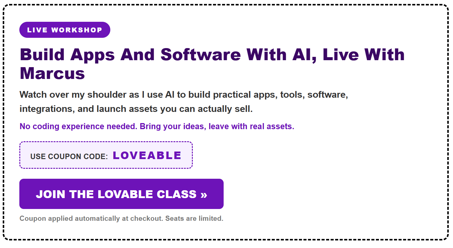

Value Warping Method
1. The problem with generic AI content
|
Key point
|
Simple interpretation
|
|
AI can produce words quickly.
|
Speed alone is not a business strategy.
|
|
Good decisions matter more than content volume.
|
Decide what problem to solve, for whom, and how it will earn before creating assets.
|
|
Opportunity, traffic, and conversion must align.
|
Traffic is only useful when the offer and user need are already clear.
|
|
Existing assets can make a task easier.
|
A relevant audience, domain, offer, data set, or workflow can provide leverage.
|
2. “Value warping”: compressing expertise into a useful solution
3. Shift from content-first marketing to tools and systems
|
Idea
|
Notes
|
|
Micro-tools
|
Build one narrow utility that solves one repeatable task.
|
|
Systems over prompts
|
A system should guide the next action; a one-off prompt merely produces output.
|
|
Repeat use
|
A useful tool can bring people back, reducing reliance on constant new traffic.
|
|
AI as an employee
|
The operator must define the task, constraints, and intended outcome.
|
|
Simple beats bloated
|
Avoid complicated apps when a lightweight solution will solve the actual problem.
|
4. Find a real problem before building
Simple validation checklist
|
Question
|
What to look for
|
|
What small task frustrates the user?
|
A repetitive, time-consuming, confusing, or expensive task.
|
|
Is there evidence of intent?
|
Search terms, existing tools, offers, questions, or active buying behavior.
|
|
Can the tool produce a clear result?
|
A file, recommendation, score, list, conversion, alert, or next step.
|
|
Does an offer fit naturally?
|
The tool’s user need should logically connect to the product or affiliate offer.
|
|
Can it be tested quickly?
|
Start with a small, usable version rather than waiting for perfection.
|
5. The practical workflow suggested in the webinar
6. Marketing and monetization themes
7. Products and offers mentioned in the webinar
|
Offer category
|
How it is positioned in the webinar
|
|
Training / “Lovable” class
|
Instruction for creating and launching AI-supported software or assets.
|
|
Software takeovers
|
Acquisition of prebuilt tools, source code, domains, and setup guidance.
|
|
Focus Desktop software
|
A Windows desktop tool with sections for niches, offers, keywords, domains, planning, AI search, and support.
|
|
Keyword and data tools
|
Tools intended to support research, tracking, and opportunity discovery.
|
|
Done-for-you and membership offers
|
Packaged sites, tools, guidance, calls, and related resources.
|
8. Claims and important cautions
|
Caution
|
Why it matters
|
|
Revenue claims are anecdotal.
|
A small test or individual result does not establish likely performance for others.
|
|
The webinar sells products and time-limited offers.
|
Separate the educational framework from the sales presentation and urgency messaging.
|
|
New software may create security warnings.
|
The presentation notes Windows-related installation warnings; only download software from sources you trust and scan it before running.
|
|
A tool is not passive income by itself.
|
The speaker notes that acquisition or creation is a starting point; validation, promotion, and maintenance are still required.
|
9. Key terms to remember
|
Term
|
Plain-English meaning
|
|
Value warping
|
Delivering a high-value result through a small, efficient tool or system.
|
|
Leverage / favors
|
Existing advantages that reduce effort or improve odds of success.
|
|
Micro-tool
|
A narrowly focused utility that solves one repeated problem.
|
|
Decision pattern
|
A repeatable process for choosing what to build and what to do next.
|
|
Output chasing
|
Creating lots of AI-generated material without a clear business purpose.
|
|
Buyer intent
|
Evidence that a person wants a solution and may take action or buy.
|
Bottom line
$1M Software Ideas – How I Find Them
Digital Product Secrets – $7M
PREORDER SIMPLE SITES 2026 AND SAVE $700
From Static Info to Useful AI Tools
A deeper playbook for turning PLR, ebooks, templates, prompts, courses, old files, and hard-won experience into useful AI-powered digital products—with keyword reports, product ideas, validation steps, traffic angles, prompts, and simple execution plans.
Most people do not need more information. They need help moving from “I know I should do this” to “I finished the next useful step.” That is the difference between a pile of content and an information product that actually earns attention.
AI makes it easier to generate words, images, outlines, code, and drafts. That does not automatically make a product valuable. Value comes from selecting the right buyer, identifying the job they repeatedly need done, building a clear path through that job, and giving them a useful output they can act on.
The opportunity is not to create more files. The opportunity is to turn useful knowledge into progress-producing systems.
This is an expanded, practical set of notes. Use it as a working document. Copy the tables into a spreadsheet. Fill in the workbook boxes. Replace the examples with your own niche. Run the prompts on your own source material. The goal is not to build a giant app overnight. The goal is to find one useful job, prove people care about it, and create the smallest product that makes the job easier.
1. The 1999 Lesson: People Pay to Start Somewhere Useful
My first introduction to the digital product world came from a PC legal forms product in 1999. It was not compelling because it taught legal theory. It was useful because it gave people a practical starting point: organized files they could begin with instead of an empty screen.
That lesson still applies. A buyer is often not paying for more reading. They are paying to avoid starting from nothing. They want a reliable first step, a clearer set of choices, and an outcome that feels less intimidating than a blank page.
Today, that same starting-point idea can be improved. A good digital tool can ask a sequence of questions, guide the customer toward a permitted template or option, identify missing details, organize a draft, and give a clear next action. In high-stakes areas such as law, medicine, taxes, finance, or regulated work, a product needs appropriate expert review, privacy protections, transparent limits, and compliant processes. The lesson is still useful, but the safeguards matter as much as the interface.
The product is not “read this.” The product is “start here, make a decision, and move forward.”
2. What Counts as a Real Information Product?
An information product can be a guide, course, template bundle, workbook, membership, software tool, or hybrid service. The format is not the deciding factor. The deciding factor is whether the product helps a specific person make useful progress on a recognizable job.
| If you have this… | It becomes more useful when you add… | The buyer receives… |
|---|---|---|
| An ebook or guide | Worksheets, decision points, examples, and a completion checklist | A guided path, not just information |
| A prompt pack | Search, categories, context fields, saved projects, and output review | A prompt workspace that supports a workflow |
| PLR or licensed content | Original positioning, curation, an audience-specific method, and a new interface | A focused product with a real use case |
| A course | Milestones, templates, implementation tasks, and progress tracking | A work-along system |
| A spreadsheet | Simple inputs, explanations, error checks, and useful outputs | A calculator, planner, or decision tool |
| Professional experience | Questions, rules, examples, constraints, and a repeatable deliverable | A productized method |
There is nothing wrong with a PDF. There is nothing wrong with an ebook. The issue is whether the buyer can use it. A short, focused guide with a practical template and a review checklist can outperform a much larger bundle when it solves one painful problem clearly.
3. Start With the Buyer Job, Not the Asset You Want to Sell
Creators often begin with the asset they already own: “I have 50 prompts,” “I have a long course,” “I have PLR articles,” or “I have an old bundle.” That is understandable, but it starts in the wrong place. Begin with the buyer’s job.
A job is something a person repeatedly wants to complete, avoid, decide, organize, or improve. It should be concrete enough that the buyer can recognize it immediately.
| Too broad | Better buyer job | Possible product outcome |
|---|---|---|
| “Help small businesses with marketing.” | “Help a local service business write a one-week promotion after a slow month.” | A promotion planner with ready-to-review assets |
| “Teach people AI.” | “Help real estate assistants prepare a repeatable listing-content draft.” | A listing-content workflow and approval checklist |
| “Sell productivity templates.” | “Help overloaded consultants turn meeting notes into a client follow-up plan.” | A meeting-to-action-plan tool |
| “Make a meal-planning product.” | “Help busy households build a weekly grocery and meal outline from preferences.” | A preference-based planning worksheet |
| “Sell a legal forms collection.” | “Help a user understand which permitted template to start with and what details are still missing.” | A guided intake and template-preparation tool, with appropriate professional review |
Buyer Job Worksheet
My specific buyer: ________________________________
The recurring situation they face: ________________________________
The job they need done: ________________________________
The result they want to see or hold: ________________________________
What makes the job frustrating today: ________________________________
What would make the first version useful: ________________________________
4. The Opportunity Map: Decide What Is Worth Building
Not every idea deserves a full product. Before you build, score the opportunity on four simple dimensions: urgency, recurrence, output value, and demonstrability. This is not a promise of demand. It is a practical filter for deciding where to spend your time.
| Dimension | Question to ask | High-score signal |
|---|---|---|
| Urgency | Does the buyer care about solving this now? | The problem causes delay, confusion, cost, risk, or visible stress. |
| Recurrence | Does this job happen more than once? | The buyer will return weekly, monthly, per project, or per client. |
| Output value | Does the tool create something useful? | The output can be sent, used, reviewed, printed, scheduled, or acted on. |
| Demonstrability | Can you show the transformation quickly? | A before-and-after demo makes the usefulness obvious. |
| Safety and fit | Can you deliver this responsibly? | You have rights, appropriate knowledge, clear limits, and a practical way to protect users. |
Give each dimension a score from 1 to 5. You do not need a perfect score. You need a clear reason to believe the product solves a problem worth testing. If an idea scores low on urgency and output value, it may still be a good content topic, but it is probably not the best first tool.
Fast Opportunity Scorecard
Idea: ________________________________
Urgency: ___ / 5 Recurrence: ___ / 5 Output value: ___ / 5 Demonstrability: ___ / 5 Safety and fit: ___ / 5
Total: ___ / 25 Next test: ________________________________
5. The Source-Material Audit: Turn a Folder Into Product Ingredients
Before you generate new material, inventory what you already have. The goal is to discover the actual ingredients: methods, questions, rules, templates, examples, data, graphics, objections, and outcomes. A messy folder can contain more product value than it appears to contain—but only when it is sorted and evaluated.
- Collect only material you have the right to use. Include your own files, licensed material, client-safe examples, internal methods, public-domain material where appropriate, and content you are authorized to adapt.
- Name each asset. Use clear categories: guide, worksheet, template, transcript, screenshot, prompt, research note, spreadsheet, example, and legal or license document.
- Tag the useful parts. Mark frameworks, recurring questions, steps, rules, objections, example outputs, common mistakes, and checklists.
- Flag the gaps. Note outdated facts, missing permissions, unclear language, risky topics, or steps that need expert review.
- Find the smallest useful sequence. Ask: “What must happen first, second, and third for the buyer to reach a useful result?”
| Source asset | What it contains | Possible product ingredient | Risk or review note |
|---|---|---|---|
| Old course transcript | Teaching sequence, examples, objections | Guided learning path and decision tree | Refresh dated references and claims |
| Prompt document | Reusable instructions | Searchable prompt workspace | Test outputs and add usage context |
| Spreadsheet | Formula, assumptions, input fields | Calculator, scorecard, or planner | Check calculations and explain assumptions |
| Client notes | Real questions and workflow friction | FAQ, onboarding, and product requirements | Remove confidential information |
| PLR package | Licensed base content | Original audience-specific workbook | Verify license and avoid reselling as-is |
6. Keyword Opportunity Reports: Find the Language of the Buyer Job
Keyword research is not about chasing a random number. It is a way to understand the language people use when they are trying to solve a problem, compare options, make a decision, or get an output. Your keyword report should lead to a product decision, a content plan, or a tool idea—not just a long list of phrases.
A useful keyword report maps a buyer job into keyword clusters, intent, content opportunities, tool opportunities, and offer angles. You can populate the report with real, date-stamped data from your chosen keyword or analytics tool later. Do not invent search volume, CPC, difficulty, ranking, or traffic figures. If you do not have validated data, label the report as a hypothesis map and test it through conversations, pages, demos, and customer feedback.
| Keyword cluster | What it reveals | Example pattern | What to build or publish |
|---|---|---|---|
| Problem terms | The pain, delay, confusion, or obstacle | “how to organize client follow-up” | A diagnostic post and simple checklist |
| Tool terms | The interface the buyer expects | “client follow-up template” or “follow-up generator” | A template library or guided generator |
| Output terms | The thing the buyer wants to create | “proposal outline,” “weekly content plan,” “scope of work draft” | An output builder with an export |
| Question terms | Where the buyer needs explanation | “what should I include in…” | An FAQ-driven guide and intake form |
| Comparison terms | How the buyer evaluates alternatives | “template vs software” or “best tool for…” | A comparison page and product-positioning section |
| Workflow terms | The process the buyer is trying to complete | “step-by-step [job] workflow” | A work-along system and implementation path |
Keyword Opportunity Report Template
Buyer job: ________________________________
Problem seed terms: ________________________________
Tool seed terms: ________________________________
Output seed terms: ________________________________
Questions buyers ask: ________________________________
Comparison terms: ________________________________
Likely intent: Learn / Choose / Build / Buy / Review
Free content or tool: ________________________________
Paid product: ________________________________
Evidence to gather: live search data, interviews, competitor pages, support questions, demo feedback, or landing-page responses.
How to Turn a Keyword Report Into a Product Map
Suppose your buyer job is: “A freelance designer needs to prepare a first client proposal.” The keyword report might reveal problem phrases around scope, pricing uncertainty, proposal structure, revision limits, and client follow-up. The product map should not be “an ebook about proposals.” It might be a proposal-prep workflow that collects project details, guides the designer through options, creates a structured first draft, and gives a review checklist before sending.
| Report finding | Interpretation | Product or content response |
|---|---|---|
| People use “how do I…” questions | They need explanation and a starting path | Create a guide, quick-start tool, and visible example output |
| People search for templates | They want speed and a usable format | Provide a template with a guided customization layer |
| People compare tools | They are evaluating options before committing | Publish transparent comparison and “who this is for” content |
| People search for a specific output | They are close to a concrete task | Build a focused generator, worksheet, or assistant |
| People ask process questions | They need sequencing and confidence | Create a work-along system with checkpoints |
7. A Practical Keyword Research Workflow (Without Guessing)
Use this workflow when you are ready to research a niche. It works whether you use a keyword platform, search-console data, marketplace search, community questions, analytics, interviews, or a combination of sources.
- Write down the buyer job in plain language. Avoid jargon. Use the words your buyer would use when explaining the problem to a friend.
- Create 10 seed phrases. Include the problem, desired output, template/tool language, and comparison language.
- Gather real evidence. Record the date, source, geography, device, and filter used. Save links or screenshots for later reference.
- Group phrases by intent. Separate learn, choose, build, buy, troubleshoot, and compare searches.
- Look for repeated friction. What do people ask over and over? What makes them hesitate? What output are they trying to produce?
- Map each cluster to a page or tool. A keyword cluster should lead to a useful page, calculator, template, guide, demo, or offer—not a pile of unrelated blog posts.
- Test the idea with a small audience. Search behavior is useful input, not a substitute for speaking with actual people.
8. The Product-Idea Matrix: Twelve Directions You Can Adapt
Below are twelve product directions. They are not finished businesses. They are ways to translate source material into a useful interface. Choose the direction that best matches your buyer job, rights, expertise, risk level, and ability to validate.
| Source material | Buyer job | Smallest useful product | First output | Fast validation |
|---|---|---|---|---|
| Consulting notes | Prepare for a client discovery call | Discovery-call planner | Question list and call plan | Have 5 consultants use it on live calls |
| Proposal templates | Create a first client proposal | Proposal-prep workflow | Structured proposal draft | Observe whether users complete it faster |
| SEO checklist | Plan a service-page draft | Page-brief builder | Headline, sections, metadata, review list | Compare drafts with and without the tool |
| Prompt library | Find the right instruction for a task | Prompt organizer | Chosen prompt plus context fields | Track repeat use and saved prompts |
| Course transcript | Implement a multi-step method | Work-along dashboard | Milestone plan and next task | Ask users where they stop or get confused |
| Pricing guidance | Prepare a pricing scenario | Assumption-based calculator | Scenario comparison and notes | Ask whether the output improves decisions |
| Design examples | Write a clear creative brief | Brief generator | Creative brief and asset checklist | Have a designer review the output |
| Customer support questions | Resolve a repeat issue | Troubleshooting flow | Next-step checklist | Measure whether support tickets become clearer |
| Workshop notes | Plan a team meeting | Agenda and follow-up builder | Agenda, decisions, owners, due dates | Use it in one real meeting |
| Meal-planning content | Organize a household week | Preference-based planner | Meal outline and grocery list | Test with households and protect health boundaries |
| Legal-form library | Understand a document-preparation process | Guided intake and template selector | Preparation checklist and draft inputs | Obtain qualified review before any launch |
| Sales-call recordings | Practice a client conversation | Role-play and objection library | Call practice plan and feedback prompts | Ask users if practice changes their confidence |
Product-Idea Rule
Build the smallest tool that produces the first useful output. Do not build user accounts, a giant dashboard, integrations, or a complex mobile app before you have evidence that people want the core result. A simple worksheet, form, spreadsheet, or guided page can validate the job before you invest in software.
9. Build an Operating Layer, Not Just a Content Bundle
An operating layer is the part of the product that turns knowledge into a repeatable action. It is what makes a guide feel like a system.
| Operating-layer element | What it does | Example |
|---|---|---|
| Intake | Collects the few details the tool needs | Audience, deadline, budget, offer, preferred style |
| Decision rule | Helps the buyer choose a path | If the buyer needs speed, start with the short-form workflow |
| Constraint | Prevents vague or unsafe results | State assumptions, required review steps, and prohibited claims |
| Output | Creates a usable result | Plan, draft, checklist, estimate, schedule, or brief |
| Review loop | Lets the buyer improve the result | Save, revise, compare options, or run a quality check |
| Handoff | Moves the output into real work | Export, send, print, assign, or schedule the next action |
When you design a product, write the buyer journey in one line: input → decision → output → review → action. If you cannot explain that sequence, the product may still be a content bundle rather than a usable tool.
10. Package the Product Like an Operating System
A strong product package does not dump a folder of unrelated assets on the customer. It gives the customer a clear route through the work.
- Start Here: A short guide explaining who the product is for, what it helps with, what it does not do, and where to begin.
- Learn: The core method, examples, definitions, and a short explanation of why the workflow works.
- Decide: An assessment, audit, selector, or scorecard that helps the user choose the right path.
- Create: Templates, forms, prompts, calculators, tools, or draft builders that produce an output.
- Execute: A task list, SOP, schedule, campaign plan, or implementation checklist.
- Track: A progress log, dashboard, review sheet, metrics worksheet, or accountability rhythm.
Your Product System Map
Start Here asset: ________________________________
Learn asset: ________________________________
Decision asset: ________________________________
Create asset: ________________________________
Execute asset: ________________________________
Track asset: ________________________________
11. Offer Architecture: Free Utility, Starter Product, Core System
Offer structure should match the customer’s readiness. Some people need a small proof step. Others are ready for a full workflow. Build an ethical ladder that helps buyers choose, not one that pressures them with vague promises.
| Offer level | Purpose | Example | What it should prove |
|---|---|---|---|
| Free utility or guide | Help the buyer experience a small win | Quick audit, checklist, short generator, or worksheet | That you understand the job and can offer useful guidance |
| Starter product | Help the buyer complete one defined task | Template kit, guided workbook, or simple planner | That the method works in a practical situation |
| Core system | Support the end-to-end workflow | Work-along dashboard, tool suite, or implementation system | That the buyer can return to the product as work continues |
| Optional implementation or review | Offer appropriate human help for a higher-stakes step | Setup, audit, feedback, expert review, or done-with-you session | That the product has a responsible boundary |
Price should reflect the usefulness of the problem solved, the depth of the outcome, the support included, the buyer’s alternatives, and the effort needed to deliver responsibly. Avoid presenting price as a guarantee of value. Test wording and packaging with real customers before making assumptions.
12. Validate Before You Build the Big Version
Validation is a set of small tests designed to reduce uncertainty. It is not a single survey, a compliment, or a viral post. The strongest early evidence comes from people using a rough version of the workflow on a real task.
| Validation method | What you learn | Simple way to run it | Watch for |
|---|---|---|---|
| Problem interviews | How the buyer describes the job and current frustration | Ask 5–10 target users about the last time they faced the problem | Real examples, repeated language, existing workarounds |
| Concierge test | Whether a guided process creates value | Deliver the first version manually with forms, calls, or a spreadsheet | Whether people finish and value the output |
| Landing-page test | Whether the promise and outcome are understandable | Publish a clear page with one call to action | Questions, sign-ups, replies, and points of confusion |
| Usability test | Where the workflow breaks | Watch 3–5 people attempt the task without coaching | Stalls, errors, missing context, and unclear labels |
| Paid pilot | Whether buyers will commit resources | Offer a small, clearly bounded early version | Fit, support needs, and delivery burden |
Good Validation Questions
- Tell me about the last time you had to do this job. What happened?
- What did you try first? What made it slow or frustrating?
- What would a useful finished output look like to you?
- What tools, templates, services, or people do you use today?
- What would make you distrust a tool in this category?
- What would need to be true for you to try a small first version?
Do not ask, “Would you buy this?” in isolation. People are often kind. Ask about their real workflow, past behavior, current alternatives, and what a useful result would change. Then show a narrow prototype and watch what they do.
13. A Simple Traffic System for Useful AI Tools
Traffic is not a one-time launch tactic. It is a set of repeatable ways to help the right person recognize a problem, see a useful approach, and decide whether your product fits. A useful tool gives you better material to show because it has a visible before-and-after.
| Traffic loop | What to publish | Why it connects to the product |
|---|---|---|
| Search loop | Problem guides, output examples, comparison pages, FAQs, and workflow posts | Each page answers a real question from the keyword report |
| Demonstration loop | Short before-and-after videos, screen recordings, and walk-throughs | The buyer can see the input, process, and result |
| Social hook loop | Specific “stop doing this / do this instead” posts and mini case walkthroughs | Hooks point to the job the product helps complete |
| Free-utility loop | Limited checklists, planners, audits, or micro tools | The buyer experiences a small piece of the operating layer |
| Trust loop | Transparent limitations, examples, updates, and educational explanations | Clarifies fit and reduces misleading claims |
Ten Simple Marketing Hooks You Can Adapt
- “Stop starting from a blank page. Start with this one decision.”
- “Your template is not the product. The guided result is.”
- “The fastest way to improve this workflow is to remove the first five minutes of confusion.”
- “Most prompt packs fail because they do not help you choose the right prompt.”
- “Turn one messy folder into a product people can actually use.”
- “Do not build an app first. Prove the output is useful first.”
- “A keyword list is not a strategy until it tells you what to build.”
- “Your next digital product may already be hidden in your old notes.”
- “The buyer does not want more content. They want a completed next step.”
- “Build the smallest tool that creates the first useful result.”
14. Turn Keywords Into a Content and Tool Calendar
Each keyword cluster should have a job in your marketing system. Do not create 50 disconnected posts. Build a small cluster where every page helps a buyer move closer to the useful output.
| Cluster type | Content piece | Free asset | Core-product bridge |
|---|---|---|---|
| Problem | “Why [job] feels harder than it should” | Quick diagnostic checklist | Show the full workflow that solves the issue |
| Template | “What to include in a [desired output]” | Starter template | Offer the guided customization system |
| Comparison | “Template vs tool vs service for [job]” | Decision guide | Clarify who benefits from your approach |
| Question | “How do I [specific job] without [common obstacle]?” | Short action plan | Demonstrate the product’s input-to-output path |
| Workflow | “A step-by-step [job] workflow” | Workflow map | Invite the buyer into the work-along version |
The most important rule is relevance. The free post or tool should naturally lead to the paid system because both are about the same job. Do not attract people with a broad curiosity topic and then offer an unrelated product.
15. Competitive Review: Learn Without Copying
Reviewing alternatives can make your product clearer. The goal is not to copy another person’s code, wording, design, product claims, customer testimonials, or protected content. The goal is to understand category expectations and identify the gaps your product can responsibly address.
- What buyer job does the alternative claim to solve?
- What input does it collect?
- What output does it produce?
- What is difficult, generic, unclear, or missing from the experience?
- What safety, privacy, support, or accessibility questions should you handle better?
- What narrow segment could benefit from a more focused version?
Use your review to make an original product specification. Build from your own rights-cleared source material, your own customer research, and your own design decisions.
16. The 30-Day Information-Product Build Plan
This plan keeps the work small and evidence-driven. Adjust the pace to your availability. If you find important safety, rights, or demand issues, slow down and address them before moving forward.
| Week | Focus | Deliverables | Decision point |
|---|---|---|---|
| Week 1 | Buyer job and source audit | Asset inventory, buyer-job statement, risk list, first opportunity score | Is this job clear, useful, and responsible to test? |
| Week 2 | Keyword report and product map | Keyword clusters, content map, product idea matrix, first prototype outline | What is the smallest useful output? |
| Week 3 | Prototype and validation | Manual or no-code version, 3–5 usability tests, revision log | Where do users struggle or get value? |
| Week 4 | Offer and traffic assets | Clear sales page, demo, free utility, first content cluster, onboarding notes | Are the promise, fit, and boundaries easy to understand? |
17. Prompt Library: Use AI to Organize the Work, Not Replace Judgment
These prompts are intentionally structured. They ask the AI to plan, identify gaps, and show its reasoning in an organized form. They do not remove your responsibility to verify rights, facts, calculations, outputs, safety, privacy, or market fit.
Prompt 1: Source-Material Inventory
I am giving you a folder of source material. First, create an inventory with these columns: file name, asset type, topic, useful framework, recurring question, template or example, possible buyer job, potential output, outdated material, rights or attribution issue, privacy issue, and review need.

Do not build a product yet. First tell me what is present, what is missing, what is duplicated, and what should not be reused without review. Then suggest the three strongest buyer jobs that could be served from this material.
Prompt 2: Keyword Opportunity Report
Act as a product-research assistant. My buyer job is: [INSERT JOB].

Create a keyword opportunity report without inventing search volume, CPC, rankings, traffic, or difficulty data. Organize the report into:
1. Problem terms
2. Tool and template terms
3. Desired-output terms
4. Question terms
5. Comparison terms
6. Workflow terms
7. Related pain points and objections

For each cluster, propose likely intent, a useful article or landing-page angle, a free utility or checklist, and a paid product feature. Clearly label all ideas as hypotheses that need real data and user validation.
Prompt 3: Product-Idea Matrix
Using this source-material inventory and buyer job, create ten original product ideas. For each idea, include: buyer, recurring job, smallest useful interface, inputs, decision rules, concrete output, risks or expert-review needs, free preview, paid product, first validation test, and why this is better than a generic ebook.

Score each idea from 1 to 5 for urgency, recurrence, output value, demonstrability, complexity, safety, and fit with my existing assets. Recommend the smallest high-value option to test first.
Prompt 4: Product Specification
Write a lean product specification for this idea: [INSERT IDEA].

Include the target buyer, job-to-be-done, core promise, product boundaries, inputs, processing steps, decision rules, outputs, review loop, handoff, onboarding, help content, privacy considerations, high-risk claims to avoid, accessibility considerations, and test plan. Keep the first version narrow enough to prototype in one week.
Prompt 5: Validation Interview Guide
Create a 20-minute customer-discovery interview for [BUYER] who needs to [JOB]. Do not ask leading questions or ask people to predict whether they will buy. Ask about the last time they faced the problem, their current workaround, time or frustration involved, the output they want, alternatives they have tried, and what would make a tool untrustworthy. End with a gentle invitation to test a rough prototype.
Prompt 6: Content Engine
Using this keyword report and product specification, create a 12-piece content plan. Include four problem-focused posts, three output-focused posts, two comparison posts, two demonstrations, and one transparent “who this is for / not for” page. Every piece must connect to the same buyer job and naturally lead to the same useful next step. Avoid clickbait promises, fabricated results, or unsupported claims.
18. Quality, Rights, Privacy, and Ethics Checklist
Ethics are not an afterthought. They are part of product quality. A product that creates confusion, relies on unverified claims, exposes private information, or operates outside its proper boundary may create harm rather than value.
- Rights: I have the right to use, modify, and sell the material in the way I plan to use it.
- Accuracy: I have reviewed instructions, examples, calculations, dates, and claims for accuracy.
- Boundaries: I clearly state what the tool does, what it does not do, and when a qualified professional should be involved.
- Privacy: I collect only information that is genuinely needed, protect it appropriately, and explain how it is handled.
- Safety: I test outputs for harmful, misleading, or inappropriate results and include guardrails where needed.
- Accessibility: I make the instructions, interfaces, files, and outputs as usable as reasonably possible for the intended audience.
- Support: I provide a clear starting point, help information, and a way to report issues.
- Claims: I do not promise earnings, rankings, conversions, legal outcomes, medical outcomes, or other results that I cannot responsibly support.
19. Your First Seven Days
- Day 1: Choose one rights-cleared folder, course, transcript, template pack, or note collection.
- Day 2: Run the source-material inventory and choose three possible buyer jobs.
- Day 3: Score the jobs using urgency, recurrence, output value, demonstrability, and safety.
- Day 4: Build a hypothesis keyword report and list the buyer’s likely language, questions, outputs, and comparisons.
- Day 5: Choose one smallest useful interface: a planner, selector, generator, calculator, workbook, or guided workflow.
- Day 6: Create a manual prototype and test it with realistic inputs. List every point of confusion.
- Day 7: Share a clear demo or simple landing page with a small target audience and ask for real workflow feedback.
20. The Real Opportunity
The real opportunity in AI-powered software is not simply to create more content faster. It is to package useful knowledge in a way that helps someone act with more clarity, less friction, and a better starting point.
Start with a real buyer job. Use your existing material as ingredients, not as the final product. Build the smallest interface that creates a useful output. Use keyword reports to understand the buyer’s language. Validate the workflow with real people. Add traffic assets that demonstrate the transformation. Improve the product through use, not assumptions.
Static information becomes a useful product when it helps the right person make the next useful decision and complete the next useful step.
Optional next step: To see an example of a work-along product direction, visit www.SimpleSitesBigProfits.com.
INSANE WordPress Ai Plugin Opportunity
How I Make $1M+ With Simple WordPress Plugins Using AI — The Overlooked $673 Billion Opportunity
JOIN THE AI APPS / PLUGINS CLASS HERE
NEW – we are adding 2 sessions to this including a plugin class where you will build a plugin, a membership site section for saas AND a section on lovable ai and claude. (7 coupons left use coupon code LOVEABLE)
📋 What’s In This Training
- The $673B Opportunity — Why This Business Model Is Different
- How I Made $1M+ With Simple Digital Tools
- Vibe Coding — Build Plugins With AI (No Experience Needed)
- Real Traffic Data — 1,001 Keywords Analyzed From WordPress.org
- Top Plugin Profiles — Installs, Revenue & Business Model
- 12 Validated Market Opportunities — Deep Research
- The Opportunity Map — Where The Money Is Right Now
- Portfolio Strategy — How to Build a Plugin Business, Not Just a Plugin
- The Watchlist — 14 More Ideas Worth Tracking
- Decision Rules Before You Write a Single Line of Code
- Real Plugins. Real Numbers. Documented Revenue.
- The 8-Step Playbook — How To Do It
JOIN THE AI APPS / PLUGINS CLASS HERE
NEW – we are adding 2 sessions to this including a plugin class where you will build a plugin, a membership site section for saas AND a section on lovable ai and claude. (7 coupons left use coupon code LOVEABLE)
The $673B Opportunity — Why This Business Model Is Different
Before we get into the specifics — let’s talk about why this business model is different from everything else you’ve probably seen.
What if there was one simple thing you could make with AI that taps into a $600 billion industry, comes with a built-in traffic strategy, is easy for list building, and can go from idea to MVP in days — not months or years?
Here’s what makes it work:
- Something simple. One small tool. One focused problem it solves. Not an app empire. Not a SaaS platform. Just one thing that does one thing really well.
- Anyone can make it with AI. You describe what you want in plain English. AI writes the code. You test it. You ship it. No computer science degree. No coding bootcamp. No agency fees.
- Ties into a $600 billion industry. The platform this tool lives on powers 43.5% of every website on the internet. The total economic value of this ecosystem? $596–$673 billion.
- Built-in traffic strategy. There’s a free marketplace that sends you targeted traffic on autopilot — no ads, no SEO hustle, no social media posting. The platform does the marketing for you.
- Easy for list building. Every person who installs your free tool is a warm lead. You collect their email. You have a relationship. You have an audience. That list is an asset you own forever.
- MVP in days, not months. With AI tools, a working version of your product can be ready in an afternoon. You don’t need to wait. You don’t need funding. You can test the market this week.
One simple tool. One free listing. One upgrade page. That’s the whole funnel. That’s the whole business. Solo founders are doing $500K–$2M/yr with exactly this model — and most of the internet has never heard of them.
Now here’s the reveal — we’re talking about WordPress plugins. WordPress powers 43.5% of every website on the internet. That’s not a niche. That’s the internet. And the business ecosystem built on top of it is worth an estimated $596–$673 billion in total economic value. The plugin market alone is $1.3–$1.6 billion per year.
Most people walk right past this. They’re chasing dropshipping, crypto, or the next shiny object — while a small group of solo founders with no VC funding and no big team are quietly building $500K to $10M per year businesses selling simple tools to WordPress site owners. And now with AI vibe coding, you don’t even need to know how to code to get started.
Why the Plugin Market Is So Attractive
The plugin market is highly concentrated at the top — a handful of companies (Elementor, Yoast, WP Rocket, MemberPress, Awesome Motive’s portfolio) likely account for 30–40% of all premium plugin revenue — while the long tail of 10,000+ small plugins splits the remainder. That long tail is where the opportunity lives for a solo founder.
| Revenue Tier | Examples | Est. Annual Revenue |
|---|---|---|
| Enterprise / VC-backed | Elementor, Yoast SEO, WP Rocket | $20M – $100M+ |
| Mid-market bootstrapped | MemberPress, Gravity Forms, Beaver Builder | $2M – $20M |
| Solo / small team (the sweet spot) | WP Fusion, Barn2, SEOPress, Restrict Content Pro | $500K – $2M |
| Early stage / growing | Thousands of niche plugins | $10K – $500K |
The sweet spot — $500K to $2M — is where solo founders and small teams live. These are real, documented businesses. And the barrier to entry has never been lower.
How I Made $1M+ With Simple Digital Tools
I’m not a computer science graduate. I didn’t raise venture capital. I didn’t have a team of 50 engineers. What I had was a simple idea, an audience of people who needed help, and the willingness to build something useful.
The formula was straightforward: find a problem people have → build a simple tool that solves it → charge a fair price → let the recurring revenue compound.
This business model works because:
- The market is enormous and hungry. 810 million websites need tools. Every niche — booking, SEO, forms, performance, memberships, eCommerce — has room for a well-positioned product.
- Recurring revenue is the default. Annual license renewals mean your revenue compounds year after year. 1,000 customers at $99/yr = $99,000/yr before you add a single new customer.
- Distribution is built in. There’s a free marketplace that markets your tool for you. A free version with 10,000 active users is a sales funnel. You don’t need ads.
- AI has eliminated the biggest barrier. You used to need to be a developer. Now you describe what you want to an AI and get working code back in minutes. Vibe coding is real, and it works.
- Small and simple wins. The most profitable tools are often the most focused — one problem, one solution, done well. You don’t need to build something massive.
The $1M insight: I didn’t make $1M from one big launch. I made it by stacking small wins — multiple simple tools, each solving a specific problem, each generating recurring revenue. $10K/mo here, $8K/mo there. It adds up faster than you think.
Income disclaimer: Results are not typical. I have years of experience and an existing audience. Most people who attempt to build and sell digital tools make little to nothing. These figures represent my personal experience and should not be taken as a guarantee or expectation of earnings.
Vibe Coding — Build WordPress Plugins With AI (No Experience Needed)
Vibe coding means you describe what you want in plain English, and an AI (Claude, ChatGPT, Cursor, etc.) writes the code. You test it, tweak it, and ship it. No CS degree required. No developer needed. No months of learning.
- Pick a specific problem. Think of one thing that would make a WordPress site owner’s life easier. One frustration. One repetitive task. One missing feature. That’s your idea.
- Describe it to AI. Open Claude or ChatGPT. Describe exactly what you want the plugin to do in plain English. Be specific. Ask for clean PHP code with a WordPress settings page. You’ll be surprised how fast it comes back.
- Test it. Download LocalWP (free) to run WordPress on your computer. Drop the plugin code in. Click around. Does it work? If not, paste the error back into AI and ask it to fix it. Iterate.
- Add a freemium layer. Give the core plugin away free on WordPress.org. That’s your list builder and your traffic engine. Charge for the advanced version — extra features, priority support, more customization. Price it at $29–$99/yr.
- Publish and let the flywheel spin. WordPress.org does the SEO. People search for a plugin, find yours, install it, love it, upgrade. You wake up to Stripe notifications.
The math on one simple plugin: 50,000 free installs converting at just 2% to a $39/yr paid version = 1,000 paying customers × $39 = $39,000/yr recurring. That’s one plugin. Stack three of them and you’re looking at $100K+/yr. That’s the model.
Example AI Prompt to Get Started
“Write me a WordPress plugin that adds a customizable floating WhatsApp chat button to any WordPress site. Include a settings page in the WP admin where the user can set their phone number, button color, button position (bottom-left or bottom-right), and a custom welcome message. The plugin should be lightweight, use no jQuery dependency, and follow WordPress coding standards. Include proper uninstall cleanup.”
That prompt, pasted into Claude or ChatGPT, will return a working plugin in under 60 seconds. Test it, tweak it, and you have a product.
Real Traffic Data — 1,001 Keywords Analyzed From WordPress.org
We analyzed a real keyword export from the WordPress.org/plugins directory — 1,001 organic keywords driving traffic to the plugin marketplace. This is the actual search demand flowing into WordPress.org every month. Here’s what it reveals.
Top 30 Plugins by WordPress.org Traffic (From the Data)
| # | Plugin / Keyword | Search Volume/mo | WP.org Visits/mo | Avg Position | Notes |
|---|---|---|---|---|---|
| 1 | elementor | 139,410 | 5,290 | 4.54 | 10M+ installs — $59–$599/yr Pro, ~$80–100M ARR est. |
| 2 | contact form 7 | 28,600 | 2,163 | 2.00 | 10M+ installs — FREE only, no paid tier (massive gap) |
| 3 | yoast seo | 27,100 | 1,986 | 2.10 | 5M+ installs — free + $99/yr Premium, ~$30M ARR est. |
| 4 | rank math | 22,200 | 1,870 | 2.30 | 2M+ installs — free + $59–$499/yr Pro |
| 5 | wp fastest cache | 18,100 | 1,720 | 2.10 | 1M+ installs — free + $49.99/yr Pro |
| 6 | all in one wp migration | 14,800 | 1,650 | 2.50 | 5M+ installs — free + $69/yr premium extensions |
| 7 | wp mail smtp | 12,100 | 1,540 | 2.80 | 3M+ installs — free + $49–$299/yr Pro |
| 8 | litespeed cache | 11,200 | 1,490 | 2.20 | 6M+ installs — free (LiteSpeed server required for full features) |
| 9 | wpforms | 9,900 | 1,420 | 2.60 | 6M+ installs — free + $49.50–$299.50/yr |
| 10 | fluent forms | 4,200 | 628 | 2.28 | 300K+ installs — WPManageNinja, $59–$199/yr |
| 11 | ai engine | 2,920 | 620 | 3.06 | AI plugin — growing fast, $49/yr pro |
| 12 | funnelkit | 940 | 614 | 2.75 | WooCommerce funnels — $99.50–$399/yr |
| 13 | malcare | 2,690 | 599 | 1.75 | Security plugin — $99–$299/yr, ~$3M ARR est. |
| 14 | wp all import | 5,320 | 582 | 2.58 | 100K+ installs — $199–$399/yr pro |
| 15 | givewp | 1,040 | 571 | 1.17 | Donation plugin — StellarWP, $149–$499/yr |
| 16 | beaver builder | 4,760 | 557 | 2.45 | Page builder — $99–$399/yr, $1M+ revenue milestone |
| 17 | restrict content pro | 700 | 543 | 1.36 | Membership — $99–$249/yr, sold for est. $1.5–2.5M |
| 18 | gravity forms | 22,730 | 498 | 3.20 | No free version — $59–$259/yr, ~$20M ARR est. |
| 19 | link whisper | 1,760 | 485 | 1.24 | Internal linking — $77–$167/yr, ~$1M ARR est. |
| 20 | smush | 5,400 | 461 | 3.00 | 1M+ installs — WPMU Dev, free + $7.50/mo pro |
| 21 | translatepress | 2,100 | 445 | 2.10 | Translation — $89–$329/yr, 300K+ installs |
| 22 | cartflows | 1,600 | 430 | 2.30 | WooCommerce checkout funnels — $239/yr, ~$2M ARR est. |
| 23 | tutor lms | 1,200 | 410 | 2.50 | LMS — $199/yr, 100K+ installs |
| 24 | directorist | 880 | 395 | 2.20 | Directory listings — $99–$299/yr |
| 25 | wp activity log | 1,450 | 380 | 2.40 | Audit log — $99–$199/yr, 200K+ installs |
| 26 | accessibility checker | 720 | 365 | 1.90 | Equalize Digital — $119–$899/yr |
| 27 | sugar calendar | 590 | 350 | 1.80 | Events — $49–$149/yr, Sandhills Dev |
| 28 | updraftplus | 8,100 | 1,280 | 2.70 | 3M+ installs — free + $70/yr premium |
| 29 | woocommerce | 49,500 | 3,100 | 3.10 | 5M+ installs — Automattic, free core + paid extensions |
| 30 | jetpack | 18,000 | 1,380 | 2.90 | 5M+ installs — Automattic, free + $9.95–$79.95/mo |
The biggest gap in this entire dataset: Contact Form 7 has 10 million+ active installs and zero paid tier. The developer relies on donations. This is one of the most-installed pieces of software on the internet with no monetization. Anyone who builds a polished “Contact Form 7 Pro” or a premium add-on suite for CF7 is sitting on a goldmine.
JOIN THE AI APPS / PLUGINS CLASS HERE
NEW – we are adding 2 sessions to this including a plugin class where you will build a plugin, a membership site section for saas AND a section on lovable ai and claude. (7 coupons left use coupon code LOVEABLE)
Top Plugin Profiles — Installs, Revenue & Business Model
Here are detailed profiles of the most instructive plugins from the data — what they built, how they priced it, and what it’s worth.
Elementor — The Freemium Giant
Page Builder 10M+ Installs ~$80–100M ARR
Founded in 2016 by two Israeli developers with no VC funding initially. Built a free drag-and-drop page builder that was genuinely better than anything else available. Grew to 10M+ free installs. Converted a fraction to Elementor Pro at $59–$599/yr. Now powers 8%+ of all websites on the internet. Raised $15M Series A in 2019, valued at $1.5B+ in 2021. The lesson: win by being free, fast, and genuinely useful. The paid tier sells itself.
WP Fusion — The Solo Founder Story
CRM Integration $776K ARR (2024) Solo Founder
Jack Arturo built WP Fusion alone. It connects WordPress membership sites to CRM tools like ActiveCampaign, HubSpot, and Infusionsoft. Started in 2016 making $44K. By 2024 it was doing $776K/yr — fully transparent, annual reports published every year. Price: $247–$540/yr. The lesson: solve a specific integration problem for a specific audience. Charge accordingly. Publish your numbers.
Barn2 Plugins — The Husband & Wife Team
WooCommerce Tools $1.7M ARR (2024) 2-Person Team
Katie and Andy Keith run Barn2 from the UK. They publish annual transparency reports going back to 2018. Revenue has grown from ~$400K to $1.7M across 19 plugins. Their bestseller, WooCommerce Product Table, is used on 15,000+ sites at $99/yr. The lesson: a portfolio of focused plugins compounds faster than one big bet.
WP Rocket — The Performance Plugin
Caching / Performance $2.6M ARR (2018) No Free Version
WP Rocket launched in 2013 with a bold strategy: no free version, premium only at $49/yr. By year 3 they were at $1M ARR. By 2018 they reported $2.6M. They proved you don’t need a freemium model — if your product is genuinely the best, people will pay upfront. The lesson: sometimes “premium only” is the right strategy if you can deliver clear, measurable results.
Gravity Forms — The No-Free-Version Form Builder
Forms ~$20M ARR (est.) No Free Version
Gravity Forms has never had a free version. Starts at $59/yr. Has dominated the premium form builder market for 15+ years. No WordPress.org listing. Grows entirely through word of mouth, developer community, and direct search. The lesson: if your product is genuinely superior, you don’t need free. But you need to be genuinely superior.
SEOPress — The Solo Founder SEO Plugin
SEO $500K+ ARR Solo Founder
Benjamin Denis built SEOPress alone. Competing directly with Yoast and Rank Math. Published transparency reports showing $500K+ ARR. Price: $49/yr for Pro. 300K+ active installs. The lesson: you can compete in a crowded market if you’re genuinely better on a specific dimension (in SEOPress’s case: cleaner UI, better value, no upsell harassment).
Restrict Content Pro — The Membership Plugin That Sold
Memberships $500K+/yr at sale Acquired
Built by Pippin Williamson (Sandhills Development). Part of a portfolio that generated $4.3M/yr across 5 plugins before being acquired by Awesome Motive in 2021. Restrict Content Pro alone was doing $500K+/yr at time of sale. The lesson: build to sell. A plugin doing $500K/yr can sell for $1.5–3M. That’s a real exit.
12 Validated Market Opportunities — Deep Research
The following analysis is based on a keyword dataset of 10,000+ WordPress-related search terms, filtered for product-shaped searches, grouped into buildable concepts, and validated against existing competitors, pain points, and monetization potential. Each opportunity includes a verdict: GO, CONDITIONAL GO, or DO NOT START HERE.
Executive summary: Start with a deliberately narrow utility, not a miniature version of an established suite. The best balance of visible demand, low-to-moderate keyword difficulty, solo-developer scope, and a believable market gap is a lightweight announcement bar/popup. Age verification and QR campaign management are the next best first builds. Duplication and table-of-contents products are easy to ship and attract search demand, but need sharper differentiation to convert free users.
BUILD FIRST
1. Lightweight Popup & Announcement Bar
The fast, reliable announcement bar and simple popup that never becomes a marketing suite.
The Problem
WordPress users frequently encounter significant challenges with popup and announcement bar plugins — display reliability issues, conflicts with caching, JavaScript errors, CSS conflicts that freeze page scrolling, and bloated plugins that slow down sites. The core job is to communicate with visitors without breaking the site or hurting performance.
Why You Can Still Win
A significant gap exists for a solution that prioritizes predictable, reliable display behavior with minimal conflicts. Current offerings are either too heavy (OptinMonster, Thrive Leads) or too basic. There’s clear demand for a lightweight plugin with built-in conflict diagnostics and a one-screen setup.
Recommended Wedge
One-screen setup, tiny front-end payload, predictable display rules, cookie/frequency controls, accessibility defaults, and a conflict diagnostic panel.
Solo-Developer MVP
Simple interface for creating basic popups and announcement bars with reliable display triggers (on page load, on scroll, click-based), robust cookie-based frequency controls, basic targeting (specific pages, logged-in/out users), minimal code footprint, and basic diagnostic logging.
Pricing
Free core → $39–$79/year Pro; agency tier $149/year.
Existing Market Proof
OptinMonster ($9+/mo SaaS), Popup Maker (780K+ installs, $87+/yr), Thrive Leads ($99/yr), WPFront Notification Bar (free/Pro). The market is proven — the gap is for something lighter and more reliable.
BUILD FIRST
2. Age Verification Gate
A lightweight, cache-safe age gate for alcohol, cannabis, gaming, and restricted stores.
The Problem
WordPress sites in alcohol, cannabis, adult content, and gaming industries need age verification. Existing solutions are either too basic, lack WooCommerce product-level gating, have poor documentation, or are buried inside expensive suites.
Recommended Wedge
Fast wizard, page/product rules, Yes/No and date-of-birth modes, localStorage/cookie options, cache diagnostics, and WooCommerce product gating.
Pricing
Free core → $39–$79/year; WooCommerce add-on or Pro at $99/year.
Existing Market Proof
Age Gate (40,000+ installs, free), WooCommerce Age Verification Popup ($29/yr), Easy Age Verify (free + $3.99/mo). Market is proven but underserved at the quality end.
BUILD FIRST
3. QR Code Generator
WordPress-native QR campaigns with changeable destinations — without a separate QR SaaS.
The Problem
Businesses want to generate QR codes for their WordPress content without paying for a separate SaaS tool. They want dynamic QR codes (changeable destinations), campaign tracking, and easy generation from within WordPress.
Recommended Wedge
Dynamic QR codes with changeable destinations, campaign UTM tagging, scan analytics, bulk generation, and Gutenberg block for embedding.
Pricing
Free static QR generator → $29–$59/year for dynamic codes, analytics, and bulk generation.
BUILD FIRST
4. Duplicate Posts, Pages & Menus
The safe duplicator for menus, builder layouts, custom fields, and client workflows.
The Problem
WordPress users need to duplicate posts, pages, custom post types, and navigation menus — especially for client work and page builder workflows. Most duplicators miss menus or fail with complex custom fields.
Recommended Wedge
One-click duplication for posts, pages, AND menus, preflight preview, exact metadata control, builder compatibility tests, and rollback.
Pricing
Free core → $29–$59/year for builder compatibility, bulk rules, multisite, and rollback.
Existing Market Proof
Duplicate Page by mndpsingh287 (1M+ installs), Yoast Duplicate Post (4M+ installs). The market is massive — the gap is menu duplication and builder compatibility.
BUILD FIRST
5. Table of Contents Block
JOIN THE AI APPS / PLUGINS CLASS HERE
NEW – we are adding 2 sessions to this including a plugin class where you will build a plugin, a membership site section for saas AND a section on lovable ai and claude. (7 coupons left use coupon code LOVEABLE)
An accessible, native Gutenberg TOC block with excellent defaults and no settings maze.
The Problem
Long-form content needs navigation. Existing TOC plugins either slow down sites, require shortcodes, or aren’t truly native Gutenberg blocks. Users want zero-config, accessible, and performant.
Recommended Wedge
Zero-config block, live editor preview, semantic markup, keyboard support, sticky mobile drawer, heading warnings, and theme-style inheritance.
Pricing
Free core → $29–$59/year for layouts, analytics, multisite presets, and agency controls.
Existing Market Proof
Easy Table of Contents (600K+ installs), AIOSEO includes a TOC block. Gap: a standalone, truly native, performant Gutenberg block.
STRONG SECOND PRODUCT
6. SMTP Diagnostics & Email Log
A plain-English WordPress email troubleshooter, not another SMTP configuration suite.
The Problem
WordPress emails fail silently. Users can’t diagnose why. Existing SMTP plugins configure the connection but don’t explain failures in plain English. The gap is human-readable diagnostics, not more configuration options.
Recommended Wedge
Test mail, human-readable error classification, DNS/authentication checklist, source-plugin detection, safe log redaction, and exportable support report.
Pricing
$49–$99/year; agency monitoring tier $149–$249/year.
Existing Market Proof
WP Mail SMTP (4M+ installs, $49–$299/yr), Easy WP SMTP (600K+ installs), Post SMTP (400K+ installs). Large proven market — gap is diagnostics and plain-English error explanations.
STRONG SECOND PRODUCT
7. Redirect & 404 Manager
A beginner-first 404 inbox that recommends the safest redirect and explains why.
The Problem
Broken links and 404 errors hurt SEO and user experience. The leading free plugin (Redirection) is comprehensive but overwhelming for beginners. The gap is a beginner-friendly interface that recommends the right redirect type and explains why.
Recommended Wedge
Beginner-first 404 inbox, auto-suggest redirect targets, plain-English explanations, bulk actions, and SEO impact scoring.
Pricing
Free core → $39–$79/year for bulk rules, import/export, monitoring alerts, and agency tools.
STRONG SECOND PRODUCT
8. FAQ & Schema Block Generator
A lightweight FAQ block that produces valid markup and warns when schema rules change.
The Problem
Content creators want FAQ sections that generate valid schema markup for Google rich results. Existing solutions are either buried inside giant SEO plugins or produce invalid markup that gets ignored by search engines.
Recommended Wedge
Native Gutenberg FAQ block, valid JSON-LD schema output, schema validation warnings, accordion styling, and accessibility-first markup.
Pricing
Free core → $29–$59/year for advanced styling, multiple FAQ schemas, and priority support.
VALIDATE BEFORE BUILDING
9. Broken Link Scanner & Fixer
A low-resource broken-link inbox with safe, reviewable fixes.
The Problem
Broken links hurt SEO and user trust. Existing scanners either hammer shared hosting servers (causing suspensions) or produce too many false positives. The gap is a low-resource scanner with smart scheduling and reviewable fixes.
Recommended Wedge
Cloud-based or rate-limited scanning, clear false-positive controls, one-click fix suggestions, and email alerts for new broken links.
Pricing
Free basic scanner → $39–$79/year for cloud scanning, auto-fix, and monitoring.
VALIDATE BEFORE BUILDING
10. PDF Embed & Viewer
A mobile-first document viewer for one vertical, such as restaurant menus or public records.
The Problem
Embedding PDFs responsively on mobile is still broken in most WordPress setups. Landscape PDFs render poorly. Performance suffers. The gap is a mobile-first viewer with lazy loading and a vertical-specific workflow.
Recommended Wedge
Responsive viewer, lazy loading, strong mobile UX, thumbnails, and a vertical-specific workflow (restaurant menus, legal documents, real estate listings) rather than generic PDF embedding.
Pricing
Free basic embed → $39–$99/year; niche workflow bundles can justify more.
VALIDATE BEFORE BUILDING
11. Automatic Internal Linking Assistant
A review-first orphan-page and internal-link assistant for a narrow content workflow.
The Problem
Content creators struggle with orphaned pages and manual internal linking. Existing tools (Link Whisper, Internal Link Juicer) provide suggestions but users complain about irrelevant recommendations. The gap is more contextual, reviewable suggestions.
Recommended Wedge
Orphan reports, deterministic similarity matching, one-click approval, change preview, and rollback — before expensive AI features.
Pricing
$69–$149/year; agency tiers $249+.
Existing Market Proof
Link Whisper (50K+ installs, $97–$497/yr), Internal Link Juicer (90K+ installs, $69.99+/yr). Strong demand — harder first plugin due to suggestion quality challenges.
DO NOT START HERE
12. Cookie Consent & Script Blocker
Only pursue as a deliberately narrow integration or performance tool, not a general compliance promise.
Why Not
High CPC and demand are attractive, but evolving privacy law (GDPR, CCPA, ePrivacy), script discovery complexity, breakage risk, and dominant incumbents (CookieYes with 1M+ installs, Complianz with 1M+ installs) make this a poor first plugin. The compliance liability alone is a dealbreaker for a solo developer.
If You Must
Focus on a small set of specific scripts and transparent diagnostics. Never claim legal compliance. Price at $49–$149/year if a defensible niche is found.
Portfolio Strategy — How to Build a Plugin Business, Not Just a Plugin
The top ideas above can become a coherent portfolio for freelancers and agencies. The sequence matters: launch a narrow, low-risk front-end utility first; use its install base to introduce adjacent diagnostic and site-maintenance tools later.
Phase 1 — Weeks 1–4: Ship the Smallest Useful Free Plugin
Choose the popup/bar, age-gate, or QR concept. Build only the core job, a guided first-run experience, safe defaults, uninstall cleanup, and instrumentation that respects WordPress.org rules and user privacy. Get it live. Get your first 100 installs.
Phase 2 — Weeks 5–8: Prove Reliability and Distribution
Test current WordPress/PHP versions, common themes, caching plugins, multilingual sites, WooCommerce where relevant, accessibility, and mobile behavior. Publish problem-led tutorials targeting the exact queries in this report. Respond to every support thread. Build your reputation.
Phase 3 — Weeks 9–12: Add One Paid Outcome
Charge for a measurable workflow advantage: advanced rules, dynamic destinations, diagnostics, bulk operations, multisite, agency presets, analytics, or priority support. Do not gate basic safety or accessibility features. The free version must be genuinely useful — that’s what drives installs and trust.
Recommended First Product Specification: “Signal Bar”
Working concept: “Signal Bar” — a lightweight announcement bar and simple popup with built-in conflict diagnostics. This wins by being smaller and more predictable than conversion suites, not by matching them feature for feature.
| Layer | Include | Do NOT Include Initially |
|---|---|---|
| Free | Top/bottom bar, one simple modal, text/button, page targeting, start/end dates, cookie frequency, mobile preview, accessibility defaults | Drag-and-drop canvas, dozens of animations, CRM integrations, revenue attribution, AI copy generation |
| Reliability Wedge | Display-rule simulator, cache warning, z-index/overflow checks, script error notice, “why is this showing?” debug panel | Claims that every theme/plugin conflict can be auto-fixed |
| Pro | Advanced audience rules, scheduling, import/export, reusable presets, basic conversion events, multisite, agency white label | Full marketing automation or email service |
Pricing
- $49/year — one site
- $99/year — five sites
- $149/year — agency launch tier
- No lifetime pricing until support and renewal economics are known.
Launch Content Strategy
Target these exact search queries with tutorials and documentation: “WordPress popup not showing,” “announcement bar WordPress,” “lightweight popup plugin,” caching and display-rule troubleshooting. Avoid broad “best marketing plugin” terms dominated by suites — you won’t win there yet.
The Watchlist — 14 More Ideas Worth Tracking
These concepts were scored but not deeply researched because they were not as attractive as the 12 validated markets for a first build. They remain useful as add-ons, future products, or narrower vertical experiments.
| Opportunity | US Volume/mo | Median KD | Median CPC | Interpretation |
|---|---|---|---|---|
| Post notification & editorial alerts | — | 11.0 | — | Small search market; useful as an add-on rather than a standalone first product |
| Maintenance & coming-soon page | 1,850 | — | — | Plausible watchlist idea; validated top group has better demand/ease balance |
| Social review & testimonial display | 2,200 | — | — | Plausible watchlist idea; validated top group has better demand/ease balance |
| WebP conversion & image compression | 1,400 | 12.0 | $1.05 | Plausible watchlist idea; validated top group has better demand/ease balance |
| Accessibility quick-fix toolbar | — | — | — | Large or high-risk first build; validate a narrow vertical before coding |
| Download manager & protected files | — | 52.0 | $0.29 | Search competition relatively high; differentiation and distribution would be costly |
| WhatsApp click-to-chat button | — | 42.5 | — | Search competition relatively high; differentiation and distribution would be costly |
| Form spam shield / CAPTCHA alternative | — | — | — | Small search market; useful as an add-on rather than a standalone first product |
| Author box & profile card | — | — | — | Small search market; useful as an add-on rather than a standalone first product |
| Simple calculators & quote estimators | — | 36.0 | — | Search competition relatively high; differentiation and distribution would be costly |
| Custom login page & login URL | 1,850 | 27.5 | $0.28 | Plausible watchlist idea; validated top group has better demand/ease balance |
| Simple booking calendar | 5,860 | 47.0 | — | Large or high-risk first build; validate a narrow vertical before coding |
| CSV import/export utility | — | 12.0 | — | Plausible watchlist idea; validated top group has better demand/ease balance |
| External links & affiliate link manager | — | — | — | Small search market; useful as an add-on rather than a standalone first product |
Decision Rules Before You Write a Single Line of Code
JOIN THE AI APPS / PLUGINS CLASS HERE
NEW – we are adding 2 sessions to this including a plugin class where you will build a plugin, a membership site section for saas AND a section on lovable ai and claude. (7 coupons left use coupon code LOVEABLE)
These are the gates your idea must pass before you invest serious time. Most plugin ideas fail not because of bad code — but because the founder skipped validation.
| Gate | Pass Condition | Kill or Narrow the Idea When… |
|---|---|---|
| Problem interviews | At least 8–10 target users describe the same workflow pain without being led | Users say the free incumbent is already sufficient |
| Landing-page intent | Problem-led traffic produces email signups, demo requests, or preorders from the intended buyer | Only generic freebie seekers respond |
| Differentiation | The value proposition fits in one sentence and is visible in one screenshot | The pitch is merely “simpler” without a specific outcome or diagnostic capability |
| Support economics | The plugin can identify its own common failures and produce a useful support report | Every failure depends on unobservable hosting, legal, or third-party API conditions |
| Paid boundary | Pro saves recurring time, supports agencies, adds monitoring, or protects a valuable workflow | Payment only removes arbitrary limitations from a commodity feature |
The most important rule: If you can’t explain in one sentence why someone would pay for the Pro version when a free alternative exists, you don’t have a product yet. You have a feature.
Real Plugins. Real Numbers. Documented Revenue.
Every figure below comes from a publicly available source — developer transparency reports, press releases, acquisition announcements, or credible third-party databases. These are not estimates or projections. They are documented facts.
| Plugin | Developer | Revenue / Sales | Price | Source Type | Source |
|---|---|---|---|---|---|
| WP Fusion | Jack Arturo (solo) | $776K ARR (2024) | $247–$540/yr | Exact | 2024 Transparency Report |
| Barn2 Plugins (portfolio) | Katie & Andy Keith | $1.7M ARR (2024), 18,410 sales | $49–$249/yr per plugin | Exact | 2024 Year in Review |
| WP Rocket | WP Media | $2.6M ARR (2018) | $49–$249/yr | Exact | 2018 Year in Review |
| SEOPress | Benjamin Denis (solo) | $500K+ ARR | $49/yr | Exact | 2024 Year in Review |
| Sandhills Dev (portfolio) | Pippin Williamson | $4.3M ARR (2020, 5 plugins) | $49–$299/yr per plugin | Exact | 2020 Year in Review |
| Easy Digital Downloads | Sandhills Dev | $1.2M ARR (2016) | $99–$299/yr | Exact | 2016 Year in Review |
| AffiliateWP | Sandhills Dev | $1.1M ARR (2016) | $149–$299/yr | Exact | 2016 Year in Review |
| Restrict Content Pro | Sandhills Dev | $500K+/yr (at acquisition) | $99–$249/yr | Exact | WP Tavern — Acquisition Report |
| WPBakery Page Builder | WPBakery | 407,600 CodeCanyon sales (~$40.4M gross est.) | $64 one-time | Estimate | CodeCanyon Listing |
| Slider Revolution | ThemePunch | ~$9.5M gross est. (95K+ sales × $99) | $99 one-time | Estimate | CodeCanyon Listing |
| Gravity Forms | Rocketgenius | ~$20M ARR (est.) | $59–$259/yr | 3rd-Party Est. | ZoomInfo / GetLatka |
| MemberPress | Caseproof | ~$5–8M ARR (est.) | $179–$399/yr | 3rd-Party Est. | Growjo / ZoomInfo |
The acquisition math: A plugin doing $500K/yr typically sells for 3–5x annual revenue = $1.5M–$2.5M. A plugin doing $2M/yr can sell for $6M–$10M. Building to sell is a completely legitimate strategy — and WordPress plugins are highly acquisable assets.
JOIN THE AI APPS / PLUGINS CLASS HERE
NEW – we are adding 2 sessions to this including a plugin class where you will build a plugin, a membership site section for saas AND a section on lovable ai and claude. (7 coupons left use coupon code LOVEABLE)
The 8-Step Playbook
- Find a specific problem. Browse WordPress.org support forums. Search Reddit’s r/Wordpress. Look at 1-star reviews of popular plugins. What are people complaining about? What’s broken? What’s missing? Write down 10 problems. Pick the one that makes you think “I can’t believe nobody has fixed this properly.”
- Validate before you build. Post in a Facebook group or Reddit thread: “If a plugin existed that did X, would you pay $X/yr for it?” Get 10 people to say yes before you write a line of code. Better yet, build a landing page and collect email signups.
- Vibe code your MVP. Open Claude or ChatGPT. Describe your plugin in plain English. Ask for a working WordPress plugin with a settings page. Test it in LocalWP. Iterate with AI until it works. This can take an afternoon.
- Add a freemium layer. The free version does the core job well. The Pro version adds power-user features, agency tools, multisite support, priority support, or advanced analytics. Price Pro at $29–$99/yr to start.
- Publish on WordPress.org. Submit your free plugin to the WordPress.org repository. This is your distribution engine. WordPress.org ranks in Google for millions of plugin-related searches. Your free listing gets you in front of 810 million potential users.
- Build your email list. Every free user is a warm lead. Use a simple in-plugin notice or a welcome email to invite them to your list. Offer a tip, a tutorial, or a bonus. This list is your most valuable asset — you own it forever regardless of what happens to WordPress.org.
- Publish problem-led content. Write tutorials targeting the exact search queries your potential users are typing. “WordPress popup not showing,” “how to fix 404 errors in WordPress,” “WordPress email not sending.” These rank. They drive installs. They compound over time.
- Stack and compound. Once your first plugin is stable and generating revenue, build a second one. Then a third. Each one adds to your recurring revenue base. Each one cross-promotes the others. Each one builds your reputation in the ecosystem. This is how $10K/mo becomes $100K/mo.
Remember: WP Fusion started at $44K in year one. By year eight it was doing $776K. Barn2 started with one plugin and now has 19. Pippin Williamson built 5 plugins and sold the company for what was likely $10M+. None of them started with a big team or VC money. They started with one simple tool that solved one real problem.
The opportunity is right now. AI vibe coding has eliminated the biggest barrier to entry — you no longer need to be a developer. The WordPress ecosystem is still growing. The plugin market is still fragmented. There are still thousands of problems that don’t have a great solution. The window is open. The question is whether you’ll walk through it.
Research compiled July 2026 | Sources: WordPress.org, Barn2, WP Fusion, Sandhills Development, WP Rocket, SEOPress, CodeCanyon, WP Engine, W3Techs, ZoomInfo, GetLatka, Growjo, WP Tavern, Post Status
JOIN THE AI APPS / PLUGINS CLASS HERE
NEW – we are adding 2 sessions to this including a plugin class where you will build a plugin, a membership site section for saas AND a section on lovable ai and claude. (7 coupons left use coupon code LOVEABLE)
Lovable Ai Business Setup – FULL WALKTHRU
CLICK HERE TO GET YOUR LOVABLE ACCT
My next trainings will be about how to use lovable to make simple desktop apps
the $25 plan will do just fine – you can create tons of stuff with it.
CLICK HERE TO JOIN MY DESKTOP TOOLS TRAINING
USE COUPON CODE LOVEABLE TO SAVE $200 THIS IS A COURSE YOU DON’T WANT TO MISS BECAUSE WE WILL BE CREATING FULL BUSINESS WITH YOU… YES EVERYONE WILL WALK AWAY WITH A SELLABLE TOOL THEY CAN PROFIT WITH.
Want my prompts, my templates, and my exact process instead of trying to piece it together yourself? Elite members get everything I use, plus the stuff I do not share publicly. If you are serious about doing this for real, this is the shortcut.
Upgrade To AI Profit Scoop Elite »Get the prompts, templates, and my full process
Full Detailed Video Notes
Quick Summary
The video explains a business method based on building small, single-purpose software tools with AI. The presenter calls this idea micro software. Instead of attempting to create a huge platform with many features, the goal is to find one recurring problem, build a focused utility that solves it, and connect that utility to a sensible business model.
The tool could be sold for a one-time fee, offered through a subscription, used as a freemium product, licensed to other businesses, monetized with affiliate offers, or given away to build a targeted email list. The presenter demonstrates how tools such as Ahrefs, Google, YouTube, Similarweb, ChatGPT, Claude, Lovable, Electron, and the Gemini API can support the research and creation process.1
The central lesson of the entire video is: “Solve one problem.”
The presenter also gives an important reality check. Building software with AI may be faster than traditional coding, but it is still a real business. It requires research, testing, troubleshooting, marketing, persistence, and ongoing improvement. There is no guarantee that an app will make money simply because AI helped create it.1
The Main Business Idea: Micro Software
Micro software is a small program that performs one useful task exceptionally well. It is not intended to compete with an enormous enterprise platform. It is designed to remove one frustration, automate one repetitive task, convert one type of file, organize one kind of information, or make one part of a workflow faster.
The presenter uses ordinary tools such as Notepad, calculators, text utilities, formatters, converters, and simple whiteboards to illustrate the concept. These products may not look exciting, but people continue to use and buy them because they save time or solve an immediate problem.1
He gives a simple revenue illustration:
| Example | Calculation | Gross revenue illustration |
|---|---|---|
| Small audience | $17 × 500 buyers | $8,500 |
| Larger audience | $17 × 5,000 buyers | $85,000 |
These figures are examples, not income promises. The larger lesson is that a product does not need to become a billion-dollar company to be worthwhile. A modestly priced utility can produce meaningful revenue if it solves a clear problem for enough people.1
Full Chronological Notes
00:00–02:00 — Introduction and the “Solve One Problem” Principle
The presenter opens by discussing the large number of online videos that claim people can use AI to build a business and make money very quickly. He says this information can become overwhelming because viewers are shown many tools, complicated systems, and ambitious ideas without a clear starting point.
His answer is written on his whiteboard: solve one problem. He argues that many aspiring builders make the mistake of trying to create an all-in-one AI application. That usually adds unnecessary complexity before the basic idea has been validated.
The better approach is to identify one specific problem and create the smallest useful tool that solves it. A focused utility is easier to describe, easier to build, easier to test, and usually easier to market because potential customers immediately understand what it does.1
02:00–03:18 — Reality Check: This Is Still a Real Business
The presenter says that business advice should be supported by real examples, actual tools, and visible data rather than vague motivational claims. He warns that most people who watch “make money online” content do not earn money from it.
AI reduces the technical barrier, but it does not remove the need for work. A useful product still requires:
- A real problem worth solving.
- Evidence that people care about the problem.
- A working product rather than an unfinished demonstration.
- Testing with realistic files and workflows.
- A way to reach the intended audience.
- A clear offer or monetization plan.
- Patience when errors and failed versions appear.
The presenter makes clear that there are no guarantees and that things can go wrong. The method should be viewed as a practical business process, not an instant-income shortcut.1
03:18–04:50 — What Counts as Micro Software?
Micro software is presented as a small desktop program or online utility that performs a narrow function. The presenter refers to familiar programs such as Notepad, calculators, Microsoft Word, and a simple whiteboard tool. Each succeeds because users can quickly understand its purpose.
A strong micro-software idea can usually be explained in one sentence. Examples include:
- Save and organize everything copied to a computer’s clipboard.
- Convert an Excel spreadsheet into a PDF or HTML file.
- Find and replace text across multiple files.
- Format or repair JSON code.
- Organize useful AI prompts and copy them with one click.
- Manage a particular repetitive WordPress task.
The product does not need to be visually impressive. It needs to be reliable, easy to use, and valuable to a defined group of users.1
04:50–06:09 — The Presenter’s 2002 Floppy-Disk Example
The presenter tells a story from 2002 to explain how he first understood the economics of reusable digital products. He says he purchased packs of blank floppy disks at a very low unit cost. He then used Microsoft FrontPage to create a simple digital version of an Herbalife catalog, added PayPal links, and placed the HTML package on the disks.
He sold the disks to other Herbalife representatives for $500 each and says he made $7,000 in one night from roughly two hours of work. His main insight was not the specific disk or catalog. It was that a digital product could be created once and sold repeatedly without rebuilding the entire product for every buyer.1
The broader business lesson is that reusable digital assets can have low reproduction costs. Software applies the same principle: the initial build may require substantial effort, but distributing another copy can be relatively inexpensive.
06:09–08:28 — From Digital Files to Information Products
As the internet became more accessible, digital products such as ebooks, PDFs, courses, and downloadable files became easier to create. This also created a problem: when almost anyone can produce a basic PDF, its perceived value may decrease.
The presenter describes his 2008 product, Simple Sites Big Profits. It was initially offered through formats such as a PDF, a printable book, and a physical DVD. He says it produced one $247 sale during its first month.1
The example introduces an important distinction between the information itself and the way the information is packaged and delivered. Buyers may value the same material differently depending on whether it appears to be a loose collection of files or a structured tool that guides them through a process.
CLICK HERE TO GET YOUR LOVABLE ACCT
My next trainings will be about how to use lovable to make simple desktop apps
the $25 plan will do just fine – you can create tons of stuff with it.
CLICK HERE TO JOIN MY DESKTOP TOOLS TRAINING
08:28–09:59 — Packaging Information as a Tool
The presenter shows a dashboard version of Simple Sites Big Profits. The dashboard looks like software, although much of its purpose is to organize and link to videos, checklists, resources, and related tools.
This packaging made the product feel more organized and actionable. Instead of searching through separate documents and files, users could open one interface and follow the material from a central location.
The presenter’s lesson is that the word software or tool may carry greater perceived value than the words ebook or course, especially when the interface makes the information easier to use. He says the stronger software-style packaging helped turn a product in the approximate $200 range into an offer worth about $1,000.1
This does not mean a creator should misrepresent a collection of links as advanced technology. The ethical and practical point is to improve usability: create a real dashboard, workflow, organizer, generator, calculator, checklist system, or automation that helps the customer apply the information.
09:59–12:00 — Validate Demand by Studying Existing Utilities
The presenter demonstrates TextCrawler, a Windows utility that performs find-and-replace operations across text files. It is a good micro-software example because its core purpose is narrow and easy to understand.
He uses Ahrefs Keyword Explorer to look at search demand. The video shows approximately 12,000 monthly searches for “find replace” and around 30 monthly searches for “text crawler.” These figures illustrate why research should focus on the problem or action rather than only the name of one product.1
The presenter says he has purchased TextCrawler more than once over the years for about $100 because it reliably does what he needs. A focused tool can retain customers even if it is not fashionable.
He also recalls a product called Niche Finder, which helped users find ClickBank products and related domains. At the time, he wished he could make software like it but did not know how to code. His point is that AI coding tools now allow nontraditional developers to test ideas that previously required a programmer.
12:00–13:46 — Market Size and Monetization Options
The presenter displays a market estimate that values the Windows utility software market at approximately $5.1 billion in 2024, with a projected rise to about $9.15 billion by 2033. These figures are presented in the video and are not independently verified in these notes.1
He then describes several ways a utility can make money:
| Model | How it works | Suitable situation |
|---|---|---|
| Freemium | The basic version is free; advanced features require payment. | Useful when the free version can attract a large audience. |
| Subscription | Users pay monthly or annually for continued access, updates, storage, or AI usage. | Suitable when the product delivers recurring value or has ongoing operating costs. |
| Perpetual license | The customer pays once for continued use of a particular version. | Appropriate for a simple desktop utility with limited ongoing costs. |
| OEM or white label | Other companies license the software engine and apply their own branding. | Useful when the technology can serve many businesses or niches. |
| Affiliate model | The tool is free but recommends relevant products or services through affiliate links. | Works when the recommendations naturally support the tool’s purpose. |
| Lead magnet or “intercept” model | The tool is free or inexpensive and attracts people likely to need a larger related offer. | Useful for building an email list and selling coaching, training, services, or advanced tools. |
The business model should be selected based on the problem, customer expectations, ongoing costs, and the creator’s larger offer.1
13:46–15:14 — Large Companies Built Around Focused Software
The presenter briefly mentions companies and brands such as Gen Digital, Norton, Avast, and Malwarebytes. He then focuses on Wondershare and refers to products including Filmora, PDFelement, UniConverter, and Recoverit.
His argument is that many successful software businesses are built around understandable use cases: edit video, work with PDF files, convert media, or recover lost data. Even when these products eventually gain many features, their core value remains connected to a specific problem.1
The lesson is not that a beginner should immediately compete with a large established company. The lesson is to look at successful software categories, identify smaller unmet needs, and choose a narrow entry point.
15:14–18:23 — Finding and Validating a Clipboard-History Idea
The presenter uses Ahrefs to research the word clipboard. He finds that “clipboard history” receives approximately 23,000 searches per month in the data shown during the video.1
He then searches Google and finds an existing product called Clipboard History IO. The site offers a free version and a Pro plan shown at approximately $1.99 per month or $14.99 per year. Similarweb is used to estimate about 11,000 monthly visits to the site.1
This competitor does not automatically make the idea bad. It proves that:
- People search for the problem.
- A product already exists to solve it.
- At least one company believes users may pay for additional features.
- The market may contain room for a different audience, operating system, feature set, interface, or pricing strategy.
The presenter suggests using ChatGPT to extend the research with a prompt similar to this:
Find competitors and top earners with software like this: https://www.clipboardhistory.io/
He then demonstrates a direct building prompt for an AI coding assistant:
I want to make a clipboard history tool that saves everything copied as a file and has the items in a list. Make this a Windows desktop EXE.
The presenter notes that the prompt does not need perfect grammar. The AI needs a clear description of the problem, desired behavior, and target format.1
18:23–22:24 — The “Intercept” Business Model
The presenter introduces Personality Prompts, a tool containing categorized AI prompts for activities such as copywriting and branding. He shows both a web version and a desktop-style version. A user can select a prompt and copy it to the clipboard.1
He uses a whiteboard to explain the intercept model:
- A person is attempting to use AI.
- The person struggles to organize prompts or get consistent results.
- A free prompt-organizer tool solves that immediate problem.
- The user joins the creator’s mailing list or enters the creator’s ecosystem.
- The creator can later present a relevant advanced product, coaching offer, service, or training program.
The free tool is therefore not random. It intercepts people at a moment when they are already experiencing the exact problem connected to the creator’s paid offer.
A good intercept product should provide genuine value on its own. If the free tool is low quality, users will not trust the paid offer. The free utility should demonstrate the creator’s understanding of the customer’s problem.1
22:24–25:30 — Building a Windows App With Lovable
The presenter shows a prompt asking Lovable to create an Electron-based Windows EXE. The requested product is a Gemini-powered JSON editor, creator, and learning tool. It includes a notepad-style interface, the ability to view and change JSON, saving controls, a folder selection, and an admin/settings area where the user can enter a Gemini API key.1
The original prompt shown in the video is informal and contains spelling errors:
lets make a windows exe electron program that is like a super robust gemini api powered json editor creator learning tool with like a notepad where they can click and view what it does change it save it ect they enter thier gemini api to use the ai stuff on an admin page also choose folder to save in make it light color schmee
A clearer reusable version would be:
Build a light-colored Electron desktop application for Windows. The application should be a robust JSON editor, creator, and learning tool powered by the Gemini API. Include a notepad-style editor where users can open, view, edit, explain, and save JSON files. Add a settings page where users can enter and test their own Gemini API key. Let users select a default folder for saved files. Package the finished application as a Windows EXE.
The presenter’s broader point is that a rough idea can be turned into a starting version quickly. However, clear specifications normally reduce unnecessary revisions and credit usage.
He also shows a master app-idea table containing categories such as:
| Category | Example directions |
|---|---|
| Timer and focus tools | Pomodoro timers, distraction blockers, meeting timers, or stage timers. |
| Meditation and wellness | Guided routines, breathing timers, habit reminders, or focused audio utilities. |
| Pet applications | Dog-calming music, pet schedules, feeding reminders, or training aids. |
| Productivity and AI workflow | Email rewriters, prompt organizers, text processors, or file utilities. |
| Fun and novelty | Joke generators, name generators, creative randomizers, or simple entertainment tools. |
CLICK HERE TO GET YOUR LOVABLE ACCT
My next trainings will be about how to use lovable to make simple desktop apps
the $25 plan will do just fine – you can create tons of stuff with it.
CLICK HERE TO JOIN MY DESKTOP TOOLS TRAINING
25:30–29:06 — Keyword Research for Software Ideas
The presenter continues using Ahrefs to test possible software topics. Figures shown in the video include the following approximate monthly search volumes:1
| Keyword | Approximate search volume shown |
|---|---|
| timer app for Windows | 350 |
| prompts | 6,800 |
| AI prompt | 5,500 |
| HTML editor | 13,000 |
| format | 24,000 |
| resume format | 19,000 |
| JSON format | 90,000 |
For “timer app for Windows,” he reviews Google results such as Free Timer App, StageTimer, and Clockify. The purpose is to see what already ranks, how competitors position their tools, and whether users want a desktop application, browser utility, mobile application, or specialized version.1
For “JSON formatter,” he finds multiple online tools. He also searches YouTube and sees JSON-related videos with very large view counts. Search-engine demand and video views can provide two different signals that people want help understanding or manipulating the format.
Keyword volume alone is not enough. A useful validation process asks:
- What exactly is the searcher trying to accomplish?
- Are current tools free, paid, outdated, complicated, or missing a feature?
- Does the search indicate a one-time question or a recurring workflow?
- Can the intended user be reached economically?
- Is there a reason to choose a desktop app instead of a free website?
- Can a small first version produce a noticeably better result?
29:06–32:25 — Use “Trigger Words” to Generate App Ideas
The presenter uses a file called software_trigger_words.txt. It contains action-oriented words that describe common software functions. He combines these words with markets, file types, professions, and recurring tasks to discover possible app ideas.1
Examples include:
| Trigger word | Possible product direction |
|---|---|
| Replacer | Replace text, code, links, names, tags, or values across many files. |
| Summarizer | Summarize documents, meeting notes, articles, transcripts, or reports. |
| Expander | Expand outlines, abbreviations, snippets, or short descriptions. |
| Formatter | Format JSON, resumes, citations, code, text, spreadsheets, or documents. |
| Minify | Reduce the size of code, images, scripts, or data files. |
| Prettifier | Improve the visual structure of code or hard-to-read data. |
| Rewriter | Rewrite sentences, emails, descriptions, headlines, or specialized documents. |
| Humanizer | Change AI-sounding text into a more natural style. |
| Bulk | Process multiple files, images, URLs, keywords, or records at once. |
The video shows approximately 63,000 searches for “rewriter,” 41,000 for “sentence rewriter,” and 146,000 for “humanizer.” The presenter describes AI humanizer software as a potentially large opportunity. These numbers can change and should be rechecked before making a product decision.1
A practical formula for brainstorming is:
Audience or file type + recurring problem + trigger word = possible micro-software idea
Examples:
- Real-estate description rewriter.
- Bulk image-name replacer.
- JSON formatter for beginners.
- Meeting-note summarizer for sales teams.
- WordPress title and meta-description rewriter.
- Resume-format checker for a particular profession.
The niche version may have less total search volume than the broad term, but it can be easier to explain and market to a specific audience.
32:25–35:05 — Testing and Debugging the JSON Tool
The presenter returns to Lovable after the JSON application has been generated. He downloads a ZIP archive, extracts it, and launches the Windows EXE. The application opens as a JSON Code Tool.1
He visits the application’s settings area, enters a Gemini API key, and tests the connection. The AI-powered feature works. He then tries to open a JSON file and receives an “unexpected token” error.
Instead of attempting to diagnose every line manually, he copies the error message and gives it back to the AI builder for correction. This demonstrates an important AI-development loop:
- Build the smallest working version.
- Run it locally.
- Test a real user action.
- Capture the exact error message.
- Give the error and relevant context back to the AI.
- Ask for a targeted fix.
- Rebuild and test again.
AI-generated code should not be assumed to work perfectly on the first attempt. Error messages, screenshots, sample files, and exact reproduction steps help the AI make better corrections.
Security note: An API key should not be hard-coded into an application or exposed to other users. If users supply their own key, it should be stored securely and the app should explain what data is sent to the external AI service.
35:05–38:09 — Live Build: Excel-to-PDF Converter
CLICK HERE TO GET YOUR LOVABLE ACCT
My next trainings will be about how to use lovable to make simple desktop apps
the $25 plan will do just fine – you can create tons of stuff with it.
CLICK HERE TO JOIN MY DESKTOP TOOLS TRAINING
The presenter asks Lovable to make a simple Electron EXE that converts Excel files into several formats. The original prompt is:
lets make a simple electron exe that converts excel to various file types including pdf html ect drag and drop simple
A clearer reusable version would be:
Build a simple Electron desktop app for Windows that converts Excel spreadsheets into PDF, HTML, and other useful formats. Use a clean drag-and-drop interface. Let the user select the desired output format and output folder. Show clear progress, success, and error messages. Package the finished app as a Windows EXE.
Lovable generates the app. The presenter downloads and extracts the ZIP archive, opens the Excel Converter EXE, drags in a spreadsheet, selects PDF, and successfully creates a PDF.1
He then adds a new feature with another prompt:
how to password protect an excel file lets add a password protect element too
Lovable updates the interface to include a Password protect toggle and a password field.1
This demonstration shows how AI development can be iterative. A creator can first confirm that the main conversion function works and then add a related feature. The warning is to avoid adding so many features that the product loses its original simplicity.
38:09–40:00 — Blog Profit Network Command Center
The presenter briefly shows another application called the Blog Profit Network Command Center. It is described as an FTP-based tool for managing multiple WordPress blogs from one dashboard.1
He says the tool is intentionally given away to attract users to his AI Profit Scoop program. This is another intercept-model example:
- The free tool attracts people who manage WordPress sites.
- Those users are interested in automation, content, traffic, or online revenue.
- The audience is therefore relevant to a larger AI-focused program.
The tool may be more valuable as a targeted customer-acquisition asset than as a small one-time sale. A creator should compare the expected value of a direct software sale with the long-term value of a qualified email subscriber or customer relationship.
40:00–45:05 — Costs, Time, and Final Advice
The presenter states that the JSON tool took less than three hours and used roughly $50 in AI credits. He attributes some of that cost to experimenting, making mistakes, and submitting many revisions while learning. He says the simpler clipboard tool cost approximately $20 to generate.1
These amounts are examples from his process, not fixed prices. Actual cost depends on the builder, plan, complexity, number of revisions, external APIs, testing needs, code quality, and distribution method.
His closing recommendation is to start with a small productivity bottleneck in one’s own daily work. The viewer should identify one tiny frustration, open Claude or Lovable, describe the desired tool, and attempt a focused first version.
He directs viewers to downloadmynotes.com for his notes, trigger-word list, and software examples.1
The Complete Method in Simple Steps
Step 1: Notice a Repeated Problem
Pay attention to tasks that cause friction every day or every week. Good starting problems often involve repetitive copying, renaming, formatting, converting, organizing, checking, summarizing, or moving data.
Write the problem in one sentence:
I repeatedly need to _, but the current process is slow because _.
Step 2: Define One Clear Outcome
Describe the tool without listing dozens of features:
This tool helps [specific user] turn [input] into [desired output] in [simple method].
Example:
This tool helps a WordPress publisher convert a spreadsheet of draft titles into organized post-planning cards through a drag-and-drop desktop interface.
Step 3: Research the Language People Use
Use a keyword tool, Google autocomplete, related searches, forums, YouTube, software marketplaces, review sites, and competitor pages. Search for the problem, desired result, file type, job role, and action words.
Do not search only for the name you want to give the app. Customers usually search for their problem before they know a particular product name.
Step 4: Examine Existing Products
Find at least three alternatives. Record:
| Question | What to examine |
|---|---|
| What is the promise? | The headline and primary use case. |
| Who is the user? | General consumers, creators, developers, agencies, or a specialized profession. |
| How is it priced? | Free, freemium, one-time, monthly, annual, or enterprise. |
| What do reviews praise? | Reliability, speed, simplicity, integrations, support, or design. |
| What do reviews criticize? | Missing features, confusing setup, poor output, privacy concerns, or high price. |
| What is the narrow opportunity? | A specialized audience, simpler workflow, desktop version, privacy-first version, bulk processing, or better onboarding. |
Competition is usually proof that the problem exists. The task is to find a realistic reason for users to choose a new version.
Step 5: Define the Minimum Useful Version
The first version should complete one full workflow. For a converter, that may be:
- Select or drag in a file.
- Choose an output format.
- Choose an output folder.
- Convert the file.
- Show a useful success or error message.
Features such as accounts, cloud syncing, team permissions, analytics, templates, and advanced AI should be delayed unless they are essential to the first result.
Step 6: Give the AI a Better Build Prompt
A strong prompt should state:
- The target user.
- The central problem.
- The required input and output.
- The operating environment, such as web or Windows desktop.
- The minimum screens and controls.
- Where data should be stored.
- Whether an external API is required.
- The desired visual style.
- Expected error handling.
- The packaging or deployment requirement.
Reusable prompt template:
Build a [web/Windows/macOS/mobile] application for [target user]. Its primary purpose is to [single outcome]. Users will provide [input], and the app will produce [output]. The minimum workflow is: [steps]. Include [essential controls only]. Store data [location/method]. If an API is needed, add a secure settings screen where the user can enter and test a key. Use a [visual style] interface. Add clear validation, progress, success, and error messages. Package the result as [desired format]. Do not add unrelated features.
Step 7: Test With Real Examples
Do not judge the product only by whether the interface opens. Test normal files, empty files, large files, unusual characters, incorrect formats, missing settings, invalid API keys, and repeated actions.
Keep a simple test log:
| Test | Expected result | Actual result | Fix needed |
|---|---|---|---|
| Valid input | Correct output file | ||
| Empty input | Clear warning | ||
| Invalid format | Helpful error | ||
| Missing API key | Setup guidance | ||
| Large file | Completes or warns about limits |
Step 8: Debug Through Short Feedback Loops
When an error occurs, provide the AI with:
- The exact error message.
- The action performed immediately before the error.
- The operating system and app version.
- A sample input, with private data removed.
- What should have happened instead.
Ask the AI to identify the likely cause, change only the relevant portion, explain the fix, and preserve working features.
Step 9: Choose the Business Model
Use a one-time license when the tool is simple and ongoing costs are low. Use a subscription when users receive continuing value, cloud services, storage, new content, or ongoing AI processing. Use freemium when a useful free version can attract many people and advanced users have a clear reason to upgrade.
Use the intercept model when the software naturally attracts the same audience that needs a larger product or service. The free tool must be genuinely useful and the later offer must be directly relevant.
Step 10: Launch Small and Learn
A first launch can involve a small email list, niche community, existing clients, beta group, or direct outreach to people who clearly experience the problem. Measure whether users complete the core workflow, return to the app, request the same missing feature, and recommend it to others.
Avoid interpreting downloads alone as success. Useful signals include completed actions, repeat usage, activation rate, upgrades, support requests, refunds, referrals, and willingness to pay.
Important Lessons From the Video
| Lesson | Practical meaning |
|---|---|
| Solve one problem | A narrow promise improves clarity, development speed, and marketing. |
| Research before building | Search activity, existing products, traffic estimates, reviews, and pricing reveal whether the problem has commercial value. |
| Competition can validate demand | An existing paid tool proves that at least some users may pay, although it does not guarantee room for a new entrant. |
| Packaging matters | A dashboard or working utility can make information easier to use and therefore more valuable. |
| AI removes part of the coding barrier | Nonprogrammers can create prototypes, but testing, security, distribution, and maintenance still matter. |
| Start with the core workflow | Confirm the main function before adding secondary features. |
| Expect debugging | Copy exact error messages and use short build-test-fix cycles. |
| Select monetization deliberately | Direct sales, subscriptions, licensing, affiliate offers, and lead generation serve different goals. |
| A free tool should lead somewhere relevant | Intercept products work when the user’s immediate problem connects naturally to the backend offer. |
| Real businesses require work | Tools, prompts, and AI credits do not replace customer research or execution. |
Practical Warnings
Do not treat the search volumes as permanent. The figures in the video are snapshots from the presenter’s research. Recheck them with current data before committing time or money.
Do not assume demand guarantees sales. A large keyword may be informational, dominated by free tools, difficult to rank for, or poorly matched to a paid desktop app.
Do not expose API keys. Use secure storage and clear privacy practices. Never publish a private key in source code or a public repository.
Do not distribute untested AI-generated software. Generated code may contain errors, security weaknesses, licensing issues, or behavior that fails with real data.
Do not overbuild the first version. Every extra feature increases development time, testing requirements, support needs, and possible failure points.
Do not make unsupported income promises. The presenter’s historical revenue examples and cost estimates describe his reported experience. Results vary by market, execution, pricing, reach, and product quality.1
Final Action Checklist
- [ ] Write down one recurring problem.
- [ ] Define one user and one desired outcome.
- [ ] Research the problem using the language customers use.
- [ ] Find at least three competing or substitute products.
- [ ] Compare features, pricing, positioning, and reviews.
- [ ] Select one differentiating angle.
- [ ] Define the minimum useful workflow.
- [ ] Create a clear first build prompt.
- [ ] Generate and run the initial version.
- [ ] Test it with realistic inputs.
- [ ] Copy exact errors back into the AI builder.
- [ ] Fix the core function before adding features.
- [ ] Choose a direct-sale, subscription, freemium, licensing, affiliate, or intercept model.
- [ ] Explain how the app handles files, personal data, and API keys.
- [ ] Launch to a small relevant audience.
- [ ] Track real usage and repeated feedback.
- [ ] Improve only the features users actually need.
Final Takeaway
The fastest path proposed in the video is not “ask AI for a random app and hope it makes money.” It is a disciplined sequence:
Find one recurring problem → verify that people care → build the smallest useful solution → test it with real inputs → fix errors → connect it to a clear business model.
Lovable, Claude, and other AI tools can make the building stage faster, but the strongest opportunity still comes from understanding the user and choosing the right problem. A small utility with a clear purpose can be more practical and profitable than an ambitious platform that never becomes reliable or reaches the right audience.
CLICK HERE TO GET YOUR LOVABLE ACCT
My next trainings will be about how to use lovable to make simple desktop apps
the $25 plan will do just fine – you can create tons of stuff with it.
CLICK HERE TO JOIN MY DESKTOP TOOLS TRAINING
250 Software Trigger Words for Finding Micro-Software Ideas
Purpose: Use these trigger words in Ahrefs, Semrush, Google Keyword Planner, Keywords Everywhere, Ubersuggest, Google Trends, YouTube, app stores, software marketplaces, and ordinary Google searches to uncover small software opportunities.
Core formula: Niche, audience, file type, or task + trigger word = possible software idea.
Examples include real estate + calculator, WordPress + bulk editor, resume + formatter, podcast + summarizer, Excel + cleaner, and photographer + invoice generator.
How to Use the List
Start with a seed topic such as a profession, hobby, file type, platform, business task, or pain point. Combine that seed with each trigger word in both orders. For example, test PDF compressor and compress PDF, or email extractor and extract emails. Then add modifiers that reveal a narrower commercial angle.
| Modifier type | Examples |
|---|---|
| Audience | for lawyers, for teachers, for agencies, for beginners |
| Platform | for Windows, for Mac, for WordPress, Chrome extension |
| Workflow | bulk, batch, automatic, offline, desktop, drag and drop |
| Commercial intent | software, tool, app, download, pricing, alternative, lifetime deal |
| Problem or quality | faster, private, secure, no login, local, simple, free, professional |
A keyword with high volume is not automatically a good business. Check the search intent, competing products, pricing, reviews, traffic, difficulty, recurring use, and whether a focused tool can offer a clear advantage.
Text and Content Transformation
| No. | Trigger word | Example keyword combination |
|---|---|---|
| 1 | Rewriter | [seed topic] rewriter |
| 2 | Replacer | [seed topic] replacer |
| 3 | Summarizer | [seed topic] summarizer |
| 4 | Expander | [seed topic] expander |
| 5 | Formatter | [seed topic] formatter |
| 6 | Paraphraser | [seed topic] paraphraser |
| 7 | Shortener | [seed topic] shortener |
| 8 | Simplifier | [seed topic] simplifier |
| 9 | Humanizer | [seed topic] humanizer |
| 10 | Formalizer | [seed topic] formalizer |
| 11 | Casualizer | [seed topic] casualizer |
| 12 | Translator | [seed topic] translator |
| 13 | Transcriber | [seed topic] transcriber |
| 14 | Proofreader | [seed topic] proofreader |
| 15 | Spellchecker | [seed topic] spellchecker |
| 16 | Punctuation Fixer | [seed topic] punctuation fixer |
| 17 | Capitalizer | [seed topic] capitalizer |
| 18 | Decapitalizer | [seed topic] decapitalizer |
| 19 | Case Converter | [seed topic] case converter |
| 20 | Sentence Splitter | [seed topic] sentence splitter |
| 21 | Text Merger | [seed topic] text merger |
| 22 | Text Cleaner | [seed topic] text cleaner |
| 23 | Text Extractor | [seed topic] text extractor |
| 24 | Readability Analyzer | [seed topic] readability analyzer |
| 25 | Tone Changer | [seed topic] tone changer |
File and Format Utilities
| No. | Trigger word | Example keyword combination |
|---|---|---|
| 26 | File Converter | [seed topic] file converter |
| 27 | Format Converter | [seed topic] format converter |
| 28 | PDF Converter | [seed topic] pdf converter |
| 29 | Image Converter | [seed topic] image converter |
| 30 | Video Converter | [seed topic] video converter |
| 31 | Audio Converter | [seed topic] audio converter |
| 32 | Document Converter | [seed topic] document converter |
| 33 | Spreadsheet Converter | [seed topic] spreadsheet converter |
| 34 | Archive Converter | [seed topic] archive converter |
| 35 | Encoder | [seed topic] encoder |
| 36 | Decoder | [seed topic] decoder |
| 37 | Compressor | [seed topic] compressor |
| 38 | Decompressor | [seed topic] decompressor |
| 39 | Zipper | [seed topic] zipper |
| 40 | Unzipper | [seed topic] unzipper |
| 41 | File Merger | [seed topic] file merger |
| 42 | File Splitter | [seed topic] file splitter |
| 43 | File Flattener | [seed topic] file flattener |
| 44 | File Normalizer | [seed topic] file normalizer |
| 45 | File Optimizer | [seed topic] file optimizer |
| 46 | File Repairer | [seed topic] file repairer |
| 47 | File Viewer | [seed topic] file viewer |
| 48 | File Previewer | [seed topic] file previewer |
| 49 | File Opener | [seed topic] file opener |
| 50 | File Exporter | [seed topic] file exporter |
Data, Code, and Developer Tools
| No. | Trigger word | Example keyword combination |
|---|---|---|
| 51 | JSON Formatter | [seed topic] json formatter |
| 52 | XML Formatter | [seed topic] xml formatter |
| 53 | CSV Cleaner | [seed topic] csv cleaner |
| 54 | SQL Formatter | [seed topic] sql formatter |
| 55 | Code Beautifier | [seed topic] code beautifier |
| 56 | Minify | [seed topic] minify |
| 57 | Prettifier | [seed topic] prettifier |
| 58 | Linter | [seed topic] linter |
| 59 | Validator | [seed topic] validator |
| 60 | Syntax Checker | [seed topic] syntax checker |
| 61 | Schema Generator | [seed topic] schema generator |
| 62 | Regex Tester | [seed topic] regex tester |
| 63 | API Tester | [seed topic] api tester |
| 64 | Endpoint Monitor | [seed topic] endpoint monitor |
| 65 | Webhook Tester | [seed topic] webhook tester |
| 66 | Log Analyzer | [seed topic] log analyzer |
| 67 | Query Builder | [seed topic] query builder |
| 68 | Query Optimizer | [seed topic] query optimizer |
| 69 | Code Converter | [seed topic] code converter |
| 70 | Code Generator | [seed topic] code generator |
| 71 | Code Explainer | [seed topic] code explainer |
| 72 | Code Reviewer | [seed topic] code reviewer |
| 73 | Dependency Checker | [seed topic] dependency checker |
| 74 | Package Manager | [seed topic] package manager |
| 75 | Environment Manager | [seed topic] environment manager |
Search, Extraction, and Discovery
| No. | Trigger word | Example keyword combination |
|---|---|---|
| 76 | Finder | [seed topic] finder |
| 77 | Searcher | [seed topic] searcher |
| 78 | Locator | [seed topic] locator |
| 79 | Scanner | [seed topic] scanner |
| 80 | Crawler | [seed topic] crawler |
| 81 | Scraper | [seed topic] scraper |
| 82 | Harvester | [seed topic] harvester |
| 83 | Extractor | [seed topic] extractor |
| 84 | Parser | [seed topic] parser |
| 85 | Detector | [seed topic] detector |
| 86 | Recognizer | [seed topic] recognizer |
| 87 | Identifier | [seed topic] identifier |
| 88 | Classifier | [seed topic] classifier |
| 89 | Tagger | [seed topic] tagger |
| 90 | Indexer | [seed topic] indexer |
| 91 | Filter | [seed topic] filter |
| 92 | Sorter | [seed topic] sorter |
| 93 | Grouper | [seed topic] grouper |
| 94 | Matcher | [seed topic] matcher |
| 95 | Deduplicator | [seed topic] deduplicator |
| 96 | Link Checker | [seed topic] link checker |
| 97 | Broken Link Finder | [seed topic] broken link finder |
| 98 | Email Extractor | [seed topic] email extractor |
| 99 | Keyword Extractor | [seed topic] keyword extractor |
| 100 | Metadata Extractor | [seed topic] metadata extractor |
Bulk Productivity and Automation
| No. | Trigger word | Example keyword combination |
|---|---|---|
| 101 | Bulk | [seed topic] bulk |
| 102 | Bulk Editor | [seed topic] bulk editor |
| 103 | Batch Processor | [seed topic] batch processor |
| 104 | Automator | [seed topic] automator |
| 105 | Scheduler | [seed topic] scheduler |
| 106 | Reminder | [seed topic] reminder |
| 107 | Timer | [seed topic] timer |
| 108 | Stopwatch | [seed topic] stopwatch |
| 109 | Countdown | [seed topic] countdown |
| 110 | Tracker | [seed topic] tracker |
| 111 | Logger | [seed topic] logger |
| 112 | Recorder | [seed topic] recorder |
| 113 | Clipboard Manager | [seed topic] clipboard manager |
| 114 | Snippet Manager | [seed topic] snippet manager |
| 115 | Template Manager | [seed topic] template manager |
| 116 | Shortcut Manager | [seed topic] shortcut manager |
| 117 | Hotkey Manager | [seed topic] hotkey manager |
| 118 | Macro Recorder | [seed topic] macro recorder |
| 119 | Auto Clicker | [seed topic] auto clicker |
| 120 | Auto Filler | [seed topic] auto filler |
| 121 | Form Filler | [seed topic] form filler |
| 122 | Auto Responder | [seed topic] auto responder |
| 123 | Notification Manager | [seed topic] notification manager |
| 124 | Workflow Builder | [seed topic] workflow builder |
| 125 | Task Manager | [seed topic] task manager |
Organization and Business Administration
| No. | Trigger word | Example keyword combination |
|---|---|---|
| 126 | Organizer | [seed topic] organizer |
| 127 | Dashboard | [seed topic] dashboard |
| 128 | Planner | [seed topic] planner |
| 129 | Calendar | [seed topic] calendar |
| 130 | Checklist | [seed topic] checklist |
| 131 | Form Builder | [seed topic] form builder |
| 132 | Kanban Board | [seed topic] kanban board |
| 133 | Whiteboard | [seed topic] whiteboard |
| 134 | Mind Mapper | [seed topic] mind mapper |
| 135 | Note Taker | [seed topic] note taker |
| 136 | Bookmark Manager | [seed topic] bookmark manager |
| 137 | Inventory Manager | [seed topic] inventory manager |
| 138 | Asset Manager | [seed topic] asset manager |
| 139 | Contact Manager | [seed topic] contact manager |
| 140 | CRM | [seed topic] crm |
| 141 | Invoice Generator | [seed topic] invoice generator |
| 142 | Quote Generator | [seed topic] quote generator |
| 143 | Receipt Generator | [seed topic] receipt generator |
| 144 | Expense Tracker | [seed topic] expense tracker |
| 145 | Budget Planner | [seed topic] budget planner |
| 146 | Time Tracker | [seed topic] time tracker |
| 147 | Attendance Tracker | [seed topic] attendance tracker |
| 148 | Shift Scheduler | [seed topic] shift scheduler |
| 149 | Appointment Booker | [seed topic] appointment booker |
| 150 | Reservation Manager | [seed topic] reservation manager |
Calculators, Estimators, and Decision Tools
| No. | Trigger word | Example keyword combination |
|---|---|---|
| 151 | Calculator | [seed topic] calculator |
| 152 | Estimator | [seed topic] estimator |
| 153 | Forecaster | [seed topic] forecaster |
| 154 | Predictor | [seed topic] predictor |
| 155 | Simulator | [seed topic] simulator |
| 156 | Modeler | [seed topic] modeler |
| 157 | Scorer | [seed topic] scorer |
| 158 | Grader | [seed topic] grader |
| 159 | Ranker | [seed topic] ranker |
| 160 | Comparator | [seed topic] comparator |
| 161 | Comparison Tool | [seed topic] comparison tool |
| 162 | Cost Calculator | [seed topic] cost calculator |
| 163 | ROI Calculator | [seed topic] roi calculator |
| 164 | Profit Calculator | [seed topic] profit calculator |
| 165 | Pricing Calculator | [seed topic] pricing calculator |
| 166 | Margin Calculator | [seed topic] margin calculator |
| 167 | Break-even Calculator | [seed topic] break-even calculator |
| 168 | Tax Calculator | [seed topic] tax calculator |
| 169 | Loan Calculator | [seed topic] loan calculator |
| 170 | Savings Calculator | [seed topic] savings calculator |
| 171 | Conversion Calculator | [seed topic] conversion calculator |
| 172 | Unit Converter | [seed topic] unit converter |
| 173 | Size Calculator | [seed topic] size calculator |
| 174 | Duration Calculator | [seed topic] duration calculator |
| 175 | Capacity Planner | [seed topic] capacity planner |
Media, Design, and Creative Utilities
| No. | Trigger word | Example keyword combination |
|---|---|---|
| 176 | Image Editor | [seed topic] image editor |
| 177 | Photo Enhancer | [seed topic] photo enhancer |
| 178 | Background Remover | [seed topic] background remover |
| 179 | Object Remover | [seed topic] object remover |
| 180 | Watermark Remover | [seed topic] watermark remover |
| 181 | Watermark Maker | [seed topic] watermark maker |
| 182 | Thumbnail Maker | [seed topic] thumbnail maker |
| 183 | Logo Maker | [seed topic] logo maker |
| 184 | Icon Generator | [seed topic] icon generator |
| 185 | Mockup Generator | [seed topic] mockup generator |
| 186 | Meme Generator | [seed topic] meme generator |
| 187 | Collage Maker | [seed topic] collage maker |
| 188 | Screenshot Tool | [seed topic] screenshot tool |
| 189 | Screen Recorder | [seed topic] screen recorder |
| 190 | GIF Maker | [seed topic] gif maker |
| 191 | Video Trimmer | [seed topic] video trimmer |
| 192 | Video Resizer | [seed topic] video resizer |
| 193 | Video Captioner | [seed topic] video captioner |
| 194 | Audio Trimmer | [seed topic] audio trimmer |
| 195 | Audio Normalizer | [seed topic] audio normalizer |
| 196 | Noise Remover | [seed topic] noise remover |
| 197 | Voice Changer | [seed topic] voice changer |
| 198 | Subtitle Generator | [seed topic] subtitle generator |
| 199 | Color Picker | [seed topic] color picker |
| 200 | Palette Generator | [seed topic] palette generator |
Security, Privacy, Recovery, and System Tools
| No. | Trigger word | Example keyword combination |
|---|---|---|
| 201 | Password Generator | [seed topic] password generator |
| 202 | Password Manager | [seed topic] password manager |
| 203 | Password Auditor | [seed topic] password auditor |
| 204 | Encryption Tool | [seed topic] encryption tool |
| 205 | Decryption Tool | [seed topic] decryption tool |
| 206 | File Shredder | [seed topic] file shredder |
| 207 | Data Masker | [seed topic] data masker |
| 208 | Redactor | [seed topic] redactor |
| 209 | Anonymizer | [seed topic] anonymizer |
| 210 | Privacy Scanner | [seed topic] privacy scanner |
| 211 | Permission Auditor | [seed topic] permission auditor |
| 212 | Vulnerability Scanner | [seed topic] vulnerability scanner |
| 213 | Port Scanner | [seed topic] port scanner |
| 214 | Network Monitor | [seed topic] network monitor |
| 215 | Uptime Monitor | [seed topic] uptime monitor |
| 216 | Backup Tool | [seed topic] backup tool |
| 217 | Restore Tool | [seed topic] restore tool |
| 218 | Recovery Tool | [seed topic] recovery tool |
| 219 | Undelete Tool | [seed topic] undelete tool |
| 220 | Duplicate File Finder | [seed topic] duplicate file finder |
| 221 | Disk Cleaner | [seed topic] disk cleaner |
| 222 | Storage Analyzer | [seed topic] storage analyzer |
| 223 | Startup Manager | [seed topic] startup manager |
| 224 | Process Monitor | [seed topic] process monitor |
| 225 | System Optimizer | [seed topic] system optimizer |
AI, Marketing, and Web Builders
| No. | Trigger word | Example keyword combination |
|---|---|---|
| 226 | AI Generator | [seed topic] ai generator |
| 227 | Prompt Generator | [seed topic] prompt generator |
| 228 | Prompt Organizer | [seed topic] prompt organizer |
| 229 | Chatbot Builder | [seed topic] chatbot builder |
| 230 | Agent Builder | [seed topic] agent builder |
| 231 | Content Generator | [seed topic] content generator |
| 232 | Title Generator | [seed topic] title generator |
| 233 | Headline Generator | [seed topic] headline generator |
| 234 | Name Generator | [seed topic] name generator |
| 235 | Idea Generator | [seed topic] idea generator |
| 236 | Question Generator | [seed topic] question generator |
| 237 | Quiz Maker | [seed topic] quiz maker |
| 238 | Survey Builder | [seed topic] survey builder |
| 239 | Landing Page Builder | [seed topic] landing page builder |
| 240 | Website Builder | [seed topic] website builder |
| 241 | Sitemap Generator | [seed topic] sitemap generator |
| 242 | SEO Analyzer | [seed topic] seo analyzer |
| 243 | Keyword Generator | [seed topic] keyword generator |
| 244 | Keyword Clustering Tool | [seed topic] keyword clustering tool |
| 245 | SERP Tracker | [seed topic] serp tracker |
| 246 | Rank Tracker | [seed topic] rank tracker |
| 247 | Ad Generator | [seed topic] ad generator |
| 248 | Email Generator | [seed topic] email generator |
| 249 | Product Description Generator | [seed topic] product description generator |
| 250 | Social Post Generator | [seed topic] social post generator |
Fast Keyword Research Formulas
| Formula | Example |
|---|---|
| [Niche] + [trigger word] | real estate profit calculator |
| [File type] + [trigger word] | CSV cleaner |
| [Platform] + [trigger word] | WordPress broken link finder |
| [Audience] + [trigger word] | teacher lesson planner |
| [Task] + [trigger word] | invoice reminder automator |
| Bulk + [object] + [action] | bulk image resizer |
| [Competitor] + alternative | TextCrawler alternative |
| Best + [tool] + for + [audience] | best time tracker for freelancers |
| [Tool] + for Windows/Mac | clipboard manager for Windows |
| Offline/private/local + [tool] | offline PDF converter |
Recommended Validation Process
- Enter a broad seed topic into the keyword tool.
- Combine it with 10–25 trigger words from the most relevant category.
- Export related keywords and questions.
- Look for recurring problems, meaningful search demand, and commercial language.
- Search Google, YouTube, app stores, Product Hunt, GitHub, and software marketplaces for existing solutions.
- Compare pricing, reviews, complaints, missing features, and target audiences.
- Select one narrow problem that can be solved by a minimum useful product.
- Build and test the smallest version before adding unrelated features.
Important Note
This is an idea-discovery list, not a list of validated businesses. Every idea still requires current keyword research, competition analysis, product testing, security review, and a realistic distribution plan.
CLICK HERE TO GET YOUR LOVABLE ACCT
My next trainings will be about how to use lovable to make simple desktop apps
the $25 plan will do just fine – you can create tons of stuff with it.
CLICK HERE TO JOIN MY DESKTOP TOOLS TRAINING
I Used AI To Make Membership Site
HOW I BUILT PERSONALITY PROMPTS
One of the biggest misconceptions about artificial intelligence is that it helps people create more content.
While that is certainly true, it misses the much bigger opportunity.
The real power of AI is not that it writes articles or generates images. The real power is that it helps you turn a single idea into an entire digital business.
Most people open ChatGPT or another AI tool with a small task in mind.
They ask for a blog post.
A YouTube script.
A social media caption.
An ebook.
Then they publish it and repeat the process tomorrow.
This approach certainly creates content, but it rarely creates assets.
The project behind Personality Prompts followed a completely different philosophy.
Instead of asking,
“Can AI write this?”
The better question became,
“How far can one good idea go?”
That single shift transformed one conversation into an ecosystem that included:
- A comprehensive guide exceeding 140 pages
- A searchable prompt library
- A lightweight website
- A landing page designed for lead generation
- A webinar presentation
- A collection of 95 premium prompts
- A growing email list
- Evergreen search traffic
- Multiple monetization opportunities
None of these assets were created independently.
Every one of them came from expanding the original idea instead of constantly searching for new ones.
One of the strongest themes throughout the project is that every successful digital business begins with one well-developed question rather than hundreds of disconnected ideas. Throughout the build, the focus stayed on creating something unique, packaging it into reusable assets, and expanding it into a complete business ecosystem.
The Big Lesson
Most creators think they have an idea problem.
They don’t.
They have an expansion problem.
A single strong idea can become:
- hundreds of webpages
- dozens of videos
- lead magnets
- software
- memberships
- courses
- prompt libraries
- affiliate products
- newsletters
- communities
The challenge isn’t finding ideas.
The challenge is learning how to develop them.
The Manus Projects Where This Was Built
Rather than treating AI as a chatbot, the project was developed through organized AI workspaces where different tasks were separated into focused projects.
Instead of one massive conversation containing everything, each workspace had a specific responsibility.
Think of it like assigning departments inside a company.
One handles research.
One builds products.
Another develops marketing.
Another focuses on sales.
This separation keeps projects organized while allowing AI to specialize.
Deep Research
Everything began with research.
Questions included:
- What already exists?
- Which prompt sites are successful?
- What keywords receive traffic?
- What problems are people trying to solve?
- Which personalities are most searched?
- How could something be made different?
This stage creates direction before any content is written.
Content Creation
Once enough research existed, AI expanded that information into a large structured guide.
Instead of random prompts, everything was categorized.
Sections naturally supported one another.
The result became much more valuable than isolated prompt collections.
Prompt Library
Instead of publishing prompts inside one document, each prompt became its own asset.
That decision made it possible to:
- organize categories
- improve searchability
- scale indefinitely
- package products
- improve SEO
The project eventually expanded into hundreds of individual prompt pages instead of one downloadable file. The prompt library was built so new prompt files could simply be added and automatically recognized by the site’s indexing structure.
Website Development
Rather than building complicated software, AI created an extremely lightweight website.
The philosophy was simple.
Build something that works.
Improve it later.
The project intentionally avoided unnecessary complexity and relied on basic HTML pages instead of modern frameworks to speed up deployment.
Landing Page
Traffic means nothing without conversions.
After the prompt library existed, attention shifted toward creating a landing page.
Its job was simple.
Convert visitors into subscribers.
The landing page focused on:
- one clear promise
- one offer
- one action
- one email signup
Everything else became secondary.
Webinar Funnel
Instead of creating another sales page, AI helped generate an entire webinar presentation.
Rather than guessing what should appear inside the webinar, AI first analyzed successful webinar presenters, extracted common patterns, and identified the structure shared by top-performing presentations before writing the final webinar.
That approach dramatically improved the quality of the finished presentation.
Why This Business Was Different
Most prompt libraries look almost identical.
Thousands of random prompts.
Little organization.
No real positioning.
The goal here was different.
Create something specific.
Create something searchable.
Create something expandable.
Create something people could actually use.
Instead of:
“Here are prompts.”
The positioning became:
“Here is a complete thinking system.”
That difference makes marketing much easier.
The Mindset
How to Elicit Ideas Like This
Good ideas rarely appear fully formed.
Instead, they’re developed through structured curiosity.
Every successful digital product begins with asking better questions.
The project behind Personality Prompts wasn’t created because someone randomly thought of a membership site.
It started because one question led to another.
Then another.
Eventually those questions formed an entire business.
The Core Mindset Principle
Don’t search for products.
Search for interesting questions.
Questions naturally create:
- research
- discussions
- products
- videos
- articles
- software
Answers eventually become businesses.
The Idea Elicitation Formula
Whenever you discover something interesting, expand it using six questions.
Start With A “What If?” Question
Nearly every innovative business begins here.
Examples include:
- What if prompts were organized like a searchable library?
- What if personalities became business frameworks?
- What if every prompt became its own webpage?
- What if prompt collections ranked in Google?
- What if prompts became memberships instead of PDFs?
“What if” removes limitations.
Notice What Surprises You
Pay attention whenever something feels unexpected.
Surprise usually indicates opportunity.
Ask:
- Why did that happen?
- Why isn’t everyone doing this?
- Is this repeatable?
Curiosity often leads toward profitable niches.
Ask Who Else Would Want This
Never assume you’re the only customer.
Instead ask:
Who experiences this same problem?
Examples:
- marketers
- founders
- agencies
- coaches
- educators
- freelancers
- consultants
Each audience creates another market.
Ask What The Biggest Version Could Become
Many people stop at:
“I’ll make a guide.”
Instead ask:
Could this become:
- software?
- membership?
- community?
- certification?
- newsletter?
- affiliate business?
- prompt marketplace?
- API?
Small ideas often hide much larger businesses.
Ask How You Would Sell It
Marketing should influence development from day one.
Questions include:
- Would someone subscribe?
- Would they buy it once?
- Would they recommend it?
- Could affiliates promote it?
- Could businesses license it?
Thinking about sales early prevents creating products nobody wants.
Build The Smallest Version First
Don’t build the empire immediately.
Build proof.
The Personality Prompts project started with a small collection before expanding into a much larger ecosystem. As the creator explains, simple technology and a focused initial version make it easier to launch, gain customers, and improve later rather than waiting for a perfect product.
Launch.
Learn.
Improve.
Repeat.
Data Validation
What the Data Said Before I Built Anything
One of the biggest mistakes entrepreneurs make is building first and researching later.
Successful projects reverse this order.
Research first.
Validation second.
Building third.
This dramatically reduces risk.
Google Trends
Google Trends answers one simple question.
Is interest growing?
Before investing weeks or months into a project, examine:
- search momentum
- seasonal demand
- geographic interest
- related searches
- rising topics
Growing markets create expanding opportunities.
Declining markets require stronger positioning.
Keyword Research
Search engines reveal buyer intent.
Instead of guessing what people want, keyword tools provide evidence.
Look for:
- monthly search volume
- keyword difficulty
- commercial intent
- long-tail opportunities
- comparison searches
- alternatives
- review keywords
These searches become future content.
The Ahrefs SEO Strategy That Was Baked In From Day One
Rather than relying on one homepage, the project was designed around hundreds of potential search pages.
Examples include:
- personality prompts
- sales prompts
- marketing prompts
- productivity prompts
- leadership prompts
- negotiation prompts
- persuasion prompts
Every category could eventually support:
- glossary pages
- comparison pages
- tutorials
- examples
- downloadable resources
This approach creates topical authority instead of isolated articles.
How People Are Making Money
The Six Monetization Models
The strongest online businesses rarely depend on one income source.
Instead, they combine multiple revenue streams around the same audience.
Prompt Marketplace Sales
Sell individual prompt collections.
Examples include:
- niche bundles
- industry prompts
- business frameworks
- marketing systems
Digital delivery keeps costs extremely low.
Subscription Access
Instead of selling one product once, provide continuous access.
Members receive:
- new prompts
- updates
- exclusive content
- templates
- premium resources
Recurring revenue creates a more predictable business.
Report Sales
Some customers prefer buying information instead of subscriptions.
Premium reports can include:
- research
- frameworks
- strategies
- prompt collections
- implementation guides
One-time purchases often introduce buyers to larger offers.
Display Advertising
As search traffic grows, advertising becomes another revenue source.
Educational content naturally attracts visitors searching for:
- AI tools
- prompt engineering
- productivity
- automation
- business ideas
Higher traffic increases advertising potential.
B2B SaaS Opportunities
Businesses frequently need specialized prompt systems.
Examples include:
- customer support
- sales
- recruiting
- education
- healthcare
- marketing
Rather than selling prompts individually, they can be integrated into software products.
Email List Plus Affiliate Marketing
Perhaps the most valuable asset isn’t the prompt library.
It’s the audience.
Every visitor who joins an email list becomes someone you can continue helping with:
- software recommendations
- AI tools
- hosting
- courses
- productivity apps
- memberships
The Personality Prompts project was designed around this principle by pairing content with email capture, opt-in offers, and future promotions, creating a long-term relationship rather than relying on a single sale.
Step 1: The Idea
What It Actually Is and How It Works
Every successful digital business begins with an idea.
But not every idea has the ability to grow into an ecosystem.
The Personality Prompts project worked because it wasn’t simply another collection of AI prompts.
Instead, it combined established personality psychology with modern artificial intelligence to create something people immediately understood.
People are naturally curious about themselves.
They want to know:
- Why do I think this way?
- Why do I make certain decisions?
- Why do I struggle with some situations but thrive in others?
- Why do some personalities work well together while others clash?
- Which careers fit me best?
- How should I communicate with different personality types?
Those questions have existed for decades.
AI simply became a better delivery mechanism.
Instead of reading dozens of books and manually interpreting personality systems, users could interact with AI and receive highly personalized responses in seconds.
That combination transformed traditional personality frameworks into an interactive experience.
Rather than replacing existing personality models, AI made them easier to understand, easier to apply, and easier to personalize.
The project also benefited from a simple positioning statement.
Instead of saying:
“Here are AI prompts.”
It effectively became:
“Use AI to understand yourself and others through proven personality frameworks.”
That message is much easier to market because it solves a recognizable problem.
Why Personality Content Has Evergreen Demand
Unlike trends that disappear after a few months, personality content has remained popular for decades.
People continually search for:
- personality types
- relationship compatibility
- career matching
- leadership styles
- communication advice
- workplace behavior
- parenting personalities
- dating compatibility
These topics remain relevant regardless of changing technology.
That makes them ideal for long-term SEO and evergreen content.
The Five Frameworks That Power the Entire Project
One important reason this idea became so expandable is that it wasn’t built around one personality model.
It combined several respected frameworks, allowing the content library to appeal to different audiences while creating thousands of possible content combinations.
MBTI (Myers-Briggs Type Indicator)
The Myers-Briggs framework is probably the most recognizable personality system on the internet.
It categorizes people into sixteen personality types using four preference dimensions.
Examples include:
- INTJ
- ENFP
- ISTP
- INFJ
- ENTP
- ESFJ
Each personality type creates dozens of content opportunities.
Examples include:
- Career recommendations
- Leadership style
- Learning preferences
- Communication style
- Relationships
- Strengths
- Weaknesses
- Productivity
- Decision making
- Workplace habits
Instead of creating one article about MBTI, every personality type can become an entire content category.
DISC
DISC focuses less on personality identity and more on observable behavior.
It groups people into four primary styles:
- Dominance
- Influence
- Steadiness
- Conscientiousness
This framework is widely used by:
- businesses
- HR departments
- sales teams
- leadership coaches
- consultants
Because DISC is business-oriented, it naturally creates opportunities for:
- workplace training
- management resources
- coaching
- B2B software
- professional development
That makes it especially attractive from a commercial perspective.
Enneagram
The Enneagram introduces another layer by emphasizing motivations rather than behaviors.
Instead of asking:
“What do people do?”
It asks:
“Why do people do it?”
Its nine personality types create enormous opportunities for:
- self-improvement
- coaching
- emotional intelligence
- spirituality
- relationships
- leadership
- productivity
Many readers enjoy comparing their Enneagram type with MBTI, which creates natural opportunities for comparison content.
Big Five (OCEAN)
Unlike some personality systems that categorize people into fixed types, the Big Five measures personality across five continuous traits.
These include:
- Openness
- Conscientiousness
- Extraversion
- Agreeableness
- Neuroticism
This framework is widely respected within academic psychology and scientific research.
Because it measures traits instead of labels, it supports highly personalized AI conversations.
Instead of assigning someone to one category, AI can discuss varying degrees of each personality dimension.
Jungian Archetypes
Jungian archetypes focus less on personality testing and more on universal human patterns.
Examples include:
- The Hero
- The Sage
- The Creator
- The Explorer
- The Ruler
- The Caregiver
- The Rebel
- The Magician
- The Innocent
- The Everyman
- The Lover
- The Jester
These archetypes are widely used in:
- branding
- storytelling
- marketing
- leadership
- personal development
Because many companies already use archetypes for branding, this framework opens another commercial audience beyond individual consumers.
Why Combining Frameworks Creates Exponential Content
One framework creates dozens of articles.
Five frameworks create thousands.
For example:
MBTI + Career
MBTI + Relationships
DISC + Leadership
DISC + Sales
Enneagram + Parenting
Big Five + Productivity
Archetypes + Branding
Each combination becomes another content opportunity.
Instead of building one personality website, you build an expanding knowledge base.
Step 2
Build a Content Library
Most people would stop after creating prompts.
Instead, the project expanded into a structured content library.
Think of the library as a digital encyclopedia rather than a blog.
Every topic becomes organized.
Every page connects to related pages.
Visitors can easily continue exploring.
This dramatically increases:
- time on site
- page views
- search engine visibility
- internal linking
- affiliate opportunities
Think Categories First
Instead of asking,
“What article should I write today?”
Ask,
“What category should I build?”
Examples include:
Personality Frameworks
- MBTI
- DISC
- Enneagram
- Big Five
- Archetypes
Business
- Leadership
- Sales
- Hiring
- Team Building
- Management
Relationships
- Dating
- Marriage
- Family
- Parenting
- Friendships
Personal Growth
- Productivity
- Confidence
- Communication
- Habits
- Goal Setting
Every category eventually supports dozens or hundreds of individual pages.
Every Prompt Becomes an Asset
Instead of storing prompts inside one PDF, each prompt becomes:
- a webpage
- an SEO page
- a downloadable resource
- an email lead magnet
- a future video
- social media content
This dramatically increases the lifetime value of every prompt created.
The Library Never Stops Growing
Unlike books that eventually become finished, content libraries continue expanding.
Each month you can add:
- new prompts
- new personality combinations
- new frameworks
- new business applications
- new industries
- new AI models
Growth becomes continuous.
Step 3
Building the Directory Website
Once enough content existed, it needed a home.
Rather than creating a traditional blog, the project used a directory structure.
Directories make information easier to browse.
Instead of scrolling endlessly through articles, visitors can navigate directly to the topic they need.
Examples include:
Personality Frameworks
↓
MBTI
↓
INTJ
↓
Career Prompts
Leadership Prompts
Relationship Prompts
Study Prompts
Business Prompts
Every page supports another page.
This creates an interconnected network that search engines understand more easily.
Why Directories Scale Better
Blogs organize content by publication date.
Directories organize content by usefulness.
That difference matters.
Directories encourage exploration.
Visitors naturally click multiple pages because everything is related.
This improves:
- internal linking
- session duration
- topical authority
- SEO
Keep the Technology Simple
One lesson throughout the project was resisting unnecessary complexity.
Instead of waiting months to build advanced software, the website focused on simplicity.
Simple websites:
- load faster
- cost less
- are easier to maintain
- index faster
- require fewer technical skills
Complexity can always be added later.
Launching quickly is usually more valuable.
Step 4
The Landing Page
Entrepreneur Profiles as the Hook
Traffic alone doesn’t build a business.
Visitors need a reason to stay connected.
That is where the landing page becomes essential.
Instead of promoting prompts directly, the landing page used entrepreneur personality profiles as the primary attraction.
This approach works because people naturally wonder:
- Which personality type is Elon Musk?
- How does Warren Buffett think?
- What personality type is Oprah Winfrey?
- Why do successful founders make different decisions?
These questions generate curiosity.
Curiosity generates clicks.
Clicks generate subscribers.
Why Entrepreneur Profiles Work
People don’t just want personality descriptions.
They want examples.
Entrepreneurs become living case studies.
Readers can compare:
- communication
- leadership
- decision making
- creativity
- risk tolerance
- innovation
AI then connects those observations back to personality frameworks.
The result feels practical instead of theoretical.
A Simple Landing Page Structure
A high-converting landing page does not need dozens of sections.
Instead, it should answer five questions:
What is this?
A personality prompt system powered by AI.
Why should I care?
Learn how successful entrepreneurs think and apply those insights to your own work.
What will I receive?
- Prompt library
- Personality profiles
- AI templates
- Guides
- Updates
Why trust it?
Show examples, testimonials, and recognizable entrepreneur profiles.
What should I do next?
Join the email list and receive immediate access to valuable resources.
The simpler the decision, the higher the conversion rate.
Step 5
The Webinar Funnel
Once visitors understand the value of the content, many are ready for a deeper experience.
A webinar provides that next step.
Unlike a static article, a webinar allows you to:
- educate
- demonstrate
- answer objections
- build trust
- recommend premium products
The webinar becomes more than a presentation.
It becomes the bridge between free content and paid offers.
Structure Before Slides
The most effective webinars are built around a clear narrative rather than a collection of disconnected tips.
A practical flow looks like this:
The Problem
Most people use AI without understanding how personality frameworks can improve communication, leadership, and decision making.
↓
The Opportunity
Show how combining AI with personality systems creates personalized guidance that would normally require extensive reading or coaching.
↓
The Demonstration
Walk through real examples of prompts in action, showing how different frameworks produce useful insights for different situations.
↓
The Transformation
Explain how these prompts can save time, improve self-awareness, strengthen relationships, or enhance business communication.
↓
The Offer
Invite viewers to continue with a premium prompt library, membership, consultation, or advanced training.
The webinar becomes an educational experience first and a sales tool second.
Repurposing the Webinar
One webinar should never remain only a webinar.
It can become:
- a YouTube video
- short-form clips
- blog articles
- social media posts
- email lessons
- downloadable guides
- podcast episodes
- FAQ content
Every presentation becomes a source of future assets.
Step 6
The Traffic
How People Found It
Creating valuable content is only half the challenge.
People still need to discover it.
The Personality Prompts project relied on multiple traffic channels working together rather than depending on a single platform.
Each source reinforced the others, creating a more stable flow of visitors over time.
Traffic Strategy 1
Social Media Posts
Social platforms introduced new audiences to the project through:
- personality insights
- entrepreneur examples
- prompt demonstrations
- carousel posts
- short videos
- discussion questions
Rather than attempting to explain everything in one post, each piece of content encouraged readers to explore the website for additional resources.
Traffic Strategy 2
Aweber Email List
The email list became one of the most valuable long-term assets.
Subscribers received:
- new prompts
- featured entrepreneur profiles
- AI tips
- personality insights
- announcements
- educational content
Unlike social media, email provides direct communication without relying on changing algorithms.
Each new subscriber increases the long-term value of the business.
Traffic Strategy 3
Exit Intent Pop-Up
Not every visitor is ready to purchase immediately.
An exit intent pop-up offers one final opportunity to continue the relationship before someone leaves.
Examples of incentives include:
- a free personality prompt pack
- a downloadable guide
- exclusive entrepreneur profiles
- bonus AI templates
- weekly AI newsletter
Even if visitors do not buy today, they may become future customers through email.
Traffic Strategy 4
Prompt Voodoo Subdirectory
Rather than creating isolated pages, additional resources were organized into dedicated subdirectories.
This structure helps users discover related material while strengthening topical relevance across the website.
As more content is added, each section supports the others through internal linking and shared themes.
Traffic Strategy 5
Organic SEO Through Directory Structure
The directory itself became a traffic engine.
Instead of ranking only individual articles, the website could rank entire topic clusters covering:
- personality types
- entrepreneur profiles
- AI prompts
- leadership
- communication
- productivity
- relationships
Every new page strengthened the authority of the surrounding pages.
Over time, this creates compounding search visibility.
Traffic Strategy 6
Content Sections
Rather than publishing unrelated articles, the website organized content into clearly defined sections.
Examples included:
- Personality Frameworks
- Entrepreneur Profiles
- Prompt Library
- Business Applications
- Relationship Guides
- Career Resources
- Leadership Development
- AI Tutorials
This organization improves navigation for readers while helping search engines understand the site’s expertise.
Market Proof
What the Top Prompt Sites Are Earning
One of the biggest questions people ask before starting any online business is simple:
“Can this actually make money?”
It’s a fair question.
Building a website, creating content, designing products, and growing an audience all require time.
Before investing hundreds of hours into a project, it’s important to validate that there is an existing market.
Fortunately, the AI prompt industry has already provided that proof.
Today there are dozens of businesses selling prompts, memberships, prompt libraries, AI templates, educational resources, and enterprise AI solutions.
Some operate as solo businesses.
Others have become venture-backed software companies.
The important takeaway is not the exact amount each company earns.
The important lesson is that people are consistently paying for better prompts, better workflows, and easier ways to use AI.
That demand creates opportunity.
| Website | Primary Business Model | Revenue Model | Estimated Monthly Traffic | Estimated Revenue / Valuation | Key Products | Biggest Lesson |
| PromptBase | AI prompt marketplace | Commission on prompt sales | 500K+ visits | Multi-million dollar annual business (estimated) | GPT prompts, Midjourney prompts, Claude prompts | Marketplaces scale because creators continuously add inventory. |
| FlowGPT | Community prompt library | Freemium, premium memberships, sponsorships | 1M+ visits | Significant recurring SaaS revenue (estimated) | Prompt sharing platform | Free communities can evolve into premium subscription businesses. |
| Snack Prompt | Prompt discovery platform | Memberships and sponsored listings | Hundreds of thousands of visits | Growing subscription business | Curated prompt collections | Curation can be as valuable as creation. |
| PromptHero | AI image prompt search engine | Advertising, affiliate marketing, premium features | Millions of monthly visits | Strong advertising-driven business (estimated) | Midjourney, Stable Diffusion, FLUX prompts | Search traffic can become the primary business asset. |
| PromptDen | Prompt marketplace | Prompt sales and memberships | Growing niche traffic | Early-stage marketplace revenue | AI prompt marketplace | Specialized marketplaces can compete without massive scale. |
| AIPRM | Browser extension and prompt platform | SaaS subscriptions | Millions of users | Large recurring SaaS business (estimated) | Prompt management for ChatGPT | Building software around prompts creates recurring revenue. |
| Writesonic Prompt Library | SaaS content platform | Monthly software subscriptions | Millions of visitors | Multi-million ARR business | AI writing tools | Prompts work well as feature enhancements inside larger software products. |
| Jasper AI Templates | AI content platform | SaaS subscriptions | Millions of visitors | Tens of millions in ARR (publicly reported in earlier growth stages) | Marketing templates | Customers buy outcomes, not prompts. |
| Notion AI Templates | Productivity ecosystem | Software subscriptions | Massive global audience | Multi-billion dollar company | AI workspace templates | AI features strengthen existing software ecosystems. |
| Canva Magic Studio | AI creative platform | Premium subscriptions | Hundreds of millions of users | Multi-billion dollar company | AI design templates | Templates become more valuable when integrated into existing workflows. |
What These Businesses Have in Common
Although these companies serve different audiences, several clear patterns emerge.
| Observation | Why It Matters |
| They rarely sell prompts alone. | Prompts are bundled with software, communities, education, or workflows. |
| Most generate recurring revenue. | Monthly subscriptions create predictable income and higher business value. |
| Search traffic is a major acquisition channel. | SEO compounds over time and reduces customer acquisition costs. |
| Community increases retention. | Users return for updates, discussions, and newly added prompts. |
| They package prompts into systems. | Customers prefer complete workflows instead of isolated prompt files. |
| Most continuously expand their libraries. | A growing library increases both SEO visibility and subscriber value. |
| AI moves quickly, creating ongoing demand. | Regular updates encourage repeat visits and long-term subscriptions. |
Revenue Models Used by Top Prompt Businesses
| Revenue Stream | Description | Scalability |
| Prompt Marketplace Sales | Sell individual prompt packs or templates. | Medium |
| Monthly Memberships | Unlimited access to premium prompts and resources. | Very High |
| SaaS Subscriptions | AI tools that include prompts as part of the software. | Extremely High |
| Enterprise Licensing | Customized prompt systems for businesses. | High |
| Affiliate Marketing | Recommend AI tools, software, and hosting platforms. | High |
| Display Advertising | Monetize large volumes of informational traffic. | Medium |
| Courses and Training | Teach prompt engineering and AI implementation. | High |
| Consulting Services | Help organizations integrate AI workflows. | Medium |
| API Integrations | Embed prompts into applications and platforms. | Very High |
| Template Libraries | Sell specialized business or industry templates. | High |
Why Personality Prompts Fits This Market
The Personality Prompts project followed many of these same principles.
Instead of selling random AI prompts, it focused on solving a specific problem.
Helping people understand personality through AI.
That clear positioning immediately creates advantages.
Visitors understand:
- who it’s for
- what it solves
- why it matters
- how AI improves the experience
Clarity improves conversions.
Key Takeaways
What I Learned Building This
Looking back, several lessons became obvious.
None of them were particularly technical.
Most were strategic.
These lessons can be applied to almost any AI business, regardless of the niche.
Lesson 1
One Good Question Is a Business
This may be the most important lesson in the entire guide.
Most people spend their time searching for more ideas.
In reality, one good question is often enough.
The original project did not begin with a business plan.
It began with curiosity.
One interesting question led to research.
Research led to content.
Content became a website.
The website generated an email list.
The email list supported webinars.
The webinars supported products.
The products created additional opportunities.
Everything grew from one idea that was explored deeply instead of abandoned quickly.
The lesson is simple.
Don’t underestimate one question.
Explore it completely before looking for another.
How to Recognize a Business Question
Strong questions usually have these characteristics:
- people search for the answer
- multiple industries care about it
- businesses already spend money solving it
- AI can improve the solution
- the topic continues growing over time
If several of those conditions exist, there is often a business opportunity.
Lesson 2
Simpler Technology Equals Faster Deployment
One of the biggest traps for creators is overengineering.
Many people delay launching because they believe they need:
- custom software
- complex frameworks
- expensive developers
- advanced automation
- perfect branding
The Personality Prompts project proved the opposite.
Simple technology often wins.
Basic HTML.
Simple directories.
Straightforward navigation.
Clean landing pages.
Those choices dramatically reduced development time.
More importantly, they allowed the project to launch while competitors were still planning.
Speed creates feedback.
Feedback creates improvement.
Improvement creates better products.
Perfection usually delays all three.
Build First. Optimize Later.
Launching quickly does not mean ignoring quality.
It means prioritizing momentum.
A live website with real users teaches more than months of private development.
Every visitor provides:
- new questions
- content ideas
- navigation improvements
- SEO opportunities
- product suggestions
Those insights are impossible to predict in advance.
Lesson 3
Visual Hooks Drive Opt-Ins
People rarely subscribe because of paragraphs.
They subscribe because something immediately captures attention.
That first impression is the visual hook.
Examples include:
- entrepreneur personality cards
- comparison graphics
- framework diagrams
- AI workflow illustrations
- personality wheels
- prompt previews
- before-and-after examples
Visuals simplify complex ideas.
Instead of explaining everything, they encourage curiosity.
Curiosity drives clicks.
Clicks create subscribers.
Subscribers become customers.
Design for Curiosity
Good visuals answer one question while creating another.
Instead of revealing everything, they encourage exploration.
Examples include:
- “Which personality type are you?”
- “How does your leadership style compare?”
- “What would AI recommend based on your profile?”
Questions naturally increase engagement.
Lesson 4
Build the Funnel in Batches
Many creators try to build everything at once.
Website.
Email.
Products.
Videos.
Automation.
Advertising.
Membership.
The result is usually overwhelm.
Instead, divide the project into batches.
Batch One
Research
↓
Validation
↓
Core content
Batch Two
Website
↓
Navigation
↓
SEO
Batch Three
Landing page
↓
Lead magnet
↓
Email system
Batch Four
Webinar
↓
Premium products
↓
Affiliate offers
Batch Five
Optimization
↓
Testing
↓
Expansion
Breaking large projects into batches makes them easier to complete.
Small wins build momentum.
Momentum builds businesses.
Lesson 5
Organic Search Compounds
One article might generate a few visitors.
One hundred related articles begin creating authority.
Five hundred organized pages create something much more valuable.
Search engines reward depth.
Every new page strengthens the others.
Internal links improve discovery.
Topical authority increases trust.
Returning visitors create engagement.
Over time, growth becomes exponential rather than linear.
That is why directory structures and content libraries work so well.
Each addition makes the existing content stronger.
Organic search becomes an asset that compounds month after month.
Think in Years, Not Weeks
Many people abandon SEO because they expect immediate results.
Successful publishers understand something different.
Search traffic behaves like investing.
Small contributions accumulate.
Content published today may continue generating visitors years later.
That long-term mindset changes how you build.
Instead of chasing temporary trends, focus on evergreen resources that continue helping readers.
Those assets become increasingly valuable with time.
Conclusion
The Real Product Was Never the Prompt
When people first hear about the Personality Prompts project, they often assume it was about writing better prompts.
In reality, prompts were only the beginning.
The true product was the system built around them.
One conversation evolved into:
- a structured knowledge base
- a searchable directory
- a lightweight website
- a lead-generation landing page
- a webinar funnel
- an expanding email list
- evergreen SEO content
- multiple monetization paths
Every piece reinforced the others.
Nothing existed in isolation.
That is the biggest lesson this entire guide offers.
Artificial intelligence is not most valuable when it helps you complete today’s task.
It becomes transformative when it helps you build assets that continue creating value tomorrow, next month, and years into the future.
Instead of asking AI:
“Can you write this for me?”
Begin asking:
“What business system can we build from this one idea?”
That single shift changes everything.
It changes how you research.
How you create.
How you publish.
How you monetize.
And ultimately, how you build businesses that compound rather than constantly restarting from zero.
The Personality Prompts project is proof that one well-developed idea can become an entire ecosystem.
The next question that captures your curiosity may become yours.
The 6 Fastest Ways to Make Money with AI
Artificial intelligence has transformed the way people build businesses online. Tasks that once required an entire team of writers, designers, programmers, and marketers can now be completed by one person with the help of AI tools. However, while the technology has made starting a business easier, making money still requires strategy.
Many people assume AI is a shortcut to instant wealth. They generate blog posts, social media content, or AI-generated images and expect money to appear overnight. Unfortunately, that’s rarely how successful businesses are built.
The real opportunity lies in using AI to solve problems faster, create valuable products more efficiently, and reach customers through smart marketing strategies.
Instead of focusing on the newest AI tool, successful entrepreneurs focus on building systems that consistently attract traffic, generate leads, and convert visitors into paying customers.
This guide explores six of the fastest ways to make money with AI. These methods work individually, but they become even more powerful when combined into a complete business system.
Affiliate Marketing with Instant Traffic Methods
Affiliate marketing has been one of the most popular online business models for years. The concept is straightforward: promote another company’s product or service and earn a commission whenever someone makes a purchase through your referral link.
What has changed is how quickly AI allows you to build content around those offers.
Years ago, affiliate marketers relied heavily on search engine optimization (SEO). They would publish dozens or even hundreds of blog posts and wait several months before receiving meaningful traffic. Today, there are much faster ways to reach potential customers without depending entirely on search rankings.
The biggest mistake beginners make is sharing affiliate links without offering any value first. People rarely purchase simply because someone posted a referral link. Instead, they buy when they understand how a product solves a problem.
That is why creating useful content should always come before promotion.
Examples include:
- Step-by-step tutorials
- AI prompt collections
- Beginner guides
- Product comparison articles
- Templates
- Checklists
- Resource lists
When you provide genuine value first, recommending an affiliate product becomes a natural extension of the content instead of feeling like a sales pitch.
Focus on Instant Traffic Instead of Waiting
One of the smartest shifts in modern affiliate marketing is focusing on traffic sources that deliver visitors immediately.
Rather than waiting months for a website to rank, you can distribute valuable content where your audience is already active.
Popular instant traffic sources include:
- YouTube videos
- Facebook Groups
- LinkedIn articles
- Industry forums
- Medium publications
- Reddit communities
- Short-form video platforms
- Email newsletters
The goal is simple: meet people where they already spend their time.
Create Something People Actually Want
The fastest-growing affiliate marketers usually build one valuable resource around a specific topic.
Imagine you’re promoting an AI website builder.
Instead of telling people to buy it immediately, you could create:
- “25 Website Prompts for Small Businesses”
- “Beginner’s Guide to Building Your First Website with AI”
- “50 AI Website Design Ideas”
- “Website Launch Checklist”
Someone looking for those resources is already interested in solving a problem.
Once they’ve received value from your guide, they’re much more likely to trust your recommendation.
Research Before Creating
One advantage of AI is that it helps you produce content quickly, but speed should never replace research.
Before creating content, identify topics people are already searching for.
Useful research methods include:
- Keyword research tools
- Search trends
- Community discussions
- Frequently asked questions
- Product reviews
- Industry forums
Your goal is not simply finding high-volume keywords.
Your goal is finding real problems.
Every search represents someone looking for help.
AI Can Speed Up Content Creation
Once you’ve identified a topic, AI can help create:
- Blog outlines
- Video scripts
- Email sequences
- Prompt libraries
- Product comparisons
- Landing pages
- Social media posts
This dramatically reduces production time while allowing you to focus on marketing and customer engagement.
Instant Traffic Sources Comparison
| Traffic Source | Speed | Cost | Best For |
| YouTube | Fast | Free | Tutorials and reviews |
| Facebook Groups | Fast | Free | Community engagement |
| Medium | Free | Professional audiences | |
| Medium | Medium | Free | Educational articles |
| Fast | Free | Problem-solving discussions | |
| Email Marketing | Fast | Low | Existing subscribers |
Common Affiliate Marketing Mistakes
Many beginners fail because they focus on selling instead of helping.
Avoid these common mistakes:
- Posting affiliate links without context
- Promoting products you haven’t researched
- Choosing commissions over quality
- Ignoring audience needs
- Depending entirely on SEO
- Publishing generic AI-generated content without editing
Remember, affiliate marketing is a trust business.
People don’t buy because you shared a link.
They buy because you’ve demonstrated that you understand their problem and can point them toward a useful solution.
When combined with AI, affiliate marketing becomes faster, more scalable, and easier to manage. However, success still depends on creating something valuable before asking people to purchase.
Running Ads to an Offer or Business
If affiliate marketing with instant traffic is about putting your content in front of the right audience organically, then paid advertising is about accelerating that process. Running ads allows you to reach potential customers almost immediately, making it one of the fastest ways to generate website visitors, leads, and sales.
However, paid advertising is also one of the easiest places to lose money if you don’t have a clear strategy.
Many beginners create a simple advertisement, send people directly to an affiliate link or product page, and wonder why no one buys. The problem isn’t necessarily the advertisement. More often than not, the customer simply isn’t ready to make a purchasing decision.
People need context before they buy.
Instead of immediately selling a product, successful marketers use paid ads to introduce a problem, provide a helpful solution, and then guide potential customers through a simple sales journey.
Think Beyond the Advertisement
The advertisement is only the first step.
A much more effective process looks like this:
Advertisement
↓
Helpful landing page
↓
Free resource or guide
↓
Email signup
↓
Product recommendation
↓
Follow-up emails
This approach builds trust before asking for a sale. Even if someone doesn’t purchase immediately, you’ve gained an email subscriber that you can continue educating and marketing to over time.
AI Makes Ad Creation Faster
Writing advertisements used to require multiple brainstorming sessions and countless revisions. AI now makes it possible to generate dozens of ideas within minutes.
Instead of creating one advertisement, you can ask AI to generate multiple variations using different emotional triggers.
For example:
- Curiosity-driven headlines
- Fear of missing out
- Time-saving benefits
- Cost-saving angles
- Productivity improvements
- Success stories
- Beginner-friendly messaging
- Problem-focused hooks
Testing different messaging is one of the fastest ways to improve advertising performance.
Send Traffic to Value, Not Just a Product
Suppose you’re promoting an AI website builder.
Rather than directing users straight to the sales page, create something valuable first.
Examples include:
- Free Website Planning Workbook
- AI Website Prompt Collection
- Website Design Checklist
- Beginner Website Blueprint
- 10 Website Mistakes Small Businesses Should Avoid
The advertisement promotes the free resource.
The free resource introduces the product naturally.
This creates a much smoother customer journey.
Choosing the Right Advertising Platform
Not every platform works equally well for every business.
Some platforms target users who are actively searching for solutions, while others introduce products to people who may not even realize they have a problem yet.
| Platform | Best For | Strength |
| Google Ads | Search intent | People actively looking for solutions |
| Microsoft Ads | Search traffic | Often lower competition |
| Facebook Ads | Interest targeting | Large audiences |
| Instagram Ads | Visual products | Lifestyle and consumer brands |
| LinkedIn Ads | B2B marketing | Professional services |
| YouTube Ads | Education and demonstrations | Long-form explanations |
If you’re promoting products people are already searching for, search-based advertising often performs well because the audience already has buying intent.
Social media advertising can also be highly effective, but it generally requires more testing because you’re introducing products rather than responding to existing searches.
Budget Wisely
One important lesson for beginners is that advertising should be viewed as an investment, not a guarantee.
Before spending money, ask yourself:
- Is my offer clear?
- Does my landing page solve a problem?
- Do I have a follow-up sequence?
- Can I afford to test multiple advertisements?
Paid advertising always involves testing.
Some campaigns perform well immediately.
Others require adjustments before becoming profitable.
That’s completely normal.
AI Can Improve the Entire Funnel
AI isn’t limited to writing advertisements.
It can also help create:
- Landing pages
- Email sequences
- Product descriptions
- Customer FAQs
- Sales scripts
- Video advertisements
- Audience research
- Customer personas
Using AI across your entire marketing funnel creates consistency while significantly reducing production time.
Common Advertising Mistakes
Many campaigns fail because marketers focus entirely on traffic instead of conversions.
Avoid these common mistakes:
- Sending visitors directly to a sales page
- Targeting audiences that are too broad
- Using only one advertisement
- Ignoring landing page quality
- Not collecting email addresses
- Spending too much before testing
Advertising becomes much more effective when every click has a purpose.
Instead of paying for visitors repeatedly, build a system that captures leads and creates multiple opportunities for future sales.
When combined with affiliate marketing, paid advertising becomes a powerful way to grow quickly while building valuable business assets like an email list and customer database.
Selling Services to Local Businesses
While many AI business ideas focus on digital products, one of the fastest ways to generate income is by helping businesses solve everyday problems.
Thousands of local businesses understand that technology is changing, but many don’t know where to start. They know they need a better website, improved marketing, automated customer communication, or stronger online visibility, but they often lack the time or technical knowledge to implement those improvements themselves.
This creates an opportunity.
Instead of competing with thousands of online entrepreneurs for affiliate commissions, you can provide practical AI-powered services to businesses in your local area.
Why Local Businesses Are Great Clients
Local businesses typically value results over technology.
Most restaurant owners, dentists, gyms, salons, contractors, and retail stores don’t care which AI tool you use.
They care about outcomes.
Can you help them:
- Save time?
- Get more customers?
- Respond to inquiries faster?
- Improve their online presence?
- Increase sales?
If the answer is yes, AI becomes your competitive advantage behind the scenes.
Start with One Simple Service
A common mistake is trying to become an AI expert in everything.
Instead, choose one service that solves one specific problem.
For example:
- Website creation
- AI-powered chatbots
- Email automation
- Social media content
- Appointment booking systems
- Customer FAQ automation
- Review management
- Business profile optimization
Simple services are easier to explain, easier to deliver, and easier for customers to understand.
Popular AI Services Businesses Will Pay For
| Service | Problem Solved | Recurring Opportunity |
| Website Creation | No online presence | Maintenance plans |
| Social Media Content | Inconsistent posting | Monthly management |
| AI Chatbots | Missed customer inquiries | Support subscriptions |
| Email Automation | Poor customer follow-up | Campaign management |
| SEO Audits | Low online visibility | Monthly optimization |
| Review Response Systems | Reputation management | Ongoing service |
AI Helps You Deliver Faster
What once required several days can often be completed in hours.
AI can assist with:
- Writing website copy
- Creating social media calendars
- Designing email campaigns
- Producing business proposals
- Creating chatbot conversations
- Building marketing plans
This means you can serve more clients without significantly increasing your workload.
Finding Your First Clients
The easiest place to start is your own community.
Look for businesses that have:
- Outdated websites
- Inactive social media accounts
- Poor online reviews
- No Google Business Profile
- Slow customer response times
- Missing online booking systems
Rather than immediately trying to sell a service, identify one problem and offer a practical solution.
Business owners appreciate helpful advice much more than generic sales pitches.
Create Repeatable Packages
Instead of pricing every project differently, develop service packages.
For example:
Starter Package
- Website refresh
- AI-generated business content
- Contact form setup
Growth Package
- Everything in Starter
- Social media content
- Email automation
- Basic chatbot
Premium Package
- Full website
- Content creation
- Automation
- Monthly support
- Analytics reporting
Packages make buying decisions easier because customers immediately understand what’s included.
Build Long-Term Relationships
The first sale shouldn’t be your last interaction with the client.
Offer ongoing services such as:
- Monthly content updates
- Website maintenance
- Marketing reports
- Email campaigns
- AI chatbot improvements
- Seasonal promotions
Recurring services create predictable monthly income and reduce the need to constantly find new customers.
Common Mistakes When Selling AI Services
Avoid these pitfalls:
- Selling technology instead of results
- Offering too many services
- Charging too little
- Ignoring follow-up opportunities
- Using complicated technical language
- Promising unrealistic outcomes
Businesses aren’t buying artificial intelligence.
They’re buying growth, efficiency, and peace of mind.
When you position AI as the tool that helps deliver those results, selling becomes much easier.
Create a Lead Magnet and Give It Away
If there’s one marketing strategy that continues to outperform almost every social media trend, it’s building an email list. Social media platforms may change their algorithms, reduce your reach, or even disappear over time, but an email list remains one of the few digital assets you truly own.
That’s where lead magnets come in.
A lead magnet is a valuable resource you offer for free in exchange for a visitor’s email address. The goal isn’t simply to collect contacts. It’s to begin building a relationship with potential customers before asking them to buy anything.
Instead of trying to make an immediate sale, you’re earning trust first.
Why Lead Magnets Work
People are constantly searching for answers, shortcuts, templates, and tools that make their lives easier. If you provide a resource that solves a real problem, many people are willing to exchange their email address for it.
AI makes creating these resources significantly faster than before. What once took several weeks to produce can often be completed in a day, allowing you to build multiple lead magnets for different audiences.
The key is to focus on usefulness rather than length. A five-page checklist that solves a specific problem can often outperform a 100-page eBook filled with generic information.
Types of Lead Magnets You Can Create with AI
AI allows you to create lead magnets in almost any format.
Popular examples include:
- AI prompt collections
- Business checklists
- Marketing templates
- Sales scripts
- Email templates
- Website planning guides
- Industry cheat sheets
- Productivity worksheets
- Mini eBooks
- Resource libraries
Choose a format that matches your audience’s needs. Busy professionals often prefer quick reference guides, while beginners may appreciate step-by-step tutorials.
Focus on One Specific Problem
Many people make the mistake of creating broad lead magnets such as “Everything You Need to Know About AI.”
A more effective approach is to narrow your focus.
Examples include:
- 50 AI Prompts for Real Estate Agents
- Small Business Website Launch Checklist
- AI Email Templates for Customer Support
- Social Media Content Calendar for Restaurants
- Beginner’s Guide to AI-Powered Marketing
Specific resources attract highly targeted audiences who are more likely to become paying customers.
Turn Your Lead Magnet into a Sales Funnel
Your lead magnet should be the beginning of the customer journey, not the end.
A simple funnel looks like this:
Free Guide
↓
Email Signup
↓
Thank You Page
↓
Recommended Product or Service
↓
Follow-up Emails
↓
Premium Offer
The thank-you page is an excellent opportunity to recommend an affiliate product, software subscription, or your own service while the visitor is still engaged.
Promote Your Lead Magnet
Creating a great resource isn’t enough. You also need to put it in front of the right audience.
Popular promotion methods include:
- Social media posts
- Facebook Groups
- LinkedIn articles
- Community forums
- Blog articles
- YouTube videos
- Paid advertisements
- Guest content
- Email partnerships
Remember that your lead magnet should solve a genuine problem. Promotion becomes much easier when people find it genuinely useful.
Lead Magnet Ideas by Industry
| Industry | Lead Magnet Example |
| Real Estate | Home Buying Checklist |
| Fitness | 30-Day Workout Planner |
| Restaurants | Social Media Promotion Guide |
| Accounting | Tax Preparation Checklist |
| E-commerce | Product Launch Planner |
| Marketing | AI Prompt Collection |
| Education | Study Planner |
| HR | Interview Question Templates |
| Freelancing | Client Proposal Template |
| Healthcare | Appointment Reminder Toolkit |
Mistakes to Avoid
A lead magnet should create trust, not disappointment.
Avoid these common mistakes:
- Making it too generic
- Overloading it with unnecessary information
- Delivering poor-quality content
- Asking for too much information on the signup form
- Not following up after someone subscribes
- Immediately pushing expensive products
Think of your lead magnet as your digital handshake. It introduces your expertise and encourages people to continue learning from you.
Done correctly, one lead magnet can generate leads for months or even years while supporting affiliate sales, consulting services, software products, and digital downloads.
Make AI-Powered Software
If there is one business model that has become dramatically more accessible because of AI, it’s software development.
In the past, building software required extensive programming knowledge, large budgets, or hiring experienced developers. Today, AI-assisted development has significantly lowered the barrier to entry, making it possible for entrepreneurs to create useful applications without years of coding experience.
The opportunity isn’t in building the next billion-dollar platform.
It’s in solving one specific problem extremely well.
Why Software Has Higher Perceived Value
People naturally assign greater value to software because it performs a task automatically.
Compare these two offers:
- A PDF explaining how to write emails.
- An AI tool that writes emails in seconds.
Both solve a similar problem, but the software often appears far more valuable because it saves time and effort.
This perception allows software products to command higher prices while creating opportunities for recurring subscriptions, upgrades, and additional services.
Solve One Problem
Many entrepreneurs try to build software that does everything.
Instead, ask yourself:
“What is one repetitive task that people would gladly automate?”
Examples include:
- Email writing
- QR code generation
- SEO audits
- HTML editing
- Website planning
- Image optimization
- File conversion
- Content formatting
- Invoice generation
- Proposal writing
Simple software is often easier to market because customers immediately understand its purpose.
Look for Existing Demand
One of the easiest ways to find software ideas is by paying attention to what people are already searching for.
Look for:
- Trending topics
- Frequently asked questions
- Industry changes
- New technology
- Popular software limitations
- Repetitive manual tasks
When demand already exists, your job becomes much easier.
Instead of convincing people they need your product, you’re providing a better solution to an existing problem.
AI Software Ideas
| Problem | AI Tool |
| Writing emails | AI Email Generator |
| SEO optimization | Meta Tag Generator |
| Business planning | Business Plan Builder |
| Content creation | Blog Outline Generator |
| Customer support | FAQ Generator |
| Website planning | Site Structure Builder |
| Marketing | Ad Copy Generator |
| Sales | Proposal Writer |
| HR | Job Description Generator |
| Productivity | Meeting Summary Tool |
Combine Software with Other Revenue Streams
Software doesn’t have to generate income by itself.
It can support multiple business models.
For example:
Free Tool
↓
Email Signup
↓
Affiliate Product
↓
Premium Version
↓
Consulting Service
↓
Online Course
One application can generate several different income streams simultaneously.
Keep It Simple
Many successful software businesses began with remarkably simple tools.
Examples include:
- Domain calculators
- QR code generators
- Password generators
- Markdown converters
- Unit converters
- Invoice creators
- Budget calculators
These aren’t revolutionary ideas.
They’re practical solutions to everyday problems.
Monetization Options
You don’t necessarily have to charge users immediately.
Common monetization methods include:
- Free with affiliate recommendations
- One-time purchase
- Monthly subscription
- Premium upgrades
- Consulting upsells
- Advertising
- Licensing
- Membership access
Often, offering a useful tool for free can produce greater long-term revenue by attracting a larger audience.
The real goal is to create an asset that continues bringing visitors into your business ecosystem.
Run Press Releases
Many entrepreneurs associate press releases with multinational corporations, major product launches, or celebrity announcements.
In reality, press releases remain one of the most overlooked marketing strategies for small businesses and digital entrepreneurs.
When used correctly, they can generate visibility, establish credibility, and introduce your products to entirely new audiences.
What Makes Something Newsworthy?
Not every announcement deserves a press release.
A statement like “We launched a new business” is unlikely to attract attention.
Instead, focus on sharing something genuinely useful.
Examples include:
- A free AI tool
- Industry research
- New business software
- Public resource library
- Productivity calculator
- Community initiative
- Market insights
People are far more interested in solving problems than hearing promotional announcements.
Combine Press Releases with Valuable Products
Press releases become much more effective when they introduce something tangible.
Examples include:
- A new AI-powered calculator
- A business automation tool
- A prompt library
- A free industry guide
- A productivity application
This gives journalists, bloggers, and readers a reason to pay attention.
Build Authority
One overlooked benefit of press releases is credibility.
Appearing alongside industry news helps position your business as an active participant within your market rather than simply another company trying to sell products.
Over time, this contributes to stronger brand recognition.
Integrate Press Releases with Your Marketing Strategy
Rather than treating a press release as a one-time event, use it to support your existing marketing efforts.
For example:
Launch software
↓
Publish press release
↓
Share on social media
↓
Send to email subscribers
↓
Write supporting blog articles
↓
Create YouTube tutorials
↓
Run advertisements
Every marketing channel reinforces the others.
Press Release Ideas
| Product | Announcement Angle |
| AI Software | New productivity tool |
| Prompt Collection | Free business resource |
| Website Calculator | Industry planning tool |
| Marketing Guide | New educational resource |
| Business Report | Market research findings |
| Template Library | Free toolkit launch |
Mistakes to Avoid
Press releases should inform rather than advertise.
Avoid:
- Overly promotional language
- Exaggerated claims
- No real news value
- Publishing without supporting content
- Ignoring follow-up marketing
A press release works best when it’s one piece of a larger marketing strategy rather than your only promotional effort.
Conclusion
Each of these six methods offers a practical way to generate income with AI, but their true power comes from combining them into a single business system.
Imagine creating an AI-powered software tool, offering it as a free download through a lead magnet, promoting it with affiliate products, driving traffic through paid advertising, announcing it with a press release, and eventually selling additional services to businesses that need more personalized support.
That’s no longer six separate strategies.
It’s one connected ecosystem where every piece supports the next.
The biggest lesson is that AI doesn’t replace business fundamentals. People still buy solutions to real problems, trust businesses that provide value, and recommend products that genuinely make their lives easier.
Instead of chasing every new AI trend, focus on creating useful assets that solve specific problems. Whether that’s a helpful guide, a software application, a service for local businesses, or an educational resource, value will always outperform hype.
Artificial intelligence has made building a business faster than ever before, but success still belongs to those who understand their audience, solve meaningful problems, and consistently provide something worth using. If you combine these six strategies thoughtfully, you’ll be building more than just an AI side hustle—you’ll be creating a business with the potential to grow for years to come.
First Affiliate Sale IN 24 Hours???
Every successful affiliate marketer eventually reaches a point where content alone is no longer enough. Once you understand how to choose profitable niches, create valuable articles, and recommend quality products, the next challenge becomes building an efficient business that can grow without consuming every hour of your day.
Fortunately, affiliate marketing has never been more accessible. Launching a professional website costs far less than starting most traditional businesses, AI tools have dramatically reduced the time needed for research and content creation, and automation makes it possible for one person to accomplish what once required an entire team.
However, technology is only valuable when it supports a clear strategy. Purchasing expensive software without knowing how to use it rarely leads to better results. Likewise, relying entirely on AI to generate websites or articles without adding original insights often produces content that fails to rank, convert, or build trust.
The most successful affiliates treat software, AI, landing pages, email platforms, and analytics as business assets rather than shortcuts. Every tool should help answer one important question:
Will this save time, increase conversions, or build a long-term asset?
This section explores the practical side of affiliate marketing, including startup costs, hosting, domains, AI workflows, landing pages, email marketing, and the systems that help affiliates build scalable businesses instead of simply publishing more content.
What does it actually cost to start an affiliate marketing website?
One of affiliate marketing’s greatest advantages is its relatively low startup cost. Unlike traditional businesses, you do not need inventory, employees, retail space, or expensive equipment. Your primary investment is building digital assets that continue generating traffic and commissions over time.
Many beginners mistakenly believe they need thousands of dollars before getting started. In reality, most successful affiliate websites begin with only a handful of essential tools.
Typical First-Year Costs
| Expense | Estimated Cost |
| Domain Name | $10–20/year |
| Web Hosting | $40–150/year |
| WordPress | Free |
| Premium Theme (Optional) | $40–80 |
| AI Writing Tool | $20–50/month |
| Email Marketing | Free to $30/month |
| Canva Pro (Optional) | Around $15/month |
| Keyword Research Tool | Free to $100+/month |
Many affiliates launch for less than $200, then reinvest commissions into better tools as revenue grows.
Instead of buying expensive courses or unnecessary software, prioritize assets that directly contribute to traffic and conversions. The discussion also emphasizes buying assets such as quality domains instead of chasing expensive promises or unrealistic shortcuts.
Which hosting provider should I use and how much does it cost?
Your hosting provider is the foundation of your website. Slow or unreliable hosting negatively affects user experience, search rankings, and conversions.
Good hosting should provide:
- Fast loading speeds
- Reliable uptime
- SSL certificates
- Automatic backups
- Strong customer support
- Easy WordPress installation
Popular Hosting Providers
| Provider | Best For | Typical Starting Price |
| Hostinger | Beginners | $3–5/month |
| Bluehost | New websites | $3–6/month |
| SiteGround | Growing sites | $4–8/month |
| Cloudways | Advanced users | $11+/month |
| WP Engine | Premium WordPress | $20+/month |
| Rocket.net | High-performance WordPress | Premium pricing |
| Kinsta | Business websites | Premium pricing |
Choose reliability over simply selecting the cheapest option. A fast website improves both user experience and affiliate conversions.
Do I need AWeber, GetResponse, or another email tool, and what do they cost?
If you plan to build a long-term affiliate business, email marketing should be one of your earliest investments.
Unlike social media followers, your email list is an audience you control.
Popular platforms include:
Email Marketing Platforms
| Platform | Best For | Free Plan |
| AWeber | Beginners | Yes |
| GetResponse | Automation | Limited |
| Kit (formerly ConvertKit) | Content creators | Yes |
| MailerLite | Small businesses | Yes |
| Brevo | Budget-conscious users | Yes |
| ActiveCampaign | Advanced automation | No |
Typical pricing ranges from free to around $30 per month for smaller lists.
Email marketing allows you to:
- Promote new articles
- Recommend affiliate offers
- Build trust
- Recover abandoned visitors
- Launch products
- Generate repeat commissions
Unlike search traffic, subscribers can return whenever you publish new content.
What other tools do I actually need: keyword research, tracking, landing pages?
Many beginners overspend on software before publishing their first article.
Instead, focus on tools that directly improve productivity.
Essential Affiliate Marketing Toolkit
| Category | Recommended Tools |
| Website | WordPress |
| Analytics | Google Analytics |
| Search Data | Google Search Console |
| Keyword Research | Ahrefs, Semrush, LowFruits, Google Keyword Planner |
| Graphics | Canva |
| AI Assistant | ChatGPT, Claude, Gemini |
| Landing Pages | WordPress, Elementor |
| Link Management | Pretty Links, ThirstyAffiliates |
| Email Marketing | AWeber, Kit, MailerLite |
Avoid purchasing dozens of subscriptions during your first few months.
Every tool should either save time, improve conversions, or produce measurable business value.
Does my domain name matter for SEO and branding?
Yes, but probably not for the reasons many beginners assume.
Search engines no longer reward exact-match domains the way they once did.
Instead, your domain contributes more to branding than rankings.
A strong domain should be:
- Easy to remember
- Easy to spell
- Short
- Relevant
- Brandable
Good examples:
- FinanceFocus.com
- SolarAdvisor.com
- SmartHostingGuide.com
Avoid:
- Long hyphenated domains
- Numbers
- Difficult spellings
- Trend-based names that quickly become outdated
Think of your domain as digital real estate.
Over time, it becomes one of your most valuable business assets.
Should I buy an aged domain or start fresh?
Both strategies work.
An aged domain may already have:
- Existing backlinks
- Indexed pages
- Domain history
- Brand recognition
However, not every aged domain is valuable.
Some have:
- Spam backlinks
- Manual penalties
- Poor reputations
- Irrelevant history
A fresh domain offers complete control and avoids inherited problems.
Unless you understand expired domain evaluation, starting with a new, brandable domain is usually the safer choice.
Do I need a custom landing page or can I send traffic straight to the offer?
A custom landing page is almost always the better choice.
Sending visitors directly to an affiliate offer means you lose control over the customer journey.
A landing page allows you to:
- Pre-sell the product
- Explain benefits
- Build trust
- Collect email addresses
- Add disclosures
- Recommend alternatives
- Retarget visitors later
The discussion strongly recommends using a landing page because it lets you pre-sell offers and recover value from visitors who do not purchase immediately. Instead of losing hundreds of potential customers, you can continue marketing to them through your own assets.
What is the difference between a landing page, a bridge page, and a sales funnel?
These terms are often confused, but they serve different purposes.
Comparison
| Type | Purpose |
| Landing Page | Any page where visitors first arrive |
| Bridge Page | Pre-sells before sending visitors to an affiliate offer |
| Sales Funnel | Multiple connected pages designed to move visitors toward a conversion |
A bridge page typically includes:
- Product overview
- Benefits
- Testimonials
- Call to action
A complete sales funnel may include:
- Opt-in page
- Thank-you page
- Email sequence
- Sales page
- Upsell
- Follow-up emails
The source explains that a landing page is simply the page someone lands on, while a bridge page pre-sells the offer before forwarding visitors, and a sales funnel expands the process into multiple stages designed to maximize conversions.
How much should I realistically budget for my first 90 days in affiliate marketing?
Your budget should focus on acquiring assets rather than chasing promises.
For many beginners:
| Item | Approximate Cost |
| Domain | $10–20 |
| Hosting | $30–50 |
| AI Tool | $60–150 |
| Email Platform | Free–$60 |
| Miscellaneous Tools | $50–150 |
A realistic budget ranges from $150 to $500, depending on your software choices.
More importantly, invest in assets that retain value. The discussion specifically contrasts purchasing domains and other business assets with spending heavily on dreams or overpriced programs. The emphasis is on building resources you own rather than simply buying information.
Will AI replace affiliate marketers entirely?
No. AI will change how affiliate marketers work, but it is unlikely to replace those who understand marketing strategy, audience psychology, and trust building.
AI excels at tasks such as researching topics, organizing information, generating first drafts, brainstorming headlines, and summarizing complex subjects. However, it cannot replace genuine experience, personal recommendations, original testing, or the relationship you build with your audience.
The affiliates most likely to succeed in the future are those who treat AI as an assistant rather than a replacement.
AI can help you create content faster, but it cannot build your reputation for you.
Instead of asking whether AI will replace affiliate marketers, a better question is:
“How can AI help me become a better affiliate marketer?”
Successful publishers combine AI efficiency with human expertise.
Can I use AI to write all my affiliate content and rank on Google?
AI can dramatically speed up content creation, but publishing AI-generated articles without editing or adding value is rarely a good long-term strategy.
Search engines reward content that demonstrates:
- Original insights
- Helpful information
- Expertise
- First-hand experience
- Accuracy
- Trustworthiness
A better workflow looks like this:
Research → AI Draft → Human Editing → Original Examples → Images → Publishing
Use AI to save time on repetitive tasks while adding your own experience, screenshots, comparisons, opinions, and updated information.
The final article should feel like it was written for people first, not search engines.
What are the best AI tools for affiliate marketers right now?
Different AI tools excel at different tasks.
AI Tools for Affiliate Marketing
| Tool | Best Use |
| ChatGPT | Writing, brainstorming, research |
| Claude | Long-form writing and analysis |
| Gemini | Research and Google integration |
| Perplexity | Source-backed research |
| Canva AI | Graphics and social media |
| Midjourney | Marketing visuals |
| Manus AI | Research workflows and automation |
| Gamma | Presentations and reports |
| NotebookLM | Document research |
| ElevenLabs | AI voiceovers |
Rather than relying on one platform, successful marketers build workflows that combine multiple AI tools together.
Can AI build my whole affiliate funnel for me automatically?
Not completely.
AI can generate:
- Landing page copy
- Email sequences
- Blog outlines
- Product comparisons
- Social media posts
- Video scripts
- Lead magnets
- FAQs
However, you still need to:
- Choose profitable niches
- Understand your audience
- Select affiliate offers
- Review accuracy
- Publish consistently
- Measure conversions
Think of AI as your marketing assistant instead of your business owner.
Is AI-generated content hurting or helping affiliate sites in 2025 and 2026?
AI itself is neither good nor bad.
What matters is how it is used.
Poor AI content often includes:
- Generic advice
- No original research
- No unique perspective
- Outdated facts
- Keyword stuffing
High-quality AI-assisted content usually includes:
- Human editing
- Updated statistics
- Original screenshots
- Personal testing
- Better formatting
- Helpful comparison tables
The best affiliate sites are using AI to increase productivity while improving content quality.
How do I use AI to find profitable niches and keywords faster?
AI dramatically reduces research time.
Instead of manually brainstorming hundreds of ideas, AI can generate:
- Micro-niches
- Buyer keywords
- Question-based keywords
- Comparison articles
- Alternative articles
- Review ideas
- Industry trends
Example workflow:
- Ask AI for 200 niche ideas.
- Filter ideas using keyword tools.
- Check search intent.
- Evaluate affiliate programs.
- Prioritize recurring commission opportunities.
AI speeds up idea generation.
Data determines which ideas become businesses.
Can AI write email sequences that actually convert for affiliate offers?
Yes, provided you supply enough context.
AI performs best when you provide:
- Target audience
- Offer details
- Desired tone
- Customer objections
- Call to action
Rather than asking AI to “write five emails,” provide detailed instructions about your audience and goals.
Always review AI-generated emails before sending them.
Personal stories and genuine experiences typically outperform generic promotional messages.
Is using AI to generate product reviews ethical or does it hurt trust?
It depends entirely on how AI is used.
Using AI to organize information or improve writing is generally acceptable.
Pretending to have personally tested products you have never used is not.
Good affiliate reviews include:
- Honest pros and cons
- Real screenshots
- Product documentation
- Customer feedback
- Clear disclosures
- Alternative recommendations
Trust is much harder to rebuild than it is to lose.
Whenever possible, speak from genuine experience.
Can AI chatbots, like custom GPTs, be used as affiliate marketing tools themselves?
Absolutely.
Custom AI assistants can become powerful lead-generation tools.
Examples include:
- Product recommendation assistants
- Software comparison bots
- Investment calculators
- Prompt generators
- Marketing advisors
- Travel planners
- Fitness planners
Instead of simply displaying affiliate links, these tools help visitors solve problems first.
The affiliate recommendation becomes a natural extension of the conversation.
Can press releases actually drive traffic and authority to a new site?
Yes, although they should not be viewed as an SEO shortcut.
Press releases can help:
- Announce new products
- Launch websites
- Introduce research reports
- Share original data
- Generate backlinks
- Build credibility
Newsworthy announcements perform far better than promotional advertisements disguised as news.
Original statistics, surveys, calculators, and industry reports often receive more attention than simple product announcements.
What is a Joint Venture (JV) and how can it fast-track my results?
A Joint Venture is a partnership where two businesses help each other reach new audiences.
Examples include:
- Webinar collaborations
- Newsletter swaps
- Podcast interviews
- Guest blogging
- Product launches
- Co-created guides
Instead of spending years building an audience alone, a JV allows you to leverage someone else’s established community.
Successful partnerships create value for everyone involved.
How does strategic list building accelerate affiliate income faster than SEO?
SEO often requires months before producing meaningful traffic.
An email list begins growing immediately.
Every subscriber becomes someone you can reach repeatedly without depending on search engine rankings.
Benefits include:
- Repeat visitors
- Product launches
- Affiliate promotions
- Relationship building
- Higher lifetime customer value
The best affiliate marketers treat their email list as one of their most valuable business assets.
What is the fastest way to get your first affiliate sale?
There is no guaranteed shortcut, but several strategies consistently outperform random promotion.
Focus on:
- Buyer-intent keywords
- Product comparison articles
- Helpful YouTube videos
- Active online communities
- Existing audiences
- Email marketing
The source repeatedly emphasizes following data instead of guessing. Rather than promoting random products, choose offers backed by keyword demand, search volume, and proven buyer interest. Build a plan based on real market data instead of assumptions.
How does social content with the right planning beat random posting?
One of the biggest mistakes affiliate marketers make is posting content whenever they feel inspired instead of following a structured publishing strategy. Random posting often leads to inconsistent branding, duplicated topics, and missed opportunities to guide visitors toward affiliate offers.
Strategic content begins with keyword research and customer intent. Every article, video, infographic, email, or social media post should support a larger objective rather than exist as a standalone piece. Instead of asking, “What should I post today?” ask, “What question does my audience need answered next?”
A structured content system might look like this:
- One long-form blog article
- One YouTube video covering the same topic
- Three to five short-form videos
- Multiple Pinterest pins
- LinkedIn and Facebook posts
- An email newsletter
- A downloadable checklist or lead magnet
This approach allows one piece of research to generate content across multiple platforms, increasing visibility while reducing production time.
Planned Content vs Random Posting
| Planned Content | Random Posting |
| Built around keyword research | Based on inspiration |
| Supports a sales funnel | No clear objective |
| Consistent branding | Mixed messaging |
| Easier to repurpose | Constantly creating from scratch |
| Better long-term growth | Short-lived engagement |
Consistency almost always outperforms bursts of random activity.
Can I use other people’s audiences (OPA) to get results without building my own?
Yes, and many successful affiliate marketers grow much faster by leveraging audiences that already exist.
Instead of spending years building traffic from zero, you can contribute value to communities where your ideal customers already spend time.
Examples include:
- Guest blogging
- Podcast interviews
- YouTube collaborations
- Facebook groups
- LinkedIn newsletters
- Reddit communities
- Quora answers
- Industry newsletters
- Webinar partnerships
The key is contributing helpful information rather than simply dropping affiliate links.
When people view you as an expert, they naturally become interested in your website, email list, and recommendations.
Other people’s audiences should accelerate your growth, not replace building your own audience over time.
What is the “fast-track” stack, the combination of tools and tactics that compresses the timeline from zero to income?
There is no magic formula, but combining several proven strategies dramatically increases your chances of generating early results.
Example Fast-Track Stack
| Component | Purpose |
| AI Research | Find profitable opportunities faster |
| Keyword Research | Validate demand |
| Website | Build long-term assets |
| Landing Pages | Increase conversions |
| Email List | Capture visitors |
| YouTube | Build authority |
| SEO | Long-term traffic |
| Social Media | Daily visibility |
| Affiliate Offers | Monetization |
| Analytics | Measure performance |
The real advantage comes from how these components work together.
Instead of relying entirely on SEO or social media, successful affiliates build multiple systems that support one another.
How do solo ads work and can they build an affiliate list quickly?
Solo ads involve paying someone with an established email list to send your offer to their subscribers.
The goal is usually not immediate affiliate sales but growing your own email list.
A typical process looks like this:
- Create a lead magnet.
- Build a landing page.
- Purchase solo ad traffic.
- Collect email subscribers.
- Follow up with an automated email sequence.
Solo ads can generate subscribers quickly, but results depend heavily on list quality and targeting.
Always test with small budgets before scaling.
What is a lead magnet and why is it the fastest way to grow an email list?
A lead magnet is something valuable offered free in exchange for an email address.
People rarely subscribe simply because you ask them to.
They subscribe because they receive immediate value.
Popular Lead Magnet Ideas
- Checklists
- Cheat sheets
- Templates
- Toolkits
- AI prompts
- eBooks
- Industry reports
- Buying guides
- Comparison charts
- Video training
A strong lead magnet solves one specific problem quickly.
The more relevant it is to your affiliate offers, the better your future conversion rates.
Can I partner with micro-influencers to get fast affiliate traction?
Absolutely.
Micro-influencers often have highly engaged audiences despite having fewer followers.
Advantages include:
- Lower partnership costs
- Higher engagement
- Strong community trust
- Easier collaboration
- Better response rates
Potential partnerships include:
- Sponsored tutorials
- Product reviews
- Interviews
- Live streams
- Giveaways
- Newsletter mentions
Quality engagement usually matters more than audience size.
How do I stop jumping from strategy to strategy (shiny object syndrome)?
Every week there seems to be a new “best” platform, AI tool, affiliate program, or marketing tactic.
Constantly switching prevents meaningful progress.
Instead:
- Choose one niche.
- Select one primary traffic source.
- Publish consistently.
- Measure results.
- Improve existing content.
- Expand only after building momentum.
The biggest competitive advantage is often consistency rather than discovering new tactics.
At what point should I outsource or hire help for my affiliate business?
Outsourcing becomes valuable once repetitive tasks prevent you from focusing on higher-value work.
Good tasks to outsource include:
- Image creation
- Formatting articles
- Video editing
- Data entry
- Graphic design
- Technical website maintenance
Keep strategic work such as niche selection, offer research, and content planning under your control until clear systems are established.
How do I scale an affiliate site that is already making money?
Scaling rarely means publishing more random content.
Instead, focus on improving what already works.
Growth opportunities include:
- Updating high-performing articles
- Adding comparison tables
- Expanding into adjacent keywords
- Creating YouTube videos
- Building email sequences
- Improving internal linking
- Testing higher-paying affiliate offers
- Increasing conversion rates
Small improvements across many pages often produce larger gains than constantly creating new articles.
Is it better to have one big affiliate site or many small niche sites?
For most marketers, one authority website is the better long-term investment.
Benefits include:
- Stronger branding
- Better topical authority
- Easier SEO
- Simpler management
- Larger email list
- Greater trust
Micro-sites still have their place, particularly when targeting highly specialized markets, but dividing attention too early often slows growth.
Build one successful asset first.
Expand later.
What does a sustainable, long-term affiliate marketing business actually look like?
A sustainable affiliate business is built on owned assets rather than temporary traffic spikes.
Core assets include:
- Website
- Email list
- YouTube channel
- Content library
- Social media profiles
- Lead magnets
- Analytics
- Brand reputation
Revenue comes from multiple affiliate programs instead of depending on a single company.
Traffic comes from multiple channels rather than one algorithm.
This diversification creates stability.
How do I protect my affiliate income from a single algorithm or platform change?
One platform should never determine whether your business survives.
Diversify:
Traffic Diversification Checklist
- Website SEO
- YouTube
- Email marketing
- Direct visitors
- Partnerships
Similarly, diversify your affiliate programs.
Avoid relying on one merchant for the majority of your income.
Multiple traffic sources and multiple income streams create a much more resilient business.
What separates the top 1% of affiliate marketers from everyone else?
Top affiliates rarely possess secret tactics.
Instead, they consistently do ordinary things exceptionally well.
Common characteristics include:
- Patience
- Data-driven decisions
- Consistency
- Continuous learning
- Excellent content
- Strong branding
- Email list ownership
- Diversified traffic
- Conversion optimization
- Long-term thinking
They focus on building assets instead of chasing shortcuts.
They measure everything.
They improve continuously.
If you could only give one piece of advice to a brand-new affiliate marketer, what would it be?
Build assets, not just commissions.
Anyone can post affiliate links.
Far fewer people build businesses.
Every article you publish, every email subscriber you gain, every YouTube video you upload, every comparison guide you create, and every helpful resource you produce becomes a digital asset that can continue attracting visitors for years.
Do not measure success by today’s commission.
Measure it by the size and quality of the business you are building.
If you consistently help people solve real problems, recommend trustworthy products, and improve your content over time, commissions become the natural outcome of the value you create.
Conclusion
Affiliate marketing has evolved far beyond simply placing links inside blog posts. Today, successful affiliates operate like modern digital publishers, combining websites, email marketing, AI tools, video content, social media, analytics, and conversion optimization into a complete business system.
While AI has dramatically accelerated research, writing, and automation, it has not replaced the fundamentals. Trust, authority, helpful content, and genuine problem solving remain the foundation of long-term success. The marketers who thrive are those who use technology to improve productivity while continuing to provide unique insights and real value.
The fastest-growing affiliate businesses also understand the importance of owning their audience. Search engines, social media platforms, and affiliate programs will continue to change, but assets such as your website, email list, content library, and brand remain under your control. These assets compound over time, creating opportunities that extend far beyond individual commissions.
Above all, remember that affiliate marketing is not a sprint. It is the process of building a portfolio of digital assets that consistently attract visitors, answer important questions, and connect people with solutions they genuinely need. Stay focused, keep learning, measure your results, and continue improving your systems. Those habits, more than any single tool or tactic, are what separate long-term affiliate businesses from short-lived projects.
How to Actually Make Money With AI
Artificial intelligence has become one of the most talked-about technologies in history. Every day, thousands of new videos, blog posts, and social media threads promise that AI will help you write books in minutes, create endless blog posts, build online businesses overnight, or even replace entire teams of employees.

Because of this excitement, millions of people have rushed to tools like ChatGPT, Claude, Gemini, and other AI assistants with the same goal.
“Help me make money.”
The problem is that most people start by asking the wrong questions.
Instead of asking AI to build a business, they ask AI to complete a task.
They ask for an article.
They ask for a YouTube script.
They ask for an ebook.
They ask for a business idea.
Then they repeat the process tomorrow.
And the next day.
Eventually they discover something disappointing.
They’re producing more content than ever before, but their business isn’t growing.
They’ve become more productive, but not necessarily more profitable.
The issue isn’t the AI.
It’s the way they’re thinking.
One of the most important ideas throughout this guide is that AI is most valuable when used as a research and intelligence engine. The information it uncovers becomes the foundation for business assets that can generate traffic, leads, and revenue over time.
How Most People Use AI (And Why It Doesn’t Work)
Join Ai Profit Scoop Elite Here
The average AI user approaches every conversation the same way.
They have an immediate problem.
They want an immediate answer.
They open ChatGPT.
They ask for content.
They copy it.
They publish it.
Then they start over.
This workflow feels efficient because AI responds almost instantly.
But speed alone doesn’t create leverage.
Without strategy, you’re simply producing more temporary work at a faster pace.
The Biggest Mistake
The single biggest mistake people make is asking AI for outputs instead of asking AI to build systems.
Outputs disappear.
Systems continue working.
A blog post is an output.
A content strategy covering an entire niche is a system.
A YouTube script is an output.
A video publishing framework with 500 future topics is a system.
A product review is an output.
A comparison engine covering hundreds of products is a system.
Professional business builders spend far more time creating systems than individual pieces of content.
The Most Common “Make Money With AI” Prompts
Below are examples of prompts that millions of people use every day.
None of them are necessarily wrong.
The problem is that they usually stop after the first answer.
| Common Prompt | Why People Use It | Why It Usually Falls Short | Better Direction |
| Write me a blog post | Publish quickly | Creates one piece of content | Research an entire content cluster before writing |
| Write a YouTube script | Save time | One video rarely builds a channel | Build a 100-video publishing roadmap |
| Give me 50 side hustle ideas | Find inspiration | Ideas alone do not create income | Research proven business models with demand |
| Write an ebook | Sell digital products | Most ebooks never gain traction | Build a lead generation funnel around the ebook |
| Generate social media posts | Stay active | Posts disappear quickly | Create evergreen content that can be repurposed |
| Create product descriptions | Launch products | Limited long-term value | Build complete sales systems |
| Find keywords | Improve SEO | Often lacks strategy | Organize keywords by intent and topical authority |
| Write product reviews | Earn affiliate income | One review has limited reach | Build comparison hubs and buyer guides |
| Create an email | Increase conversions | One email has short lifespan | Build automated email sequences |
| Summarize an article | Save time | Doesn’t create unique value | Extract insights and build original assets |
Join Ai Profit Scoop Elite Here
The difference isn’t the prompt.
It’s what happens after the prompt.
Why Most AI Content Doesn’t Convert
Many people believe more content automatically equals more income.
It doesn’t.
Successful content solves problems.
Successful businesses solve bigger problems repeatedly.
That’s why the research stage is so important.
When you understand:
- buyer intent
- customer questions
- competitor weaknesses
- pricing
- search demand
- affiliate opportunities
your content becomes far more valuable because it is built on intelligence rather than assumptions.
That shift from guessing to researching is one of the biggest advantages AI offers when used strategically.
What AI Gurus Tell You to Prompt, and Why It Still Isn’t Enough
Search YouTube for AI prompts and you’ll quickly notice a pattern.
Most creators focus on making prompts longer.
More detailed.
More complicated.
You’ll hear phrases like:
- Prompt engineering
- Mega prompts
- Ultimate prompts
- System prompts
- Expert personas
- Chain-of-thought prompting
These techniques can improve results.
But they don’t automatically create businesses.
A beautifully written prompt that generates another ordinary blog post still produces only one asset.
The question isn’t,
“How impressive is my prompt?”
The better question is,
“What business infrastructure will this prompt create?”
The Obsession With Prompt Engineering
Prompt engineering has become its own industry.
Entire courses teach people how to structure prompts with dozens of variables and formatting rules.
There is value in learning these techniques.
However, many people mistake prompt complexity for business strategy.
A sophisticated prompt cannot compensate for a weak business model.
If the underlying idea has no demand, no monetization, and no distribution plan, even the best prompt cannot transform it into a successful business.
Thinking Before Prompting
One of the strongest ideas throughout the source material is that the real difference is not the AI tool and not the prompt itself, but the thinking behind the prompt. The goal is to ask what monetizable asset will be produced and how it fits into a larger system.
Before opening your AI tool, answer questions like:
- Who will buy this?
- What affiliate products fit naturally?
- What keywords exist?
- Can this become multiple articles?
- Can it become HTML?
- Can it become video?
- Can it become an email sequence?
- Can it become social content?
- Can it become a lead magnet?
Once those questions are answered, prompting becomes much easier.
The Real Difference: Outputs vs. Assets
Join Ai Profit Scoop Elite Here
Most people use AI to finish today’s work.
Successful builders use AI to create tomorrow’s business.
That is the difference.
Content is valuable.
Business assets are even more valuable.
A single article may bring visitors.
An entire niche website with hundreds of interconnected articles becomes an asset.
A social media post disappears within days.
An evergreen research report continues attracting readers through search engines, backlinks, and references.
The goal isn’t to create more content.
The goal is to create assets that continue producing value without starting from zero each day.
Most People Use AI for Content
Typical workflow:
Idea
↓
Prompt
↓
Article
↓
Publish
↓
Repeat tomorrow
This works.
But it rarely scales efficiently.
My Method: Monetized Content Infrastructure
Instead of creating isolated pieces of content, every project becomes part of a larger ecosystem.
| Area | Most People | My Method |
| Research | Search for quick answers | Build comprehensive market intelligence |
| Keywords | Find a few keywords | Create complete keyword clusters |
| Articles | One article | Entire topical authority hubs |
| Reviews | Single review | Complete comparison engines |
| HTML | Simple formatting | Publish production-ready HTML pages |
| Affiliate Marketing | Add links at the end | Design the offer before creating content |
| Videos | One script | Multi-platform content systems |
| Images | One thumbnail | Brand image libraries |
| One newsletter | Automated nurturing sequences | |
| Reports | Short summaries | Premium downloadable resources |
| SEO | Individual pages | Programmatic publishing systems |
| Social Media | Daily posting | Content repurposing pipelines |
Every asset supports every other asset.
The website supports the email list.
The email list supports affiliate offers.
The affiliate offers support the business.
The business funds more assets.
This creates compounding growth instead of constant replacement.
My Actual Prompt Method: AI Business Asset Engineering
Everything discussed so far leads to one central framework.
Think of AI less as a writer and more as a team of specialists.
One specialist researches.
Another organizes data.
Another writes.
Another builds HTML.
Another prepares social media.
Another develops email campaigns.
Another creates video ideas.
When these pieces work together, AI becomes an engine for building business infrastructure rather than simply producing isolated content.
The workflow looks like this:
Keyword / Idea / URL / Statistic
↓
Research
↓
Market Intelligence
↓
Find the Best Angle and Hook
↓
Create a Long-Form Content Asset
↓
Convert to HTML
↓
Generate Social Media Variations
↓
Develop Video Concepts
↓
Match Relevant Affiliate Offers
↓
Assemble Everything Into a Complete Funnel or Report
Notice that content creation appears in the middle of the process, not at the beginning.
Research comes first.
Strategy comes second.
Content comes third.
Monetization is integrated throughout the workflow rather than added at the end.
This approach transforms AI from a writing assistant into a business-building partner that helps create assets capable of generating traffic, leads, and affiliate commissions long after the initial prompt has been submitted. It reflects the core principle of gathering intelligence first and then building assets from that intelligence.
What My Prompts Actually Look Like
Join Ai Profit Scoop Elite Here
If you’ve spent any time watching AI demonstrations online, you’ve probably seen prompts that look like miniature novels.
Some are hundreds or even thousands of words long.
They define roles, personalities, objectives, constraints, output formats, reasoning methods, tone, writing style, target audience, and dozens of additional instructions before finally asking AI to complete one simple task.
While there are situations where detailed prompting is useful, many people have developed the misconception that longer prompts automatically produce better businesses.
They don’t.
The biggest lesson throughout this guide is that successful AI use starts long before the prompt is written.
The prompt simply communicates your thinking.
The thinking is what creates the value.
One of the strongest ideas reflected throughout the source material is that the difference between exceptional results and average results is not the AI tool itself, but the thinking behind the prompt. The prompt is simply the execution of that thinking.
Your Prompt Is Not the Strategy
Many beginners spend hours trying to improve their prompts.
Professional AI users spend hours improving their business model.
That difference changes everything.
Consider these two people.
The first person asks AI:
Write me an affiliate marketing article.
The second person asks AI to:
- Research the niche.
- Find buying intent keywords.
- Analyze competitors.
- Discover affiliate programs.
- Build topical authority.
- Organize internal linking.
- Generate HTML.
- Create comparison tables.
- Write supporting articles.
- Create YouTube ideas.
- Generate Pinterest titles.
- Build email follow-ups.
The first person receives content.
The second person receives infrastructure.
Both used AI.
Only one built a business.
My Prompts Usually Start With Research
Join Ai Profit Scoop Elite Here
One of the most overlooked uses of AI is research.
Instead of immediately asking AI to create content, begin by gathering intelligence.
The source material repeatedly describes AI primarily as a research and intelligence engine rather than simply a writing assistant.
Instead of asking:
Write me an article about CRM software.
Start with questions like:
- Who are the biggest companies?
- Which keywords have buyer intent?
- Which products have affiliate programs?
- What questions do customers ask before purchasing?
- What comparisons appear most frequently?
- What features matter most?
- What objections do buyers have?
Once those answers exist, writing becomes much easier.
The Layers of My Prompt Process
Every project follows several layers.
Layer One
Intelligence
First, gather information.
Examples include:
- competitors
- statistics
- trends
- pricing
- business models
- affiliate programs
- customer questions
- search demand
Without intelligence, you’re guessing.
Layer Two
Organization
Raw information is rarely useful.
Organize everything into:
- categories
- tables
- clusters
- checklists
- content hubs
- buyer stages
Organization creates clarity.
Layer Three
Opportunity
Now ask:
Where is the money?
Examples include:
- affiliate programs
- recurring software
- high-ticket offers
- downloadable reports
- lead magnets
Money comes before content.
Not after.
Layer Four
Content
Only now do we begin creating:
- articles
- videos
- newsletters
- landing pages
- HTML
- infographics
- reports
Notice how content is almost the last step instead of the first.
Simple Prompts Often Beat Fancy Prompts
Join Ai Profit Scoop Elite Here
Another surprising lesson is that your prompts do not need to look impressive.
Many people assume successful AI users write prompts filled with technical language.
In reality, simple instructions often perform remarkably well because they are built upon good thinking rather than complicated wording.
Examples include:
- build this into html
- compare these companies
- organize by buyer intent
- make this into topical authority
- expand into a report
- find monetization opportunities
None of these prompts are particularly complex.
The intelligence behind them is what matters.
I Think in Projects, Not Prompts
This may be the biggest difference.
Most users think:
“I need one prompt.”
Instead think:
“I need one complete project.”
A project contains dozens of prompts.
Example:
Research
↓
Outline
↓
Statistics
↓
Comparison tables
↓
HTML
↓
SEO
↓
Video
↓
↓
Affiliate offers
↓
Lead magnet
↓
Social media
↓
Internal links
↓
Publishing checklist
Instead of producing one article…
You’ve built an entire publishing system.
Every Prompt Should Lead Somewhere
Never ask AI to create something without knowing what happens next.
Before writing a prompt, ask yourself:
- Will this attract search traffic?
- Can it build my email list?
- Can it promote affiliate products?
- Can I reuse it elsewhere?
- Can it become multiple assets?
If the answer is yes, you’re creating leverage.
One Prompt Should Create Many Assets
Join Ai Profit Scoop Elite Here
The strongest prompts rarely end with one output.
Instead, they create opportunities.
Example:
Research report
↓
Blog article
↓
HTML page
↓
YouTube script
↓
Short-form video
↓
Pinterest graphics
↓
LinkedIn article
↓
Email sequence
↓
Lead magnet
↓
Affiliate landing page
↓
Downloadable checklist
↓
Future content ideas
One prompt becomes an ecosystem.
Think Like a Director
Imagine directing a team instead of talking to one employee.
Your researcher gathers information.
Your strategist identifies opportunities.
Your writer creates articles.
Your designer prepares HTML.
Your marketer develops CTAs.
Your SEO specialist clusters keywords.
Your video producer develops scripts.
AI can perform each of these roles if you ask it to.
That mindset dramatically expands what one conversation can accomplish.
Build Assets, Not Homework
Many people unknowingly use AI like a student.
They ask it to finish assignments.
Professional entrepreneurs use AI like a business partner.
They ask it to create assets.
Assets include:
- niche websites
- comparison engines
- databases
- reports
- calculators
- glossaries
- email funnels
- affiliate hubs
These continue producing value long after the prompt has been submitted.
My 10 Core Prompt Meta-Skills
Prompt engineering is useful.
Prompt thinking is transformational.
These ten meta-skills represent ways of thinking that consistently produce stronger business outcomes.
They focus less on wording and more on directing AI toward assets that generate long-term value.
Bulk Ideation
One of the easiest ways to improve AI output is to ask for significantly more ideas than you think you need.
Most people ask:
“Give me 10 ideas.”
Instead ask for:
- 100
- 250
- 500
- 1,000
The goal is not to use every idea.
The goal is to discover patterns.
Within hundreds of ideas you’ll begin seeing recurring themes, underserved markets, profitable keywords, and opportunities that would never appear in a list of ten.
Quantity improves discovery.
Where Bulk Ideation Works
- blog topics
- affiliate niches
- YouTube ideas
- keyword clusters
- product comparisons
- local pages
- glossary terms
- FAQs
- lead magnets
Large datasets create better businesses.
Angle Extraction
Information is everywhere.
Angles are rare.
An angle is the unique way you present information.
Instead of asking AI:
“Summarize this.”
Ask:
- What’s the surprising insight?
- What’s controversial?
- What’s overlooked?
- What statistic stands out?
- What would make someone click?
The story is usually hidden inside the data.
Offer-First Thinking
Most creators begin with content.
Professional affiliates begin with monetization.
Before writing anything ask:
- Which affiliate programs fit?
- Which software converts?
- What products solve this problem?
- Where does revenue come from?
Content should naturally lead toward offers.
Not the other way around.
Forward Conversion
One idea should never stay one idea.
Every project should multiply.
Example:
One report becomes:
- article
- checklist
- infographic
- HTML page
- YouTube video
- Shorts
- podcast outline
- newsletter
- Pinterest graphics
- LinkedIn post
This dramatically increases return on every research session.
Direct Response Framing
AI often writes informative content.
Businesses need persuasive content.
Train AI to focus on:
- curiosity
- specificity
- urgency
- contrast
- benefits
- outcomes
Compare:
“CRM Software Guide”
versus
“The CRM Mistake That Costs Small Businesses Thousands Every Year”
One attracts attention.
The other explains a topic.
Programmatic SEO Thinking
Don’t think page.
Think systems.
Instead of creating:
One article.
Create:
- 500 comparison pages
- 1,000 glossary entries
- 250 location pages
- 300 statistics pages
- hundreds of buying guides
Programmatic SEO begins with structured information.
AI excels at organizing structured information.
Research Packaging
Research becomes significantly more valuable when packaged properly.
Instead of requesting paragraphs, ask AI to organize information into formats that are immediately useful.
Examples include:
- HTML pages
- comparison tables
- checklists
- implementation guides
- worksheets
- buyer frameworks
- reports
A well-packaged report can become a lead magnet, a premium download, or the foundation for multiple content assets.
Visual Data Storytelling
People remember visuals more than plain text.
Whenever AI produces data, ask:
- What charts could summarize this?
- Which statistics are most surprising?
- Can this become an infographic?
- What comparison would create the biggest impact?
- Which numbers deserve callout boxes?
Data becomes far more engaging when transformed into visual stories rather than remaining as paragraphs.
Prompt Productization
A prompt should not only produce content.
It can also become a product.
For example, a prompt that generates SEO content can evolve into:
- a template library
- a paid prompt pack
- a niche workbook
- a lead magnet
- a micro-course
- a software workflow
- a consulting framework
The same thinking applies to research prompts, email prompts, and content planning prompts.
Instead of viewing prompts as disposable tools, view them as intellectual property that can be packaged, branded, and monetized.
AI as Worker Delegation
Perhaps the biggest mindset shift is treating AI as a team of specialists instead of one general-purpose assistant.
Assign different roles to different conversations or workflows:
- Researcher – gathers facts, competitors, and market intelligence.
- Strategist – identifies opportunities and business models.
- SEO Planner – clusters keywords and maps topical authority.
- Writer – drafts long-form content.
- HTML Builder – formats content into production-ready pages.
- Social Media Manager – repurposes content into platform-specific posts.
- Email Marketer – develops newsletters and automated sequences.
- Video Producer – outlines scripts and video ideas.
- Analyst – reviews performance data and suggests improvements.
This layered approach reflects the broader principle found throughout the source material: use AI to gather intelligence first, then turn that intelligence into business assets that fit into a larger system.
Don’t Ask This. Ask This Instead.
One of the biggest misconceptions about prompting is believing that better wording alone produces better results.
It doesn’t.
The quality of your prompt is determined far more by the business thinking behind it than by clever prompt engineering.
Most people prompt AI like they’re hiring a writer.
Instead, imagine you’re managing an entire digital agency.
Don’t ask AI to simply create content.
Ask AI to build assets.
Ask AI to find opportunities.
Ask AI to organize research.
Ask AI to identify monetization.
Ask AI to build systems.
That shift alone can completely change what AI produces for your business.
Below are examples of how simple changes in prompting can turn ordinary outputs into long-term business assets.
| Don’t Ask This | Ask This Instead | Why It Produces Better Results |
| Write a blog post. | Research the topic, identify search intent, organize keywords by buyer stage, create an outline, then write a comprehensive article with internal linking suggestions. | Creates an SEO asset instead of just an article. |
| Give me 20 business ideas. | Generate 250 business ideas categorized by startup cost, recurring income potential, scalability, competition, and monetization model. | Produces a research database instead of inspiration. |
| Write a YouTube script. | Research the highest-performing videos on this topic, identify recurring hooks, then create a script with retention points and CTAs. | Uses proven content patterns. |
| Write product reviews. | Build an affiliate comparison hub covering every major product in the niche with comparison tables and buying guides. | Creates topical authority. |
| Find keywords. | Cluster 500 keywords by informational, commercial, and transactional intent while mapping them into topical silos. | Creates an entire SEO strategy. |
| Summarize this article. | Extract surprising statistics, overlooked insights, content ideas, and affiliate opportunities from this article. | Turns information into business assets. |
| Write social media posts. | Turn this article into 30 platform-specific social posts with different hooks and CTAs. | Creates a publishing pipeline. |
| Create an ebook. | Build a lead magnet that naturally introduces premium affiliate solutions throughout the reader journey. | Generates leads instead of just pages. |
| Write an email. | Build a seven-email nurturing sequence designed to educate, build trust, and recommend affiliate products naturally. | Creates automation. |
| Explain SEO. | Create a complete learning roadmap from beginner to advanced with practical implementation checklists. | Builds educational assets. |
| Write FAQs. | Identify the top 100 customer questions from search intent and organize them into searchable content clusters. | Supports topical authority. |
| Make an infographic. | Identify the most compelling statistics, create comparison points, and design a visual story readers will share. | Increases shareability. |
| Create Pinterest titles. | Generate Pinterest titles grouped by curiosity, urgency, numbers, and emotional appeal. | Enables testing. |
| Write a landing page. | Research competitor landing pages, identify persuasion patterns, then build a conversion-focused page. | Improves conversions. |
| Create an outline. | Create an outline based on ranking competitors while identifying missing opportunities they failed to cover. | Produces more competitive content. |
| Find affiliate products. | Compare affiliate programs by commission, cookie duration, EPC, recurring revenue, and market demand. | Supports smarter monetization. |
| Rewrite this content. | Improve readability while strengthening search intent, conversion points, and authority signals. | Creates higher-value content. |
| Create a checklist. | Build a printable implementation checklist readers can download in exchange for their email. | Builds your list. |
| Write HTML. | Produce clean, responsive HTML optimized for WordPress and SEO with comparison tables and callout boxes. | Creates production-ready assets. |
| Find trends. | Identify emerging trends before competitors by comparing search growth, news, and commercial opportunities. | Finds opportunities early. |
125 Prompt Skills Reference Guide
Join Ai Profit Scoop Elite Here
The best AI users are not experts because they know one incredible prompt.
They’re effective because they’ve developed a collection of prompting skills that work together.
Think of these skills as tools in a toolbox.
You won’t use every tool every day, but the more tools you have, the more business problems you can solve.
Research & Intelligence
| Prompt Skill | Primary Use |
| Market Research | Understand industries |
| Competitor Analysis | Find gaps |
| Keyword Discovery | SEO |
| Buyer Intent Analysis | Commercial content |
| Customer Pain Points | Sales copy |
| Industry Trends | Future opportunities |
| SWOT Analysis | Business planning |
| Opportunity Mapping | Find niches |
| Product Research | Affiliate selection |
| Pricing Research | Competitor analysis |
| Audience Research | Content targeting |
| FAQ Discovery | SEO |
| Search Intent Analysis | Ranking |
| Industry Statistics | Authority |
| Source Collection | Research |
SEO & Content Strategy
| Prompt Skill | Primary Use |
| Keyword Clustering | Topical authority |
| Content Silos | Site architecture |
| Internal Linking | SEO |
| Buyer Guides | Affiliate content |
| Comparison Articles | Commercial SEO |
| Alternatives Pages | High-converting pages |
| Statistics Pages | Linkable assets |
| Glossary Pages | Programmatic SEO |
| FAQ Pages | Featured snippets |
| Schema Suggestions | Rich results |
| Topical Maps | Planning |
| Pillar Content | Authority |
| Supporting Articles | Clusters |
| Evergreen Planning | Long-term traffic |
| Content Calendars | Publishing |
Writing & Copywriting
| Prompt Skill | Primary Use |
| Headlines | CTR |
| Hooks | Attention |
| Introductions | Engagement |
| Storytelling | Reader retention |
| Persuasive Writing | Sales |
| CTA Creation | Conversions |
| Product Reviews | Affiliate |
| Long-form Guides | SEO |
| Email Writing | Marketing |
| Landing Pages | Conversion |
| Sales Pages | Selling |
| Case Studies | Authority |
| FAQ Writing | Support |
| Benefit Lists | Copy |
| Objection Handling | Conversion |
Affiliate Marketing
| Prompt Skill | Primary Use |
| Offer Research | Monetization |
| Affiliate Comparison | Decision making |
| Commission Analysis | Profitability |
| Cookie Evaluation | Program selection |
| EPC Analysis | Offer quality |
| Funnel Building | Sales |
| Lead Magnet Planning | List building |
| Review Frameworks | Content |
| Bonus Creation | Conversions |
| CTA Placement | Optimization |
| Buyer Journey Mapping | Strategy |
| Upsell Opportunities | Revenue |
| Cross-selling Ideas | Revenue |
| Niche Validation | Planning |
| Product Positioning | Marketing |
HTML & Publishing
| Prompt Skill | Primary Use |
| WordPress HTML | Publishing |
| Responsive Layouts | Mobile design |
| Comparison Tables | Readability |
| Styled Lists | UX |
| Callout Boxes | Engagement |
| FAQ Sections | SEO |
| Navigation Design | UX |
| Landing Page Layout | Conversion |
| Download Pages | Lead magnets |
| Resource Libraries | Authority |
Social Media
| Prompt Skill | Primary Use |
| X Threads | Engagement |
| LinkedIn Posts | Professional audience |
| Facebook Posts | Community |
| Instagram Carousels | Visual storytelling |
| Pinterest Pins | Evergreen traffic |
| YouTube Shorts | Discovery |
| TikTok Scripts | Short-form video |
| Reddit Posts | Discussion |
| Community Questions | Engagement |
| Social Calendars | Consistency |
Email Marketing
| Prompt Skill | Primary Use |
| Welcome Series | Onboarding |
| Weekly Newsletter | Retention |
| Product Launch Emails | Promotion |
| Educational Sequences | Trust |
| Story Emails | Engagement |
| Re-engagement Campaigns | Recovery |
| Segmentation Ideas | Personalization |
| Subject Lines | Open rates |
| CTA Optimization | Clicks |
| Automation Planning | Scaling |
Video & Multimedia
| Prompt Skill | Primary Use |
| YouTube Scripts | Long-form |
| Shorts Scripts | Discovery |
| Video Hooks | Retention |
| Thumbnail Ideas | CTR |
| Infographic Planning | Visual content |
| Podcast Outlines | Audio |
| Presentation Slides | Education |
| Webinar Structure | Lead generation |
| Visual Storyboarding | Planning |
| Caption Writing | Accessibility |
Analytics & Optimization
| Prompt Skill | Primary Use |
| Conversion Analysis | CRO |
| Traffic Analysis | SEO |
| Competitor Benchmarking | Strategy |
| KPI Dashboards | Reporting |
| Split Test Ideas | Optimization |
| Heatmap Interpretation | UX |
| Funnel Analysis | Revenue |
| Performance Reviews | Growth |
| Content Audits | Maintenance |
| Opportunity Forecasting | Planning |
Automation & Business Systems
| Prompt Skill | Primary Use |
| SOP Creation | Documentation |
| Workflow Mapping | Efficiency |
| Automation Planning | Scaling |
| Prompt Libraries | Reusability |
| Team Delegation | Operations |
| Knowledge Bases | Documentation |
| Project Templates | Productivity |
| Business Checklists | Execution |
| Dashboard Planning | Monitoring |
| Asset Management | Organization |
Conclusion
Join Ai Profit Scoop Elite Here
If there’s one idea to take away from this guide, it’s this:
AI is not your business.
It is not the product.
It is not the competitive advantage.
And it is certainly not a shortcut to automatic wealth.
The real advantage comes from how you think.
Most people open AI and ask it to complete today’s task.
The highest-performing creators, marketers, and entrepreneurs ask AI to build tomorrow’s assets.
They don’t measure success by how many prompts they’ve written or how many articles they’ve published.
They measure success by what those prompts create over time.
A research database.
An authority website.
An affiliate content hub.
An email list.
A library of reusable assets.
A YouTube channel.
A lead generation funnel.
A programmatic SEO project.
A brand.
Every one of those assets compounds. Each new piece strengthens the others, creating a business that grows through systems rather than constant manual effort.
The most valuable prompt you will ever write isn’t the longest or the most technically advanced.
It’s the one that begins with a simple question:
“What business asset am I building today?”
Once that becomes your default way of thinking, AI stops being just another writing tool and becomes a powerful partner for building scalable, repeatable, and monetizable digital businesses.
Affiliate Marketing Ask Me Anything
Get A High Ticket Niche And Make Money With Marcus
One of the biggest turning points in an affiliate marketer’s journey comes after learning how affiliate marketing works. The next challenge is deciding what to promote, how to promote it, and how to build a business that continues generating income for years instead of months.
This is where many affiliates either build a sustainable business or struggle to gain traction.
Choosing the right niche is about far more than selecting something popular. The best affiliate niches combine consistent demand, strong buyer intent, quality affiliate programs, and products that genuinely solve problems. A niche that pays high commissions but has little search demand may never generate meaningful income. Likewise, a niche with enormous traffic but weak commissions can require tremendous scale before it becomes profitable.
Modern affiliate marketing also requires understanding how search engines evaluate content. Topics involving health, finance, legal advice, and medical information receive greater scrutiny because they directly affect people’s lives. At the same time, AI has changed content creation, making quality, originality, and experience more important than ever.
Beyond choosing a niche, affiliates must understand commission structures, cookie durations, recurring payments, tracking systems, and disclosure requirements. These elements often determine whether two websites with similar traffic generate dramatically different revenue.
The following questions explore the strategic decisions that shape long-term affiliate businesses, helping you choose better markets, promote products more effectively, and build a business that grows stronger over time.
Get A High Ticket Niche And Make Money With Marcus
What are the most profitable and sustainable niches in affiliate marketing right now?
The most profitable niches are usually those that solve expensive or ongoing problems. People consistently spend money to improve their finances, businesses, health, productivity, education, and lifestyles. Evergreen demand creates recurring opportunities because new customers enter these markets every day.
Examples of Strong Evergreen Affiliate Niches
| Niche | Why It Performs Well | Typical Commission Potential |
| AI Software | Explosive market growth with recurring subscriptions | High |
| Web Hosting | Every website needs hosting | High |
| Email Marketing Software | Subscription-based SaaS | High recurring |
| Personal Finance | Constant demand for financial products | High |
| Investing | Premium financial services | High |
| Cybersecurity | Growing online security concerns | High |
| Business Software | B2B customers with larger budgets | High recurring |
| Online Education | Expanding digital learning market | Medium to High |
| Health & Wellness | Evergreen consumer demand | Medium to High |
| Home Improvement | Large purchasing decisions | Medium |
Rather than chasing trends, successful affiliates look for markets where customers continually need solutions. Software, financial services, business tools, and recurring subscription products often outperform one-time consumer purchases because customers continue paying every month.
Are “YMYL” (Your Money or Your Life) niches harder to rank in?
Yes. YMYL topics include health, finance, legal advice, insurance, taxes, investing, and medical information. Because inaccurate information in these areas can negatively affect people’s lives, search engines evaluate this content much more carefully.
Content in these niches should demonstrate:
- Experience
- Expertise
- Authority
- Trustworthiness
Publishing AI-generated articles without verification is rarely enough in these industries.
Common YMYL Categories
- Personal Finance
- Investing
- Insurance
- Medical Advice
- Nutrition
- Legal Information
- Tax Planning
- Mental Health
If you enter these niches, focus on creating well-researched content, citing trustworthy sources, updating articles regularly, and avoiding exaggerated claims.
Should I target buyer-intent keywords or informational keywords?
The strongest affiliate websites target both.
Buyer-intent keywords convert better because visitors are already close to making a purchase.
Examples include:
- Best email marketing software
- Shopify vs WooCommerce
- Bluehost review
- Best CRM for small business
- Ahrefs alternatives
Informational keywords build trust and attract visitors earlier in the buying journey.
Examples include:
- How email marketing works
- What is cloud hosting?
- How to improve website speed
- SEO checklist
- How affiliate marketing works
Keyword Comparison
| Buyer Intent | Informational Intent |
| Higher conversion rates | Higher search volume |
| Lower traffic | Larger audience |
| Faster monetization | Better brand building |
| Product-focused | Education-focused |
A balanced content strategy uses informational content to build authority while comparison articles and reviews generate affiliate revenue.
How important is building a brand versus just building a content site?
Building a recognizable brand creates long-term advantages that simple content websites often struggle to achieve.
A brand builds:
- Trust
- Recognition
- Repeat visitors
- Email subscribers
- Social followers
- Higher conversion rates
Anyone can publish articles. Fewer businesses build memorable brands that people intentionally return to.
Examples include:
- Helpful tutorials
- Consistent visual identity
- Unique writing style
- Useful tools
- Downloadable resources
- Community engagement
Over time, your brand becomes a competitive advantage that competitors cannot easily copy.
Get A High Ticket Niche And Make Money With Marcus
Can I repurpose one piece of content across multiple platforms to save time?
Absolutely.
Repurposing is one of the highest-leverage activities in content marketing.
Instead of creating ten separate pieces of content, create one comprehensive resource and distribute it in multiple formats.
Content Repurposing Workflow
| Original Asset | Repurposed Content |
| Blog Article | YouTube Video |
| Blog Article | Pinterest Pins |
| Blog Article | LinkedIn Post |
| Blog Article | Facebook Post |
| Blog Article | Email Newsletter |
| Blog Article | Reddit Discussion |
| Blog Article | X Thread |
| Blog Article | Infographic |
| Blog Article | Short-form Videos |
One well-written article can become dozens of content assets, increasing visibility without starting from scratch each time.
Do I have to buy every single product I promote?
No.
Many affiliate programs do not require affiliates to purchase products before promoting them. In fact, some merchants provide review access, demonstrations, or trial accounts.
However, whenever possible, firsthand experience improves credibility. Personal testing allows you to create:
- Original screenshots
- Honest reviews
- Real comparisons
- Better tutorials
- Frequently asked questions
- Practical recommendations
If purchasing every product isn’t practical, thoroughly research reputable sources, official documentation, customer feedback, and demonstrations before recommending anything. The source material also notes that while buying isn’t required, purchasing products you know you’ll actively promote can provide valuable firsthand insight.
Is the Amazon Associates program still worth it?
The answer is both yes and no.
Amazon’s commission rates are generally lower than many specialized affiliate programs. However, Amazon remains one of the world’s largest online retailers, and customers already trust the platform.
Advantages include:
- High customer trust
- Excellent conversion rates
- Millions of available products
- Fast purchasing decisions
Disadvantages include:
- Lower commission percentages
- Short cookie duration
- Heavy competition
The discussion in the source emphasizes using Amazon not only for commissions but also as a way to understand buying behavior and identify related products customers purchase together, which can lead to higher-paying affiliate opportunities.
Amazon vs Specialized Programs
| Amazon | Specialized Programs |
| Lower commissions | Higher payouts |
| Massive product catalog | Smaller catalogs |
| Excellent trust | Higher earnings per sale |
| Easy conversions | Better recurring income |
Many successful affiliates use Amazon for entry-level recommendations while promoting higher-paying software and SaaS products elsewhere.
High-ticket versus recurring SaaS commissions. Which is better?
Neither model is universally better because each has unique advantages.
High-ticket offers provide larger commissions from individual sales.
Recurring SaaS commissions generate smaller payments that continue every month while customers remain subscribed.
Comparison
| High-Ticket Offers | Recurring SaaS |
| Large upfront commissions | Monthly recurring income |
| Fewer sales needed | Compounding revenue |
| Less predictable | More stable cash flow |
| Often competitive | Long-term customer value |
Many experienced affiliates combine both strategies to create immediate income while building recurring monthly revenue.
Get A High Ticket Niche And Make Money With Marcus
What is a cookie duration and why does it matter?
A cookie duration is the amount of time an affiliate program remembers that you referred a customer.
If someone clicks your affiliate link today but purchases next week, you receive credit only if the cookie remains active.
Examples include:
- 24 hours
- 30 days
- 60 days
- 90 days
- Lifetime cookies
Longer cookie durations generally benefit affiliates because customers often need time to research products before purchasing.
Can a company steal my commissions through clawbacks or chargebacks?
Legitimate affiliate programs do not intentionally steal commissions, but commissions can be reversed for valid reasons.
Common reasons include:
- Customer refunds
- Payment fraud
- Duplicate transactions
- Cancelled subscriptions
- Invalid leads
- Terms violations
Review each affiliate program’s payment policies before investing significant promotional effort. Reputable companies clearly explain when commissions may be adjusted.
Can I promote competing products in the same niche?
Yes, and doing so often increases credibility.
Comparison articles such as:
- Product A vs Product B
- Best Alternatives
- Top Competitors
- Which Software Is Better?
help readers make informed decisions.
As long as reviews remain balanced and honest, promoting multiple competing products demonstrates objectivity while increasing opportunities to earn commissions regardless of which solution the customer chooses.
Can I make money promoting free products or trials (CPA/PPL)?
Absolutely. One of the biggest misconceptions in affiliate marketing is that someone has to purchase an expensive product before you earn a commission. Many affiliate programs operate on CPA (Cost Per Action) or PPL (Pay Per Lead) models, meaning you earn money when someone completes a specific action such as signing up for a free trial, requesting a quote, installing an app, or submitting a contact form.
These offers often convert better than expensive products because there is less commitment required from the visitor.
Examples of CPA and PPL Offers
- Free software trials
- Insurance quote forms
- Credit score checks
- Email newsletter signups
- Webinar registrations
- Financial service applications
- Moving company quote requests
- Internet provider availability checks
The discussion highlights that many industries pay simply for qualified leads rather than completed purchases. Positioning the right offer in front of the right audience is often more important than selling an expensive product.
Get A High Ticket Niche And Make Money With Marcus
What are the best affiliate offers and where do I find them?
The best affiliate offer is not always the one with the highest commission. It is the one that matches your audience’s needs while offering good conversion rates, trustworthy products, and reliable payouts.
Quality offers can be found through:
- Company affiliate programs
- Affiliate networks
- SaaS partner programs
- CPA networks
- Financial affiliate programs
- Web hosting companies
- Educational platforms
- AI software providers
Popular Affiliate Networks
| Network | Best For |
| ClickBank | Digital products |
| CJ Affiliate | Major brands |
| ShareASale | Thousands of merchants |
| Impact | SaaS and enterprise brands |
| PartnerStack | Software companies |
| Awin | International brands |
| Rakuten Advertising | Enterprise merchants |
| MaxBounty | CPA offers |
Always evaluate offers based on:
- Conversion rate
- EPC
- Cookie duration
- Merchant reputation
- Refund rate
- Commission structure
What is the difference between CPA, CPS, CPL, and Revenue Share?
Understanding payment models helps you choose offers that match your traffic.
| Payment Model | Meaning | When You Earn |
| CPA | Cost Per Action | Visitor completes a required action |
| CPL | Cost Per Lead | Qualified lead submitted |
| CPS | Cost Per Sale | Customer buys a product |
| Revenue Share | Percentage of ongoing revenue | Customer continues paying |
Each model serves different industries.
CPA works well for:
- Finance
- Insurance
- Mobile apps
- Surveys
CPS dominates:
- eCommerce
- SaaS
- Digital products
Revenue Share is common with:
- Software subscriptions
- Web hosting
- Membership platforms
- Investment services
Choose the model that best fits your traffic and audience behavior.
Are ClickBank products still worth promoting or are they low quality?
ClickBank has changed significantly over the years.
While the platform once became known for aggressive sales pages and questionable products, today it includes many legitimate offers across health, software, education, survival, finance, and business niches.
Like any marketplace, quality varies.
Rather than judging ClickBank as a whole, evaluate each product individually by reviewing:
- Vendor reputation
- Refund policies
- Gravity score
- Customer reviews
- Sales page quality
- Support availability
Many affiliates continue earning substantial commissions from carefully selected ClickBank products because payouts are often much higher than traditional retail affiliate programs.
Get A High Ticket Niche And Make Money With Marcus
What is a “super affiliate” and how do they get better commission rates?
A super affiliate is someone who consistently generates significant sales volume.
Merchants value these affiliates because they produce predictable revenue.
Benefits often include:
- Higher commission percentages
- Exclusive coupon codes
- Early product launches
- Dedicated affiliate managers
- Custom landing pages
- Performance bonuses
- Private promotions
Super affiliates usually earn these advantages through proven performance rather than asking for them.
As your sales increase, many affiliate managers become willing to negotiate better commission terms.
How do I track which traffic source is actually generating my sales?
Tracking is one of the most overlooked skills in affiliate marketing.
Without tracking, you never know which articles, videos, ads, or social media posts are actually producing revenue.
Common tracking methods include:
- UTM parameters
- Affiliate sub IDs
- Google Analytics
- Link tracking software
- Conversion dashboards
- Custom landing pages
Useful Tracking Metrics
| Metric | Why It Matters |
| Clicks | Measures traffic |
| CTR | Shows engagement |
| Conversion Rate | Measures effectiveness |
| EPC | Earnings per click |
| Average Order Value | Revenue quality |
| Revenue by Channel | Best-performing traffic source |
Successful affiliates make decisions using data rather than assumptions.
Should I cloak my affiliate links and is it against the rules?
Affiliate link cloaking creates shorter, cleaner, and more memorable URLs.
Example:
Instead of
yoursite.com/recommends/product?affiliateid=123456
You might use
yoursite.com/go/product
Benefits include:
- Cleaner appearance
- Easier sharing
- Better branding
- Link management
- Easier updates
However, some affiliate programs prohibit cloaking.
Always review each program’s terms before modifying affiliate links.
Transparency should always come first.
Do I legally have to disclose that I use affiliate links?
Yes.
In many countries, readers should clearly understand when you may earn a commission from recommendations.
Disclosures build:
- Trust
- Transparency
- Credibility
A simple disclosure placed near affiliate links or at the beginning of articles is usually sufficient.
Being honest about commissions rarely reduces conversions because most readers appreciate transparency.
Do I need to form an LLC or register a business to start?
Usually not.
Many affiliates begin as sole proprietors.
As income grows, registering a business may provide:
- Liability protection
- Tax advantages
- Professional credibility
- Easier banking
- Better bookkeeping
Requirements vary depending on your country, so consult local regulations once your business begins generating meaningful revenue.
Get A High Ticket Niche And Make Money With Marcus
Do I have to pay taxes on affiliate commissions?
In almost every country, affiliate commissions are considered taxable income.
Keep records of:
- Income
- Expenses
- Software subscriptions
- Hosting costs
- Advertising
- Office equipment
- Business services
Maintaining organized financial records makes tax filing significantly easier.
If your income becomes substantial, consulting a qualified tax professional is often worthwhile.
How old do you have to be to do affiliate marketing?
Many affiliate programs require participants to be at least 18 years old because legal contracts are involved.
Younger creators can still build audiences, websites, and content, but payment accounts usually require an adult or legal guardian depending on local laws and affiliate program requirements.
Always review the eligibility rules before applying.
Can I do affiliate marketing if I live outside the United States or in Tier 3 countries?
Yes.
Affiliate marketing is a global industry.
Thousands of affiliates successfully operate from Asia, Africa, South America, and Eastern Europe.
The internet allows you to promote products worldwide regardless of your physical location.
Some affiliate programs may restrict countries, but many accept international publishers.
Success depends far more on your traffic than your location.
What if I live in a country that doesn’t support PayPal?
Many affiliate programs support multiple payment methods.
Common alternatives include:
- Payoneer
- Wise
- Direct bank transfer
- ACH
- Wire transfer
- Cryptocurrency
- Check payments
Before joining a program, confirm that one of their payment options works in your country.
Can I get in legal trouble for promoting a product that turns out to be a scam?
Potentially.
If you knowingly promote fraudulent products or make false claims, legal issues can arise.
Reduce your risk by:
- Researching products carefully
- Promoting reputable companies
- Avoiding exaggerated promises
- Updating outdated recommendations
- Removing questionable offers
Your reputation is one of your most valuable business assets.
Protect it carefully.
What are the FTC rules on affiliate disclosures for social media posts?
The basic principle is simple.
If you receive compensation from a recommendation, your audience should know.
Disclosures should be:
- Clear
- Easy to notice
- Close to affiliate links
- Written in plain language
Hashtags like #ad or #affiliate are commonly used on social media, while blog posts often include disclosure statements near the beginning of the article.
Transparency builds long-term trust while helping comply with applicable regulations.
Get A High Ticket Niche And Make Money With Marcus
Affiliate Marketing vs. Dropshipping. Which is Better?
Both business models can be highly profitable, but they are built on completely different foundations. Affiliate marketing focuses on promoting someone else’s products in exchange for a commission, while dropshipping involves operating your own online store and selling products without keeping inventory.
Affiliate marketing has a much lower barrier to entry because you do not have to manage inventory, customer support, refunds, or shipping. Your primary responsibility is generating traffic and helping customers find the right products. This allows you to focus on content creation, SEO, video marketing, and audience building.
Dropshipping offers greater control over branding and pricing, but it also comes with more responsibilities. Store owners must manage suppliers, customer service, returns, payment processing, and advertising costs. Profit margins can also fluctuate depending on supplier pricing and competition.
Affiliate Marketing vs. Dropshipping
| Factor | Affiliate Marketing | Dropshipping |
| Startup Cost | Low | Medium |
| Inventory | None | None (Supplier Managed) |
| Customer Support | Merchant Handles It | Store Owner Handles It |
| Shipping | Merchant | Supplier |
| Returns | Merchant | Store Owner |
| Profit Per Sale | Usually Lower | Potentially Higher |
| Scalability | High | High |
| Risk Level | Lower | Higher |
For beginners with limited capital, affiliate marketing is often the easier path because it allows you to learn digital marketing without managing an entire eCommerce business.
Why Do Most Affiliate Marketers Actually Fail?
Most affiliates do not fail because affiliate marketing no longer works. They fail because they stop before their business has enough time to grow.
Common reasons include:
- Expecting quick income
- Publishing inconsistent content
- Choosing products with little demand
- Ignoring SEO
- Never building an email list
- Constantly switching niches
- Chasing every new trend
- Giving up after a few months
Another major mistake is focusing entirely on products instead of people. Successful affiliates begin with the audience’s problem and then recommend products that solve it.
The discussion repeatedly emphasizes finding where your market already exists, understanding what people are actively searching for, and positioning valuable content directly in front of them rather than hoping visitors appear naturally.
Get A High Ticket Niche And Make Money With Marcus
Habits of Successful Affiliates
- Publish consistently
- Learn basic SEO
- Build trust before selling
- Diversify traffic
- Study conversion rates
- Improve existing content
- Test different offers
- Think long term
What Is the Hardest Truth About Affiliate Marketing Nobody Talks About?
The hardest truth is that affiliate marketing is not primarily about affiliate links.
It is about building valuable digital assets.
Affiliate links generate income only after you have earned attention, trust, and traffic.
Many beginners spend weeks searching for the “perfect” affiliate program when they have no audience to promote it to.
Instead, successful affiliates invest most of their time building:
- Helpful articles
- Comparison pages
- YouTube videos
- Email newsletters
- Interactive tools
- Resource libraries
- Checklists
- Communities
Traffic is the real asset.
Affiliate links simply monetize that traffic.
Affiliate Marketing vs. Creating Your Own Product. Which Is Smarter to Start With?
Affiliate marketing is generally the easier starting point.
You can begin earning without creating products, hiring developers, managing customers, or processing payments.
Creating your own product offers greater profit potential because you keep most of the revenue, but it also requires significantly more work.
Comparison
| Affiliate Marketing | Own Product |
| Low startup cost | Higher startup cost |
| No product creation | Must create product |
| Faster to launch | Longer development |
| Lower profit margins | Higher profit margins |
| Less customer support | Full customer responsibility |
| Excellent learning experience | Greater long-term control |
Many entrepreneurs begin with affiliate marketing, learn their audience’s needs, and later develop their own products using the knowledge they’ve gained.
Affiliate Marketing vs. Freelancing. Which Builds More Long-Term Wealth?
Freelancing exchanges time for money.
Affiliate marketing builds digital assets that can continue producing income after the work is completed.
Freelancing provides:
- Immediate income
- Predictable cash flow
- Client relationships
- Valuable experience
Affiliate marketing provides:
- Scalable income
- Recurring commissions
- Asset ownership
- Geographic flexibility
Many successful entrepreneurs combine both models by freelancing initially to generate cash while gradually building affiliate websites that eventually reduce dependence on client work.
Is Print-on-Demand or Affiliate Marketing Better for a Complete Beginner?
Both are beginner-friendly, but affiliate marketing usually requires fewer moving parts.
Print-on-demand requires:
- Product design
- Store management
- Customer support
- Branding
- Returns
- Supplier coordination
Affiliate marketing focuses primarily on:
- Content creation
- SEO
- Email marketing
- Traffic generation
- Product recommendations
Quick Comparison
| Print-on-Demand | Affiliate Marketing |
| Design products | Promote products |
| Own storefront | Content-focused |
| Customer support required | Merchant handles support |
| Brand building | Audience building |
| Inventory handled by supplier | No inventory at all |
Choose the model that best matches your strengths and interests.
Get A High Ticket Niche And Make Money With Marcus
Do I Need to Buy a Domain Name, or Can I Use a Free Platform?
Technically, you can begin with free platforms such as Medium, LinkedIn, Substack, YouTube, or social media.
However, purchasing your own domain provides significant long-term advantages.
Benefits include:
- Professional branding
- Complete ownership
- Better credibility
- Easier SEO
- Greater monetization flexibility
- Email integration
- Independence from platform changes
Think of your domain as digital real estate.
You control the content, branding, and future growth.
A memorable domain also strengthens your brand over time.
What Does It Actually Cost to Start an Affiliate Marketing Website?
One of affiliate marketing’s greatest advantages is its relatively low startup cost.
You can launch a professional website for far less than many traditional businesses.
Typical First-Year Costs
| Expense | Estimated Cost |
| Domain Name | $10–20/year |
| Web Hosting | $40–150/year |
| WordPress | Free |
| Premium Theme (Optional) | $40–100 |
| Email Marketing | Free to $30/month |
| Keyword Research Tool | Free to $100+/month |
| Graphic Design Tool | Free to $15/month |
| AI Writing Assistant (Optional) | $20–50/month |
Many beginners can realistically launch with less than $200 if they focus on essential tools first.
Which Hosting Provider Should I Choose?
Reliable hosting affects website speed, security, and user experience.
Popular beginner-friendly options include:
- SiteGround
- Bluehost
- Hostinger
- Cloudways
- Rocket.net
- WP Engine
- Kinsta
The discussion also highlights web hosting as one of the strongest affiliate categories because commissions can range from roughly $65 to $300 per sale, making it attractive for affiliates who can connect website builders with hosting solutions.
Do I Need an Email Marketing Platform?
Yes, if you want to build a long-term business.
Traffic comes and goes.
Email subscribers remain an asset you control.
Popular email platforms include:
- AWeber
- GetResponse
- MailerLite
- Kit (formerly ConvertKit)
- ActiveCampaign
- Brevo
Even a small, engaged email list can outperform thousands of anonymous website visitors because subscribers already know and trust your content.
Get A High Ticket Niche And Make Money With Marcus
What Other Tools Do I Actually Need?
Start simple.
You do not need dozens of subscriptions during your first few months.
Essential Beginner Toolkit
| Tool Category | Examples |
| Website | WordPress |
| Hosting | Reliable hosting provider |
| AWeber, Kit, MailerLite | |
| Analytics | Google Analytics |
| Search Console | Google Search Console |
| Keyword Research | Ahrefs, Semrush, LowFruits, Google Keyword Planner |
| AI Assistant | ChatGPT, Claude, Gemini |
| Graphics | Canva |
| Link Management | Pretty Links, ThirstyAffiliates |
Add premium tools only when they solve a real business problem.
Conclusion
Building a successful affiliate business is less about finding secret tactics and more about making consistently good decisions over time. Choosing profitable niches, understanding commission structures, building trust with your audience, complying with legal requirements, and investing in assets like your own website and email list all contribute to long-term success.
The strongest affiliate businesses are rarely built overnight. They grow by publishing valuable content, helping real people solve real problems, testing what works, and continually improving. Whether you choose affiliate marketing over dropshipping, freelancing, or print-on-demand, the principle remains the same: focus on creating value first, and the commissions become a natural result of the trust you build.
As your skills improve, your website, content library, videos, and subscriber list become assets that continue working long after they are created. That is what transforms affiliate marketing from a side project into a scalable online business.
Get A High Ticket Niche And Make Money With Marcus