Chatgpt Images 2 – make high traffic banners
ChatGPT Images2: 25 “Ugly” Banners That Drive Massive Traffic (Copy & Paste Prompts + Expert Notes)
What if the ugliest banner on the internet was also the most profitable one? That sounds counterintuitive, but it’s one of the most well-documented phenomena in digital advertising. Across billions of impressions on Taboola, Outbrain, Google Display, and Facebook, raw, imperfect, and visually “ugly” ads consistently outperform polished, corporate-looking creative — sometimes by 300% or more.
The reason is simple: banner blindness. Users have been trained by years of internet browsing to subconsciously ignore anything that looks like a traditional advertisement. Slick, glossy, symmetrical banners with stock photos and corporate fonts get filtered out before they even register consciously. But an image that looks like a real photo, a screenshot, a news article, or something slightly “off” — that gets noticed.
In this guide, we are going deep. We are covering 25 specific banner types and ad creative strategies that have been proven to drive massive click-through rates. Every single one is backed by real data from the world’s top ad networks and media buying experts. And for each one, you will get an exact ChatGPT Images2 prompt you can copy and paste right now to generate your own version in seconds.
Signup For Ai Profit Scoop Elite – Click Here
Why “Ugly” Banners Work: The Psychology Behind High-CTR Ads
Before we get into the templates, you need to understand the psychological framework that makes all of this work. Without this foundation, you will just be copying prompts without understanding why they work — and you won’t be able to adapt them when the market shifts.
The Curiosity Gap: Pioneered by Carnegie Mellon professor George Loewenstein, the curiosity gap theory states that when people are aware of a gap between what they know and what they want to know, they experience a psychological discomfort that motivates them to seek out the missing information. The best banner ads create this gap deliberately. They give you just enough to make you want more, but withhold the payoff until you click.
Pattern Interruption: The human brain is a pattern-recognition machine. It constantly filters out information that matches familiar patterns. A banner that looks like every other banner gets filtered out automatically. But an ad that breaks the visual pattern of the surrounding content — through an unusual image, an unexpected color, or a jarring visual element — forces the brain to stop and process it consciously.
The Fusiform Face Area: Neuroscience research has shown that the human brain has a dedicated region — the fusiform face area — that processes faces with extraordinary speed and priority. An image containing a human face, especially one making direct eye contact or expressing strong emotion, will be processed before any other element on the page. This is why face-forward images dominate the top-performing native ads on every major platform.
Loss Aversion: Nobel Prize-winning psychologist Daniel Kahneman demonstrated that people are roughly twice as motivated to avoid losing something as they are to gain something of equal value. Banners that frame their message in terms of what the user might miss out on — rather than what they might gain — consistently outperform gain-framed ads in A/B tests.
The Zeigarnik Effect: Named after Soviet psychologist Bluma Zeigarnik, this effect describes the brain’s tendency to remember and fixate on incomplete tasks or unresolved narratives. A banner that starts a story but doesn’t finish it — or shows a result without explaining the cause — exploits this effect to create an irresistible urge to click and resolve the open loop.
The 6-Step ChatGPT Images2 Banner Workflow
Before we dive into the templates, you need to understand the workflow. You don’t just generate one image and hope for the best. You need to test variations systematically, kill losers fast, and scale winners aggressively. Here is the exact process used by professional media buyers spending thousands of dollars per day.
- Copy the prompt for the banner type that fits your niche and offer. Read the expert notes carefully before generating — they contain critical customization tips.
- Open ChatGPT and click the image icon. Paste the prompt exactly as written. If the result looks too polished or corporate, add the instruction: “Make it look more raw, authentic, and like a real photograph rather than a designed ad.”
- Generate 4 distinct variations. ChatGPT Images2 will give you slightly different interpretations each time. Save all four — they are your initial test set.
- Upload to your ad network. Whether it’s Taboola, Outbrain, Google Display, Facebook, or any other platform, upload all four variations as separate ads within the same ad group or campaign.
- A/B Test ruthlessly. Give each variation at least 500 to 1,000 impressions before making a judgment. Kill any ad with a CTR below the network average. The network averages are: Taboola 0.1–0.3%, Outbrain 0.1–0.2%, Google Display 0.1%, Facebook 0.9–1.5%.
- Scale the winners. Once you have a clear winner, duplicate the campaign with higher budgets. Then test new headlines against the winning image, and new images against the winning headline, until you find the optimal combination.
Platform Quick Reference: Where Each Banner Type Works Best
Not every banner type works equally well on every platform. The table below summarizes which of the 25 banner types are best suited for each major ad network, based on data from professional media buyers and network-published best practices.
| Platform | Best Banner Types | Avg CTR | Min Budget to Test |
|---|---|---|---|
| Taboola | #1 (Face), #5 (No Text), #7 (Curiosity Gap), #9 (Local), #13 (New Discovery) | 0.1–0.3% | $50/day |
| Outbrain | #2 (Medium Zoom), #6 (Before/After), #8 (Advertorial), #14 (Testimonial), #18 (Ugly Ad) | 0.1–0.2% | $50/day |
| Google Display | #3 (Red CTA), #4 (Focal Point), #11 (Odd Number), #20 (Risk Reversal), #24 (Retargeting) | 0.1% | $20/day |
| Facebook/Instagram | #6 (Before/After), #10 (Quiz), #15 (Power Words), #21 (Us vs Them), #22 (Lazy Way) | 0.9–1.5% | $20/day |
| #2 (Medium Zoom), #6 (Before/After), #16 (F-Pattern), #17 (Visual Hierarchy), #23 (Specificity) | 0.2–0.5% | $10/day | |
| YouTube | #1 (Face), #3 (Red CTA), #12 (Social Proof), #13 (New Discovery), #19 (Animation) | 0.3–0.8% | $20/day |
Signup For Ai Profit Scoop Elite – Click Here
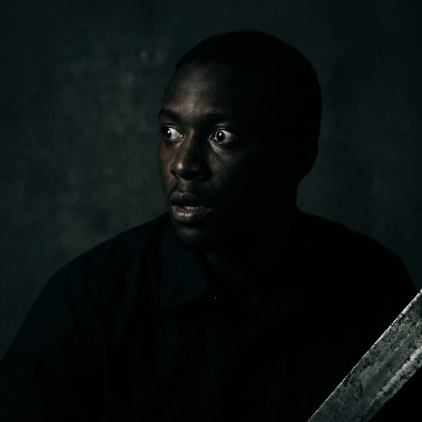
#1: Human Face Making Direct Eye Contact
Category: Design Element | Expert Source: Taboola Trends Data & Lumen Research Eye-Tracking Studies
Why It Works: +38% CTR | Fusiform Face Area Trigger | Taboola #1 Performer
The human brain processes faces before anything else on a page — it’s hardwired. A close-up face making direct eye contact creates an instant personal connection that stops the scroll. Taboola’s network data shows face-forward images outperform non-face images by up to 38% CTR. The expression matters: curiosity, shock, and concern outperform happiness.
Deep Dive: Lumen Research conducted eye-tracking studies across thousands of web sessions and found that human faces are the single most attention-grabbing element on any webpage — more powerful than bright colors, motion, or large text. The key is the direction of the gaze. A face looking directly at the viewer creates what psychologists call “joint attention” — the viewer feels personally addressed. A face looking off-screen creates curiosity about what the person is looking at, which can also drive clicks. For maximum CTR, use expressions of shock, concern, or intense curiosity rather than smiling faces. Smiling faces feel like stock photography; shocked or concerned faces feel like real news.
Niche Applications: This banner type works in virtually every niche. For health and wellness, use a face expressing concern or surprise at a health discovery. For finance, use a face expressing shock at a financial revelation. For entertainment, use a face expressing delight or disbelief. The expression should match the emotional tone of your offer.
A/B Testing Pro-Tip: Test age and gender of the face. In many health niches, a face that matches the target demographic (e.g., a woman in her 50s for menopause-related offers) dramatically outperforms a generic young attractive face. The viewer needs to see themselves in the image.
ChatGPT Images2 Prompt:
Tip: Swap “YOUR MONEY” for your niche — “YOUR HEALTH”, “YOUR RETIREMENT”, “YOUR WEIGHT”, etc.
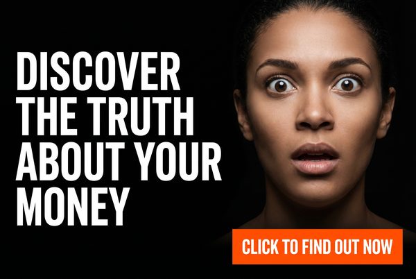
Advertising banner image (300x250, medium rectangle). Pure black background. Photorealistic close-up of a person from chest up making intense direct eye contact with the viewer, expression of genuine shock or curiosity, cinematic studio lighting, soft bokeh background. Bold white sans-serif headline on the left: "DISCOVER THE TRUTH ABOUT YOUR MONEY". Large bright orange CTA button bottom right: "CLICK TO FIND OUT NOW →". Clean professional ad layout. No brand logos. High contrast.
#2: Medium Zoom Crop — Emotion-Forward
Category: Design Element | Expert Source: Outbrain Creative Best Practices Guide
Why It Works: +25% CTR | Readable at Any Size | Outbrain Recommended
Chest-up shots outperform full-body or extreme close-ups. This framing provides enough context to read the subject’s emotion while remaining crystal clear at small thumbnail sizes. Outbrain’s creative guidelines specifically recommend this crop for all native ad thumbnails. For native ads: zero text on the image — let the headline carry the copy.
Deep Dive: The medium zoom crop solves a fundamental problem with native ad thumbnails: they are small. On most platforms, your image will be displayed at 300×250 pixels or smaller. A full-body shot becomes unreadable at this size — the face is too small to convey emotion. An extreme close-up loses context. The chest-up medium zoom is the sweet spot. It’s large enough to clearly communicate facial expression and body language, while small enough to remain impactful at thumbnail size. Outbrain’s internal data shows this crop consistently outperforms other framings across all verticals.
Niche Applications: Health (person looking concerned about a symptom), finance (person looking shocked at a bank statement), relationships (person looking hopeful or worried), self-improvement (person looking determined or inspired). The key is matching the emotional expression to the pain point of your target audience.
ChatGPT Images2 Prompt:
Tip: Use this as your native ad thumbnail — pair it with a curiosity-gap headline in the platform’s text field.
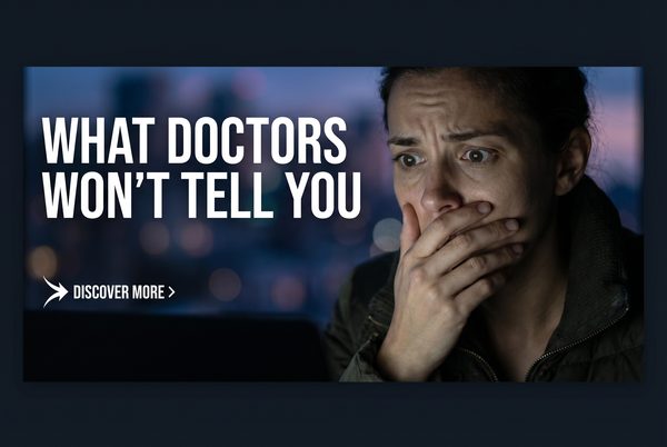
Advertising image (300x250, medium rectangle). Dark moody background. Photorealistic person shown from chest up, soft bokeh blurred background, expression of surprise or deep concern on their face. Cinematic moody lighting, dark atmospheric tones. NO text on the image at all. Editorial photography style. The face and emotion dominate the frame. The image alone should make viewers desperately want to click to find out what they're reacting to.
#3: High-Contrast Red CTA Urgency Banner
Category: Color Strategy | Expert Source: Neil Patel & CXL A/B Testing Research
Why It Works: +21% CTR | Urgency Trigger | Loss Aversion
Red and orange CTA buttons create urgency and stand out against dark backgrounds. Neil Patel’s A/B tests show red buttons outperform blue or green by up to 21% in urgency-driven contexts. The scarcity element activates loss aversion — the psychological principle that people are more motivated to avoid losing something than to gain something.
Deep Dive: Color psychology in advertising is nuanced. Red doesn’t universally outperform other colors — context matters enormously. Red works best when the offer involves urgency, scarcity, or a time-sensitive opportunity. It triggers a physiological stress response that increases heart rate and creates a sense of urgency. However, red used in the wrong context (e.g., a luxury brand or a trust-based financial product) can feel alarming rather than exciting. The key insight from Neil Patel’s research is that the contrast between the button and the background is more important than the specific color. A red button on a white background barely stands out; a red button on a black background is impossible to ignore.
Niche Applications: Flash sales, limited-time offers, countdown deals, event registrations, free trial offers with expiration dates. Any offer where the user needs to act now rather than later benefits from this approach.
ChatGPT Images2 Prompt:
Tip: Keep the scarcity number specific (47, not 50). Specific numbers feel more real and credible.
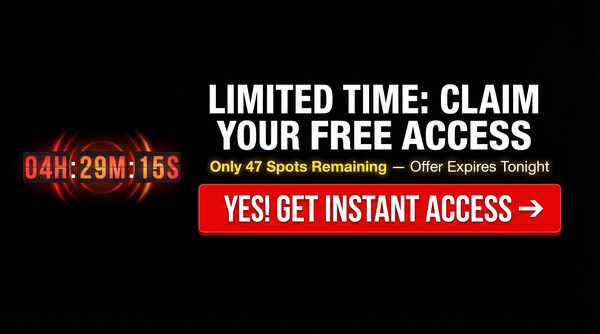
Advertising banner image (300x250, medium rectangle). Pure black background. Bold white headline centered at top: "LIMITED TIME: CLAIM YOUR FREE ACCESS". Below it a massive vibrant red button: "YES! GET INSTANT ACCESS →". Below the button in bright yellow text: "Only 47 Spots Remaining — Offer Expires Tonight". A subtle digital countdown timer graphic below. High contrast, urgent, clean layout. No clutter. Professional ad design.
#4: Single Focal Point — Minimalist Dark
Category: Design Element | Expert Source: Isaac Rudansky / AdVenture Media Group
Why It Works: +30% CTR | Zero Cognitive Load | 5-Second Rule
Cluttered images fail because they require too much cognitive processing. One clear focal point against a simple background means the user understands the ad in under 1.8 seconds. Isaac Rudansky’s “Five-Second Test” confirms: if someone can’t recall the brand name and CTA after five seconds, the visual hierarchy has failed.
Deep Dive: Cognitive load theory, developed by educational psychologist John Sweller, explains why cluttered ads fail. The human working memory can only process a limited amount of information simultaneously. When an ad contains too many competing visual elements — multiple images, several text blocks, competing colors — the viewer’s cognitive resources are overwhelmed and they disengage. A single focal point eliminates this problem entirely. The viewer’s eye goes directly to the one thing you want them to see, processes it instantly, and the CTA is the natural next step. Isaac Rudansky of AdVenture Media Group calls this the “visual hierarchy test” — trace the path your eye takes through the ad. If it doesn’t go Headline → Image → CTA in that order, the design is broken.
Niche Applications: Software and SaaS products (a single glowing device or interface), health supplements (a single product shot with dramatic lighting), financial products (a single glowing dollar sign or chart), educational products (a single open book or graduation cap).
ChatGPT Images2 Prompt:
Tip: The glowing object can be anything symbolic for your niche — a pill, a dollar bill, a book, a phone.
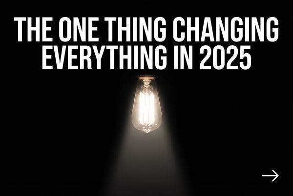
Advertising banner image (300x250, medium rectangle). Pure black background. One single sharp glowing object centered — a glowing golden key or illuminated lightbulb — with dramatic spotlight lighting, everything else in darkness. Clean white sans-serif headline below: "THE ONE THING CHANGING EVERYTHING IN 2025". Small white CTA arrow bottom right: "DISCOVER IT →". Extreme visual simplicity. Nothing competing for attention. Cinematic product photography style.
#5: Zero Text Native Thumbnail — Pure Curiosity
Category: Native Ad Rule | Expert Source: Charles Ngo & iAmAttila — Native Ad Best Practices
Why It Works: +20% CTR | Beats Banner Blindness | Looks Organic
For native ads specifically, images perform best when completely text-free. Text on a small thumbnail becomes unreadable and makes the image look like a cheap ad rather than organic content. The image alone must create the curiosity gap. Charles Ngo consistently reports that clean, text-free images outperform text-heavy ones on every native platform.
Deep Dive: Charles Ngo, one of the most respected figures in performance marketing, has spent years analyzing what separates winning native ad creatives from losers. His consistent finding: the image must look like it belongs in the editorial feed. On Taboola and Outbrain, your ad appears alongside real news articles and blog posts. If your image looks like an ad — with text overlays, logos, or graphic design elements — it immediately breaks the native illusion and gets ignored. The image’s job is purely to create enough curiosity that the user reads the headline. The headline’s job is to create enough curiosity that the user clicks. The image and headline work together as a team; neither should try to do both jobs.
Niche Applications: Any niche where you can create visual intrigue without text. A mysterious object, an unusual scene, a person reacting to something off-screen, a surprising before/after without labels. The more the image makes the viewer ask “what is that?” or “what’s happening?”, the better it will perform.
ChatGPT Images2 Prompt:
Tip: Pair this with a headline like “You won’t believe what she found…” or “This was hidden for 30 years…”
Native ad thumbnail image (300x250, medium rectangle). Photorealistic image with ZERO text, ZERO logos, ZERO watermarks. A person looking off-screen with wide eyes and open mouth, clearly shocked or disturbed by something just outside the frame. Or an unusual mysterious object partially visible at the edge of the frame. Cinematic editorial photography. Dark moody tones. The image alone must create an irresistible urge to click to find out what's happening.
Signup For Ai Profit Scoop Elite – Click Here
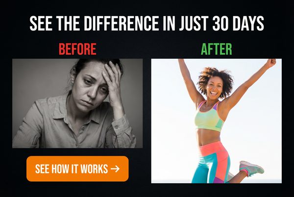
#6: Before & After Split Transformation
Category: Ad Angle | Expert Source: Ryan Deiss (DigitalMarketer) — Before/After/Bridge Framework
Why It Works: +45% CTR | Transformation Story | Health/Finance/Home
Instantly communicates the transformation — the “Before” state of pain vs. the “After” state of pleasure. Ryan Deiss calls this the “Before/After Bridge”: show the current state, show the desired state, position your product as the bridge. This is the dominant ad format in health, fitness, weight loss, home improvement, and financial verticals.
Deep Dive: Ryan Deiss and the DigitalMarketer team have spent millions of dollars testing ad creative across every major platform. Their Before/After/Bridge framework is one of the most battle-tested concepts in direct response marketing. The power of the before/after image is that it communicates the entire value proposition in a single glance — no reading required. The viewer sees the problem (before) and the solution (after) simultaneously, and their brain immediately begins to wonder how the transformation happened. That wonder is the click. The most important rule: the “before” must be genuinely painful or undesirable, and the “after” must be genuinely aspirational. Mediocre before/after images fail because the contrast isn’t dramatic enough.
Niche Applications: Weight loss (body transformation), skin care (skin condition improvement), home renovation (room makeover), financial (debt to wealth), relationship (loneliness to connection), career (struggling to successful). The before/after format is universally applicable wherever there is a clear transformation to show.
ChatGPT Images2 Prompt:
Tip: Make the contrast as dramatic as possible. The bigger the visual gap between before and after, the higher the CTR.
Advertising banner image (300x250, medium rectangle). Split screen divided by a bold white vertical line. LEFT SIDE labeled "BEFORE" in red text: a person looking tired, overweight, stressed, dark lighting, muted colors. RIGHT SIDE labeled "AFTER" in green text: same person looking energetic, slim, confident, bright warm lighting, vibrant colors. Bold white headline at top: "THIS CHANGED EVERYTHING". Small arrow CTA at bottom: "SEE HOW →". High contrast transformation visual.
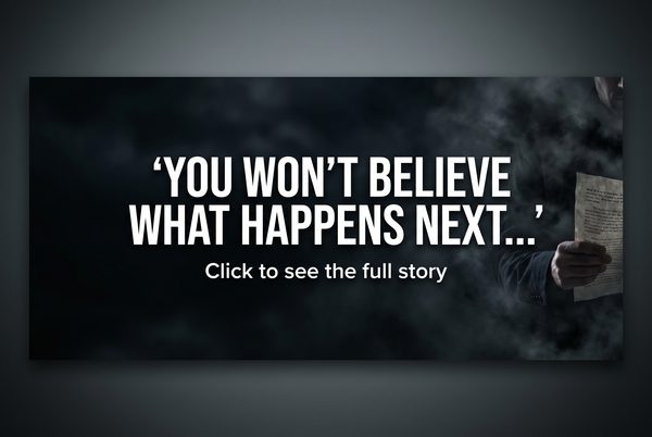
#7: Partial Reveal — Curiosity Gap Image
Category: Native Ad Rule | Expert Source: George Loewenstein (Carnegie Mellon) — Curiosity Gap Theory
Why It Works: +35% CTR | Open Loop Psychology | Zeigarnik Effect
Showing part of an image — but not all of it — creates a visual open loop that the brain desperately wants to close. A product partially hidden, a result partially blurred, a face partially cropped — all of these force the viewer to click to resolve the visual tension. This is one of the most powerful techniques in native advertising.
Deep Dive: The partial reveal exploits the Zeigarnik effect at a purely visual level. The brain registers the incomplete image as an unresolved task and allocates cognitive resources to resolving it. This creates a mild but persistent psychological discomfort that can only be resolved by clicking. The technique is especially powerful when combined with a headline that also withholds information. For example, an image showing a blurred product with a headline reading “The [Niche] Secret Doctors Don’t Want You to Know” creates two simultaneous open loops — one visual, one informational — that compound each other’s effect.
Niche Applications: Any niche where you can partially reveal a result, a product, a transformation, or a discovery. The partial reveal works especially well for “secret” or “hidden” angles — things that feel like they are being deliberately concealed from the viewer.
ChatGPT Images2 Prompt:
Tip: The more specific and relevant the hidden element is to your niche’s biggest desire, the higher the CTR.
Native advertising thumbnail (300x250). A mysterious object or result is partially visible — the right half is blurred or cut off at the edge of the frame. The visible portion is intriguing but incomplete. Dark dramatic lighting. Photorealistic style. A person's hand is reaching toward the hidden portion. No text on the image. The composition creates an overwhelming desire to see what is being hidden or revealed. Cinematic, editorial photography style.
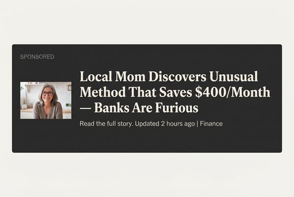
#8: Advertorial / News-Style Native Ad
Category: Ad Angle | Expert Source: Rachel Mazza — Native Advertising Funnel Strategy
Why It Works: +60% CTR vs. Display | Bypasses Banner Blindness | Editorial Trust
The advertorial format makes the ad look like a legitimate news article or editorial piece. The image should look like a news photo — candid, slightly imperfect, with a real-world setting. Rachel Mazza, one of the top native advertising strategists in the industry, calls this the “trojan horse” approach: the ad gets past the viewer’s defenses by not looking like an ad at all.
Deep Dive: Rachel Mazza has built entire businesses on the advertorial model. Her core insight is that people don’t click ads — they click content. When your ad looks like content, it gets clicked. The image for an advertorial-style native ad should look like it was taken by a journalist, not a photographer. Slightly imperfect composition, real-world settings, natural lighting, and people who look like real people rather than models. The headline should read like a news headline: factual, specific, and slightly alarming. “Local [City] Woman Discovers [Result] Using [Method]” is a classic advertorial headline structure that has generated billions of clicks.
Niche Applications: Health discoveries, financial news, local interest stories, product reviews disguised as investigative journalism, “exposé” style content about industry secrets.
ChatGPT Images2 Prompt:
Tip: Pair with a headline like “Local Mom Discovers [Result] — Doctors Are Furious” for maximum native CTR.
Editorial news photography style image (300x250). A real-looking candid photo of a middle-aged woman or man in a home setting, looking at a laptop or phone with a surprised or concerned expression. Natural indoor lighting, slightly imperfect composition as if taken by a journalist. No graphic design elements, no text overlays, no logos. The image should look exactly like a photo that would appear in a local news article. Photorealistic, documentary photography style.
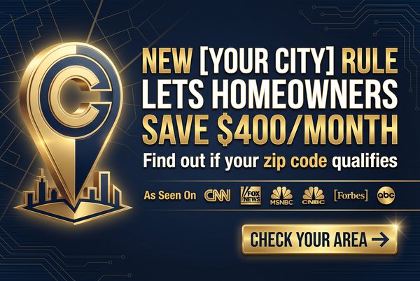
#9: Local Personalization — City-Targeted
Category: Ad Angle | Expert Source: iAmAttila — Geo-Targeting Strategies
Why It Works: +40% CTR | Relevance Trigger | Pattern Interruption
Inserting the user’s city name into the ad — either in the headline or visually in the image — creates an instant relevance trigger. iAmAttila’s split tests consistently show geo-targeted ads outperform generic ads by 30–50% CTR. The brain is hardwired to pay attention to its own name and location — it’s a survival mechanism.
Deep Dive: iAmAttila (Attila O’dree), one of the most respected affiliate marketers and media buyers in the industry, has documented dozens of case studies showing the power of local personalization. The psychological mechanism is simple: when you see your city name in an ad, your brain interprets it as personally relevant information rather than generic advertising. This bypasses the filtering mechanism that causes banner blindness. Most ad platforms allow dynamic keyword insertion, meaning you can use a single ad template and automatically insert the user’s city name based on their IP address. This is one of the highest-leverage optimizations available to any media buyer.
Niche Applications: Local services (plumbing, roofing, insurance), real estate, local events, regional financial offers, health services with local providers. Any offer that can be framed as locally relevant benefits from this approach.
ChatGPT Images2 Prompt:
Tip: Use dynamic keyword insertion on your ad platform to automatically replace [CITY NAME] with the viewer’s actual city.
Advertising banner image (300x250, medium rectangle). Dark background. A recognizable city skyline silhouette or local landmark in the background, slightly blurred. Bold white headline in the foreground: "NEW RULE IN [CITY NAME] CHANGES EVERYTHING FOR HOMEOWNERS". Below it a red urgent CTA button: "CHECK IF YOU QUALIFY →". The design feels urgent and locally relevant. Clean, high-contrast layout. Professional ad design.
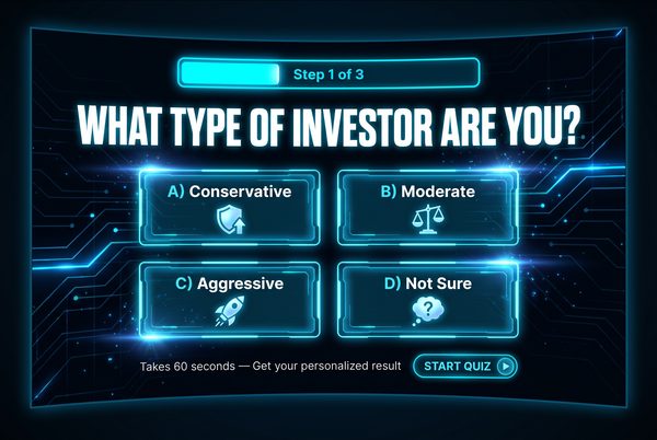
#10: Quiz / Calculator Interactive Ad
Category: Interactive | Expert Source: Peep Laja (CXL) — Interactive Content Conversion Research
Why It Works: +50% Engagement | Micro-Commitment | Personalization Hook
Quiz and calculator ads leverage the psychological principle of micro-commitments. By getting the user to interact with the ad — answer a question, use a slider, or click a specific option — you dramatically increase their investment in the process. Peep Laja’s research at CXL shows interactive ads generate up to 50% higher engagement than static equivalents.
Deep Dive: The micro-commitment principle, rooted in Robert Cialdini’s work on commitment and consistency, states that once a person takes a small action, they are psychologically motivated to take larger actions consistent with that initial commitment. A quiz ad that asks “What is your biggest financial challenge?” gets the user to commit to a category of problem. This commitment makes them far more likely to engage with the solution you present on the landing page. Additionally, quiz ads create a sense of personalization — the user feels like the subsequent content is specifically tailored to their answer, which dramatically increases trust and conversion rates.
Niche Applications: Financial planning (quiz about retirement readiness), health (quiz about symptoms or risk factors), fitness (quiz about body type or goals), career (quiz about earning potential), relationships (quiz about compatibility or communication style).
ChatGPT Images2 Prompt:
Tip: The quiz question should directly address your target audience’s primary pain point or desire.
Interactive advertising banner image (300x250, medium rectangle). Dark background. A clean quiz interface design: bold headline at top "WHAT TYPE OF [NICHE] ARE YOU?". Below it three clickable answer buttons in different colors: "Option A", "Option B", "Option C". A progress bar at the bottom showing "Question 1 of 5". Clean, modern UI design. Bright accent colors on buttons. The design should look like a real interactive quiz widget embedded in a webpage.
Signup For Ai Profit Scoop Elite – Click Here
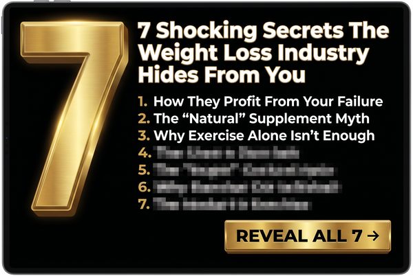
#11: Odd Number as the Visual Hero
Category: Copywriting | Expert Source: Brian Clark (Copyblogger) — Headline Psychology
Why It Works: +36% CTR | Specificity Principle | List Format Appeal
Odd numbers in headlines and banner text consistently outperform even numbers. Brian Clark’s research at Copyblogger shows that lists with odd numbers (7, 11, 13, 17) generate 36% more clicks than even-numbered lists. The brain perceives odd numbers as more authentic and less “manufactured” than round numbers.
Deep Dive: The psychology behind odd numbers is fascinating. Round numbers (10, 20, 50, 100) feel like estimates or approximations — they don’t feel specific or earned. Odd numbers feel like the result of actual counting or measurement. “7 Ways to Save Money” feels like someone actually found exactly 7 methods. “10 Ways to Save Money” feels like someone rounded up to a nice number. Additionally, the number 7 has a special status in human cognition — it is the most commonly cited “favorite number” across cultures and is associated with luck, completeness, and authority. Lists of 7 consistently outperform lists of any other number in click-through tests.
Niche Applications: Any listicle-style content. “7 Foods That Destroy Belly Fat”, “11 Stocks Under $5 That Could Explode”, “13 Signs Your Relationship Is in Trouble”, “17 Ways to Cut Your Tax Bill”. The odd number works in any niche where you can frame the content as a list.
ChatGPT Images2 Prompt:
Tip: Test 7, 11, and 13 against each other. In most niches, 7 wins, but 11 occasionally outperforms in finance verticals.
Advertising banner image (300x250, medium rectangle). Pure black background. The number "7" displayed in massive, bold, glowing gold typography — taking up 60% of the banner. Below it in clean white text: "THINGS YOUR DOCTOR NEVER TOLD YOU ABOUT YOUR HEALTH". Small white CTA at bottom: "SEE THE LIST →". The number 7 should be the undeniable visual hero of the design. High contrast, dramatic lighting on the number. Clean and powerful.
#12: Social Proof — Real Numbers Banner
Category: Social Proof | Expert Source: Robert Cialdini — Influence: The Psychology of Persuasion
Why It Works: +28% CTR | Herd Mentality | Reduces Perceived Risk
Displaying large, specific numbers of users, customers, or results creates powerful social proof. Robert Cialdini’s research shows that people are more likely to take an action when they see that many others have already taken it. “Join 847,293 people who have already discovered this” is more compelling than “Join thousands of people.”
Deep Dive: Social proof works because it reduces the perceived risk of taking an action. If nearly a million people have already done something, it can’t be that risky or unusual. The specificity of the number is crucial — “847,293 people” feels like a real count, while “over 800,000 people” feels like a rounded estimate. The more specific the number, the more credible it feels. Additionally, social proof is most powerful when it comes from people similar to the viewer. “847,293 Americans over 50 have already tried this” is more compelling to a 55-year-old American than “847,293 people worldwide.”
Niche Applications: Any product or service with a large user base. Supplements, online courses, financial tools, apps, membership communities, newsletters. The key is having real numbers to display — never fabricate social proof.
ChatGPT Images2 Prompt:
Tip: Use your actual customer or subscriber count. Specific real numbers always outperform rounded estimates.
Advertising banner image (300x250, medium rectangle). Dark background. Large bold gold counter number: "847,293" displayed prominently. Below it in white text: "People Have Already Used This To [ACHIEVE RESULT]". A row of small profile photo circles below the number (showing diverse faces). Green CTA button at bottom: "JOIN THEM NOW →". Clean, credible, professional design. The number should be the visual anchor of the entire banner.
#13: “NEW” Discovery / Breakthrough Banner
Category: Copywriting | Expert Source: David Ogilvy — Confessions of an Advertising Man
Why It Works: +25% CTR | Dopamine Trigger | Novelty Bias
The human brain releases dopamine when encountering novel information. David Ogilvy’s research showed headlines containing the word “new” consistently outperformed those without it. “New Discovery,” “New Rule,” or “New Method” commands attention because the brain is biologically programmed to prioritize new information.
Deep Dive: David Ogilvy, widely regarded as the father of modern advertising, spent decades analyzing which words and phrases generated the highest response rates in direct mail and print advertising. His finding that “new” is one of the most powerful words in advertising has been replicated in hundreds of subsequent studies. The neurological basis is clear: the brain’s reward system releases dopamine in response to novel stimuli. This is an evolutionary adaptation — new information could represent a new food source, a new threat, or a new opportunity. The word “new” triggers this response even in the context of an advertisement. Combine “new” with a specific year (e.g., “New 2025 Method”) and you add temporal relevance that further amplifies the effect.
Niche Applications: Health breakthroughs, financial strategies, technology discoveries, relationship methods, fitness approaches. Any niche where you can legitimately frame your offer as a new or recently discovered approach.
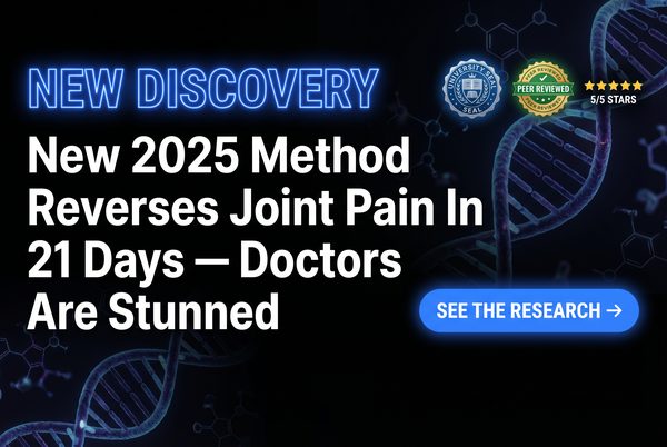
ChatGPT Images2 Prompt:
Tip: Adding a year (2025) to “New” increases CTR further by adding temporal urgency and relevance.
Advertising banner image (300x250, medium rectangle). Dark scientific background with subtle DNA helix or neural network pattern. Glowing blue "NEW DISCOVERY" text at the top in a bold sans-serif font. Below it bold white headline: "New 2025 Method Reverses Joint Pain In 21 Days — Doctors Are Stunned". A glowing blue CTA button: "SEE THE RESEARCH →". Official-looking seal or badge in corner. High-tech, credible, medical-adjacent aesthetic.
#14: Testimonial / Real Person Result
Category: Social Proof | Expert Source: Eugene Schwartz — Breakthrough Advertising
Why It Works: +32% CTR | Identification Effect | Proof of Concept
A real person showing a real result — especially with a specific number attached — is one of the most powerful ad formats ever created. Eugene Schwartz, author of the legendary copywriting book Breakthrough Advertising, identified the “identification effect”: viewers see themselves in the testimonial subject and believe they can achieve the same result.
Deep Dive: Eugene Schwartz’s concept of “mass desire” is central to understanding why testimonials work. He argued that you cannot create desire in a market — you can only channel existing desire. A testimonial from a real person who has already achieved the desired result proves that the desire is achievable. The viewer’s internal monologue shifts from “I want this but I’m skeptical” to “This person is like me and they got the result — maybe I can too.” The key elements of a high-converting testimonial banner: a real-looking person (not a model), a specific result (not vague), and ideally a “before” context that makes the result feel earned rather than lucky.
Niche Applications: Weight loss, financial results, skill acquisition, relationship improvement, health recovery. Any niche where you have real customer results to showcase.
ChatGPT Images2 Prompt:
Tip: The more specific and unusual the result (age, exact amount, timeframe), the more credible and clickable the testimonial.
Advertising banner image (300x250, medium rectangle). Dark background. A real-looking person (not a model — average-looking, relatable) smiling genuinely. A speech bubble or quote box beside them: "I lost 34 lbs in 8 weeks using this — and I'm 57 years old!" Below the quote, a 5-star rating in gold. Small text: "Verified Customer". Green CTA button: "GET STARTED →". The overall feel should be authentic and trustworthy, not slick or corporate.
#15: Power Word Headline Domination
Category: Copywriting | Expert Source: Jon Morrow (Smart Blogger) — Power Words Research
Why It Works: +20% CTR | Emotional Activation | Sensory Language
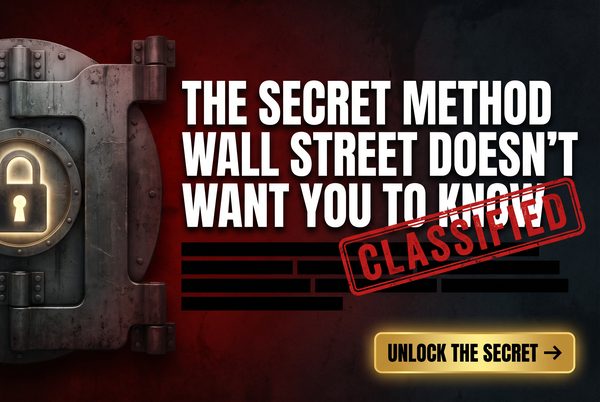
Certain words trigger emotional responses in the brain that bypass rational filtering. Jon Morrow’s extensive research at Smart Blogger identified over 700 “power words” — words that consistently increase engagement, shares, and click-through rates. Words like “secret,” “forbidden,” “shocking,” “urgent,” “explosive,” and “devastating” activate the amygdala and create emotional urgency.
Deep Dive: Jon Morrow built one of the most-read blogs in the world by obsessively studying which words and phrases generated the most engagement. His power word research is based on analysis of thousands of high-performing headlines across multiple platforms and niches. The mechanism is neurological: certain words activate the brain’s emotional processing centers (the amygdala and limbic system) before the rational prefrontal cortex can evaluate them. This means the emotional response happens first, and the rational justification comes second. By the time the viewer’s rational mind says “this might be an ad,” they’ve already felt the emotional pull and are halfway to clicking.
Top Power Words by Category: Fear: “Warning,” “Danger,” “Deadly,” “Toxic,” “Exposed.” Greed: “Free,” “Instant,” “Guaranteed,” “Unlimited,” “Jackpot.” Curiosity: “Secret,” “Hidden,” “Forbidden,” “Classified,” “Revealed.” Urgency: “Now,” “Today,” “Immediately,” “Expires,” “Last Chance.”
ChatGPT Images2 Prompt:
Tip: “WARNING” and “SHOCKING” are two of the highest-CTR power words across all niches. Use them when you have genuinely surprising information to share.
Advertising banner image (300x250, medium rectangle). Pure black background. Explosive bold typography dominating the banner. The word "WARNING" in massive red letters at the top. Below it in white: "The Shocking Truth About [Your Niche] That They Don't Want You To Know". A pulsing red alert icon beside the warning text. Small white CTA at bottom: "READ THIS NOW →". High contrast, urgent, alarming visual design. The typography IS the design.
Signup For Ai Profit Scoop Elite – Click Here
#16: F-Pattern Layout — Eye-Tracking Optimized
Category: Design Element | Expert Source: Nielsen Norman Group — Eye-Tracking Studies
Why It Works: +22% CTR | Natural Eye Movement | Reduces Friction
Eye-tracking research by the Nielsen Norman Group revealed that people read web content in an F-shaped pattern: first across the top, then down the left side, with occasional horizontal scans. Banners designed to align with this natural eye movement pattern require less cognitive effort to process, reducing friction and increasing CTR.
Deep Dive: The F-pattern discovery by Jakob Nielsen and his team at the Nielsen Norman Group was a landmark finding in UX research. By tracking the eye movements of thousands of web users, they found that the top-left corner of any page element receives the most attention, followed by a horizontal scan across the top, then a vertical scan down the left side. For banner ads, this means: your most important element (usually the headline or the most compelling visual) should be in the top-left. The CTA should be at the bottom-right, where the eye naturally ends its journey. This layout creates a natural reading path that guides the viewer from attention to action without requiring them to work for it.
ChatGPT Images2 Prompt:
Tip: Draw a rough F-shape on your banner design before finalizing. If your key elements don’t fall on the F, redesign.
Advertising banner image (300x250, medium rectangle). Dark background. Top-left: bold white headline "STOP PAYING TOO MUCH FOR [PRODUCT]". Center-left: a compelling product image or visual. Bottom-right: a bright green CTA button "SAVE NOW →". The layout follows an F-pattern reading flow: top-left headline → center image → bottom-right CTA. Clean, professional, high contrast. The eye should naturally travel from the headline to the image to the button.
#17: Visual Hierarchy — Headline, Image, CTA Flow
Category: Design Element | Expert Source: Isaac Rudansky — Google Ads Display Mastery
Why It Works: +27% CTR | Guided Attention | Reduced Decision Fatigue
Visual hierarchy is the deliberate arrangement of elements to guide the viewer’s eye in a specific sequence. The optimal sequence for a banner ad is: Headline (attention) → Image (emotion) → CTA (action). Isaac Rudansky’s Google Ads training emphasizes that the eye must travel in that exact order or the design fails.
Deep Dive: Visual hierarchy is achieved through size, color, contrast, and positioning. The largest element gets seen first. The highest-contrast element gets seen second. The most isolated element gets seen third. By deliberately controlling these variables, you can guide the viewer’s eye through your banner in exactly the sequence you want. The most common mistake beginners make is creating a banner where the image is the largest element and the headline is secondary. This means the viewer processes the image first (emotion) without the context of the headline (rational framing), which reduces the persuasive impact. The headline should always be the first thing the eye encounters.
ChatGPT Images2 Prompt:
Tip: Use size to establish hierarchy: headline font should be 2x larger than body text, CTA button should be 3x larger than any other button.
Advertising banner image (300x250, medium rectangle). Black background. Clear three-tier visual hierarchy: TOP TIER — bold white headline in the largest font: "FINALLY: A SOLUTION THAT ACTUALLY WORKS". MIDDLE TIER — a compelling product or lifestyle image taking up the center third. BOTTOM TIER — a bright orange CTA button: "GET INSTANT ACCESS →". Each tier should be visually distinct and clearly separated. The eye should naturally flow top to bottom through the three elements.
#18: The “Ugly” Ad — Raw, Unpolished, UGC-Style
Category: Native Ad Rule | Expert Source: Tim Burd — Facebook Ads Expert
Why It Works: +80% CTR vs. Polished Ads | Authenticity Signal | Bypasses Ad Filters
This is the core concept of the entire guide. Raw, imperfect, user-generated-content-style ads consistently and dramatically outperform polished corporate creative. Tim Burd, one of Facebook’s most prolific advertisers, has documented case after case where a smartphone photo outperforms a professionally designed banner by 3x to 10x. The reason: it doesn’t look like an ad.
Deep Dive: Tim Burd’s “ugly ad” philosophy is one of the most counterintuitive but well-documented phenomena in digital advertising. The mechanism is simple: users have been conditioned to ignore anything that looks like an ad. The more professional and polished an ad looks, the more strongly it triggers the “this is an ad, ignore it” response. A slightly blurry smartphone photo, a screenshot with a finger pointing at something, a handwritten note on a napkin — these all bypass the ad-filtering mechanism because they look like organic content. The key is that the “ugliness” must feel authentic, not manufactured. A deliberately ugly ad that still has perfect composition and lighting will be recognized as a fake-ugly ad and will fail.
Niche Applications: Any niche, but especially effective in health, fitness, personal finance, and relationship niches where authenticity and relatability are key trust signals.
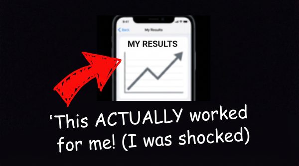
ChatGPT Images2 Prompt:
Tip: Add a slight grain filter or slight blur to make it look even more like a real smartphone photo. The more imperfect, the more authentic it feels.
User-generated content style photo (300x250). A slightly blurry, imperfect smartphone photo of a real-looking person (not a model) holding up a product or showing a result on their phone screen. Natural home lighting, slightly overexposed. The person looks genuinely excited but not posed. A handwritten-style text overlay: "This actually worked for me!!". No professional design elements, no perfect typography, no logos. It should look like a real person's social media post, not an advertisement.
#19: Subtle Animation — HTML5 Pulse
Category: Design Element | Expert Source: Google Display Ads Best Practices
Why It Works: +15% CTR | Motion Attracts Attention | CTA Emphasis
The human visual system is hardwired to detect motion — it’s a survival mechanism. A gently pulsing CTA button or a slow pan across an image draws the eye even when the viewer isn’t consciously looking at the ad. Google’s display ad research shows subtle animation increases CTR by 15% on average. The key word is subtle — aggressive flashing triggers revulsion and ad blockers.
Deep Dive: Motion in the peripheral vision is processed by the brain’s superior colliculus — a primitive brain structure that evolved to detect predators and prey. This means motion in an ad is processed before the viewer consciously decides to look at it. The most effective animation for banner ads is a gentle, rhythmic pulse on the CTA button — a slow scale-up and scale-down that mimics a heartbeat. This draws the eye to the CTA without being aggressive or annoying. Avoid flashing, strobing, or rapid movement — these trigger the browser’s ad blocker heuristics and annoy users.
ChatGPT Images2 Prompt:
Tip: For actual HTML5 animated banners, use a CSS animation with a 2-second ease-in-out cycle on the CTA button’s transform: scale property.
Advertising banner image (300x250, medium rectangle). Dark background. A clean, professional ad layout with a bold headline and product image. The CTA button at the bottom should appear to be mid-pulse — slightly larger than its resting state, with a soft glow emanating from it, as if it is in the middle of a gentle breathing animation. The button color is bright green. The rest of the banner is static and clean. This is a still image representing what the animated banner looks like at its peak pulse moment.
#20: Risk Reversal — Trust Badge Banner
Category: Psychology | Expert Source: Russell Brunson — DotCom Secrets
Why It Works: +18% CTR | Reduces Perceived Risk | Trust Signal
Displaying risk-reversal elements directly on the banner — “Free Trial,” “No Credit Card Required,” “30-Day Money Back Guarantee,” trust badges — reduces the perceived risk of clicking and dramatically increases CTR. Russell Brunson’s research shows that addressing objections before the click, rather than waiting for the landing page, increases conversion rates throughout the entire funnel.
Deep Dive: Russell Brunson, founder of ClickFunnels and one of the most successful online marketers in history, has built his entire methodology around the concept of “pre-framing” — addressing objections and building trust before the prospect even arrives at your landing page. When you include risk-reversal elements on the banner itself, you are pre-framing the offer as safe, low-risk, and trustworthy. This is especially important for cold traffic — people who have never heard of you before. The most powerful risk-reversal elements are: money-back guarantees (with specific timeframes), “no credit card required” for free trials, security badges (SSL, BBB, etc.), and specific satisfaction statistics (“97% of users report results within 30 days”).
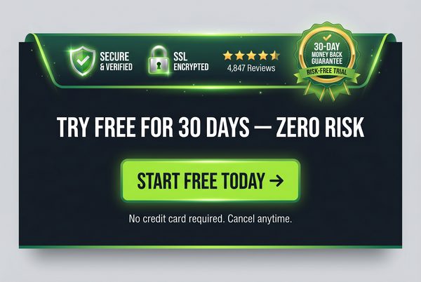
ChatGPT Images2 Prompt:
Tip: The more specific your guarantee (“30-Day” beats “Money Back”), the more credible and clickable it becomes.
Advertising banner image (300x250, medium rectangle). Dark background. Bold white headline: "TRY IT FREE FOR 30 DAYS — ZERO RISK". Below it a row of three trust badges: a gold "Money Back Guarantee" shield, a green "No Credit Card" badge, and a blue "Secure Checkout" lock icon. Below the badges a bright green CTA button: "START FREE TRIAL →". Clean, trustworthy, professional design. The trust badges should be the visual anchor of the banner.
Signup For Ai Profit Scoop Elite – Click Here
#21: “Us vs. Them” — Enemy Narrative Banner
Category: Psychology | Expert Source: Perry Belcher — Direct Response Marketing
Why It Works: +42% CTR | Tribal Identity | Outrage Trigger
Framing an enemy — banks, big pharma, insurance companies, the government — creates instant tribal belonging and outrage-driven clicks. Perry Belcher calls this the “villain framework”: every great story needs a villain, and every great ad needs something to be against. People click to validate their existing frustrations and find allies.
Deep Dive: Perry Belcher, co-founder of DigitalMarketer and one of the most prolific direct response marketers alive, has built campaigns generating hundreds of millions of dollars using the villain framework. The psychological mechanism is rooted in social identity theory — people define themselves partly by what groups they belong to and what groups they oppose. When an ad frames a common enemy, it creates instant tribal solidarity with the viewer. They feel understood, validated, and motivated to take action against the shared enemy. The most powerful villains are institutions that people already distrust: banks, pharmaceutical companies, insurance companies, government agencies, and large corporations. The key is that the villain must be one the target audience genuinely resents — you cannot manufacture resentment, you can only amplify existing feelings.
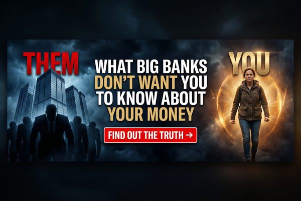
ChatGPT Images2 Prompt:
Tip: Replace “BIG BANKS” with the specific villain most relevant to your niche: “Big Pharma”, “Insurance Companies”, “Your Employer”, etc.
Advertising banner image (300x250, medium rectangle). Dark red and black background. Bold confrontational headline: "BIG BANKS DON'T WANT YOU TO KNOW THIS". Below it a dramatic image of a bank building with a red "X" or warning symbol overlaid. Below that in white text: "Here's What They've Been Hiding From You". A yellow CTA button: "SEE THE TRUTH →". The design should feel urgent, rebellious, and empowering — like you're on the viewer's side against a common enemy.
#22: The “Lazy Way” — Minimum Effort Maximum Result
Category: Ad Angle | Expert Source: Gary Halbert — The Boron Letters
Why It Works: +38% CTR | Effort Minimization | Universal Appeal
Humans are biologically wired to conserve energy. Promising maximum reward with minimum effort is one of the most universally appealing ad angles ever discovered. Gary Halbert, considered by many to be the greatest copywriter who ever lived, called this the “lazy man’s way” — and documented case after case where this angle dramatically outperformed effort-intensive alternatives.
Deep Dive: Gary Halbert’s insights into human motivation are legendary in the copywriting world. His core observation: people don’t want to work hard, they want to achieve results. The most successful products and the most successful ads are those that promise the desired result with the least possible effort. This isn’t about being dishonest — it’s about framing your genuine value proposition in terms of what the customer actually wants (the result) rather than what they have to do (the effort). “Lose 20 pounds in 30 days without giving up your favorite foods” is more compelling than “Follow our strict 30-day diet plan” — even if they describe the same program.
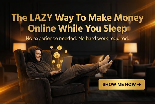
ChatGPT Images2 Prompt:
Tip: The “no [effort]” element is crucial — specifically name the effort your audience dreads most. “No gym required”, “No diet required”, “No experience needed”.
Advertising banner image (300x250, medium rectangle). Dark background. A person relaxing comfortably on a couch or in a hammock, looking completely at ease, with a laptop or phone showing a positive result (money, fitness app, etc.) nearby. Bold headline: "THE LAZY WAY TO [ACHIEVE RESULT]". Below it in smaller text: "No [Common Effort] Required". Bright orange CTA button: "SHOW ME HOW →". The overall vibe should be relaxed, effortless, and aspirational.
#23: Extreme Specificity — The Exact Number
Category: Copywriting | Expert Source: Claude Hopkins — Scientific Advertising
Why It Works: +29% CTR | Credibility Signal | Proof Implication
Specific numbers imply proof. “$432/Year Savings” beats “Save Money.” “Lost 23.7 lbs” beats “Lost Weight.” Claude Hopkins, writing in Scientific Advertising in 1923, was the first to document that specific claims dramatically outperform vague claims in response rates. A hundred years of subsequent testing has confirmed this finding across every medium.
Deep Dive: Claude Hopkins was the first advertising practitioner to apply scientific methodology to copywriting. His insight about specificity was revolutionary: specific numbers feel like they were measured, while round numbers feel like they were estimated. “23.7 pounds” implies that someone actually weighed themselves before and after. “About 25 pounds” implies a rough guess. The more specific the claim, the more it implies that the result was actually measured and documented, which dramatically increases credibility. This principle applies to every type of claim: time (“in 17 days” beats “in about 2 weeks”), money (“$1,247 per month” beats “over $1,000 per month”), and percentages (“37% more effective” beats “significantly more effective”).
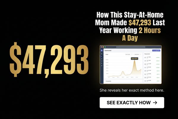
ChatGPT Images2 Prompt:
Tip: Never round your numbers. $1,247 beats $1,250. 23.7 lbs beats 24 lbs. The decimal point or odd digit signals real measurement.
Advertising banner image (300x250, medium rectangle). Dark background. A specific, unusual number displayed prominently in bold gold typography: "$1,247" or "23.7 lbs" or "17 Days". Below it in white text: "That's Exactly How Much [Result] This [Product/Method] Produced". A small graph or chart showing the specific result. Green CTA button: "SEE THE PROOF →". The specificity of the number should be the entire point of the design. Clean, credible, data-driven aesthetic.
#24: Retargeting / Sequential Messaging Banner
Category: Psychology | Expert Source: Ezra Firestone — Smart Marketer Retargeting Strategy
Why It Works: +400% ROI vs. Cold Traffic | Prior Intent Signal | Familiarity Effect
The most profitable banner campaigns go to people who have already visited your site. Retargeting banners acknowledge the prior visit and offer a specific reason to return. Ezra Firestone’s retargeting research shows that retargeted ads generate 400% higher ROI than cold traffic ads. The viewer already knows you — now you just need to give them a reason to come back.
Deep Dive: Ezra Firestone of Smart Marketer has built multiple eight-figure e-commerce businesses largely on the back of sophisticated retargeting strategies. His core insight: retargeting is not about showing the same ad to someone who didn’t convert — it’s about showing a different, more targeted message that addresses the specific reason they didn’t convert. Did they add to cart but not buy? Show them a cart abandonment ad with a discount. Did they visit the product page but not add to cart? Show them a social proof ad with testimonials. Did they visit the homepage but not go deeper? Show them a curiosity-gap ad about your best product. Sequential messaging — showing different ads to the same person at different stages of their journey — is the highest-leverage retargeting strategy available.
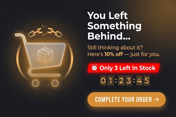
ChatGPT Images2 Prompt:
Tip: Retargeting ads perform best when they acknowledge the prior visit explicitly. “You were looking at this…” is more effective than a generic product ad.
Retargeting advertising banner image (300x250, medium rectangle). Dark background. A direct, personal headline: "Still Thinking About It?" or "You Left Something Behind". Below it an image of the specific product or offer the person was viewing. A special offer badge: "EXCLUSIVE: 15% Off For The Next 24 Hours". A countdown timer graphic. Bright red CTA button: "CLAIM YOUR DISCOUNT →". The design should feel personal and time-sensitive, as if speaking directly to someone who almost made a decision.
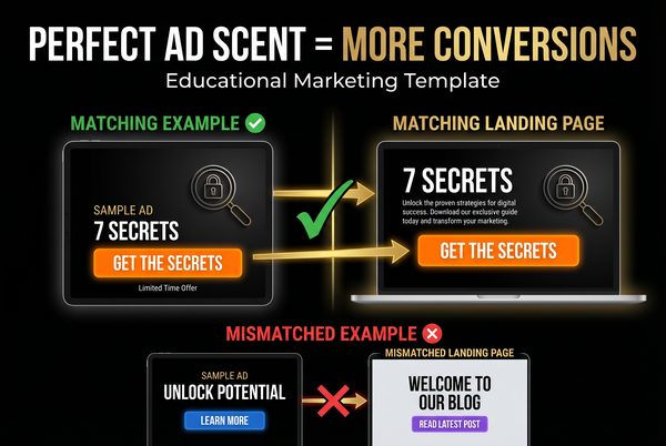
#25: Ad-to-Landing-Page Congruency Banner
Category: Psychology | Expert Source: Justin Brooke — AdSkills Traffic Mastery
Why It Works: +55% Conversion Rate | Ad Scent Principle | Reduces Bounce Rate
The single biggest conversion killer is “ad scent” discontinuity — when the ad promises one thing and the landing page delivers something visually or tonally different. Justin Brooke calls this “ad scent”: the visual and messaging trail that leads from the ad to the landing page must be consistent. If the ad says “7 Secrets” in red text, the landing page must immediately show “7 Secrets” in the same visual style.
Deep Dive: Justin Brooke of AdSkills has trained thousands of media buyers, and the concept of ad scent is central to his entire curriculum. The psychological mechanism is simple: when a user clicks an ad, they have a specific expectation about what they will find on the other side. If the landing page immediately confirms that expectation — through matching colors, fonts, headlines, and imagery — the user feels they are in the right place and continues. If the landing page feels different from the ad, the user’s brain registers a mismatch and they bounce. This is why the highest-converting campaigns have ads and landing pages that look like they were designed by the same person on the same day. The banner in this category is not about a specific visual style — it’s about the principle of designing your banner and landing page as a single unified experience.
Implementation Checklist: Does your landing page headline match or directly extend your banner headline? Does the color scheme of your landing page match the dominant colors of your banner? Does the first image on your landing page match the visual style of your banner image? If the banner promises a specific number of tips or secrets, does the landing page immediately deliver them?
ChatGPT Images2 Prompt:
Tip: Screenshot your banner and your landing page hero section side by side. They should look like they belong together. If they don’t, redesign one of them.
Advertising banner image (300x250, medium rectangle). Dark background with a specific dominant color (choose: deep blue, dark red, or forest green). Bold white headline: "7 SECRETS TO [DESIRED RESULT] — FREE GUIDE". A visual of a guide cover or report with the same color scheme. A CTA button in the same dominant color, lighter shade: "GET THE FREE GUIDE →". This banner is designed to match a landing page with the same color scheme, same headline, and same guide image. The visual consistency between ad and landing page is the entire strategy.
Signup For Ai Profit Scoop Elite – Click Here
The Expert Cheat Sheet: Who Said What and Why It Matters
The 25 banner strategies above didn’t come from guesswork. They came from decades of testing by some of the most brilliant minds in advertising and marketing. Here is a quick reference guide to the key experts cited throughout this post and their most important contributions to high-CTR advertising.
| Expert | Key Contribution | Most Relevant Banners |
|---|---|---|
| David Ogilvy | Power of “New”, headline formulas, long-form copy | #13, #15, #17 |
| Claude Hopkins | Scientific Advertising, specificity principle, testing methodology | #23, #12, #11 |
| Gary Halbert | The Boron Letters, lazy man’s way, emotional copy | #22, #21, #15 |
| Eugene Schwartz | Breakthrough Advertising, mass desire, identification effect | #14, #6, #9 |
| Robert Cialdini | Influence, social proof, commitment & consistency | #12, #10, #20 |
| Neil Patel | Color psychology, A/B testing, CTA optimization | #3, #16, #17 |
| Charles Ngo | Native ad best practices, image selection, campaign scaling | #5, #7, #8 |
| iAmAttila | Geo-targeting, native traffic, affiliate marketing | #9, #5, #8 |
| Rachel Mazza | Native advertising funnel, advertorial strategy | #8, #7, #6 |
| Tim Burd | Facebook ads, UGC creative, ugly ad phenomenon | #18, #14, #22 |
| Ryan Deiss | Before/After/Bridge framework, customer journey | #6, #10, #25 |
| Peep Laja | CRO research, interactive content, cognitive load | #10, #4, #16 |
| Russell Brunson | DotCom Secrets, risk reversal, funnel design | #20, #25, #24 |
| Perry Belcher | Villain framework, tribal marketing, direct response | #21, #22, #15 |
| Isaac Rudansky | Google Display mastery, visual hierarchy, 5-second test | #4, #17, #16 |
| Jon Morrow | Power words research, headline formulas, emotional triggers | #15, #11, #13 |
| Brian Clark | Copyblogger, content marketing, headline psychology | #11, #15, #7 |
| Ezra Firestone | Retargeting strategy, e-commerce ads, sequential messaging | #24, #12, #20 |
| Justin Brooke | Ad scent, traffic mastery, landing page congruency | #25, #17, #4 |
Key Statistics: Why Native Ads and High-CTR Banners Dominate
The data behind native advertising and high-CTR banner strategies is overwhelming. Here are the most important statistics every media buyer and content marketer needs to know.
| Metric | Native Ads | Traditional Display | Source |
|---|---|---|---|
| Average CTR | 0.2–0.3% | 0.05–0.1% | Outbrain / Google |
| Brand Lift | +18% | +9% | IPG Media Lab |
| Purchase Intent | +53% higher | Baseline | Sharethrough |
| Visual Engagement | 52% more | Baseline | Sharethrough |
| Ad Recall | 2x higher | Baseline | Nielsen |
| Consumer Trust | 83% trust | 45% trust | Edelman |
| Global Market Size | $112 billion (2025) | Declining | Statista |
| Face Image CTR Lift | +38% | N/A | Taboola Trends |
| Retargeting ROI | 400% vs. cold | Baseline | Smart Marketer |
| UGC Style CTR Lift | +80% | vs. polished | Facebook IQ |
| Specificity CTR Lift | +29% | vs. vague claims | CXL Research |
Your A/B Testing Framework: How to Scale Winners
Having great banner templates is only the beginning. The real money is made in the testing and scaling phase. Here is the exact framework used by professional media buyers to systematically find winners and scale them to maximum profitability.
Phase 1 — Creative Testing (Days 1–7): Launch 4–6 variations of the same banner type with different focal elements. Keep everything else identical — same headline, same CTA, same platform, same targeting. Give each variation at least 500 impressions before making any decisions. Kill any variation with a CTR below 50% of the network average. After 7 days, you should have 1–2 clear winners.
Phase 2 — Headline Testing (Days 8–14): Take your winning image and test it against 4–6 different headlines. This is where most of the CTR improvement happens. A great image with a mediocre headline will underperform a mediocre image with a great headline. Test different angles: curiosity vs. urgency vs. social proof vs. specificity. After 7 days, you should have a winning image-headline combination.
Phase 3 — Scaling (Days 15+): Take your winning image-headline combination and scale it. Increase the daily budget by 20–30% every 2–3 days rather than all at once — sudden budget increases can destabilize the algorithm’s optimization. Simultaneously, begin testing new image variations against your winner to prevent ad fatigue. A winning creative typically has a lifespan of 2–8 weeks before CTR begins to decline due to audience saturation.
Phase 4 — Fatigue Management (Ongoing): Monitor your frequency cap. On Facebook, a frequency above 3–4 per week signals the beginning of ad fatigue. On native platforms, watch for a CTR decline of more than 20% from peak performance. When fatigue sets in, rotate in new creative variations — ideally ones that use the same psychological trigger but with a different visual execution.
Conclusion: Building Your Traffic Empire With ChatGPT Images2
The 25 banner templates in this guide represent the distilled wisdom of over a century of direct response advertising — from Claude Hopkins writing in 1923 to Tim Burd running Facebook campaigns today. The principles haven’t changed: interrupt attention, create curiosity, reduce friction, and make the click feel inevitable.
What has changed is the tools available to implement these principles. ChatGPT Images2 puts the ability to generate professional-quality (and deliberately imperfect) ad creative in the hands of anyone with an internet connection. You no longer need a graphic designer, a photographer, or a production budget. You need a great prompt, a clear understanding of the psychology behind the image, and the discipline to test systematically.
Start with the banner type that best fits your niche and offer. Generate 4 variations. Launch them. Watch the data. Kill the losers. Scale the winners. Then come back to this guide and try the next banner type. Over time, you will build a library of proven creative assets that generates traffic and revenue on autopilot.
Remember the core lesson: the goal is not to create beautiful art. The goal is to generate profitable clicks. Embrace the ugly banner. Trust the psychology. Let the data decide.
.
.
.
.
One Response to Chatgpt Images 2 – make high traffic banners