One Page Websites = Big Profit
JOIN THE OFFER PROFIT CHALLENGE HERE
DOWNLOAD YOUR PROFIT DASHBOARD HERE
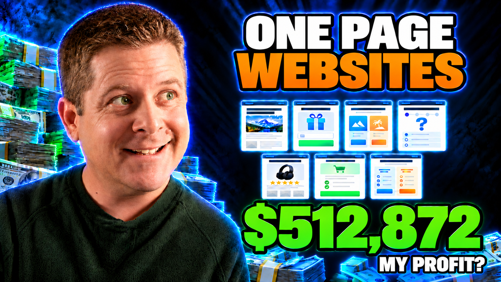
One-Page Websites That Make $512,872: The 7 Offer Page Types and Traffic Trigger Framework
When it comes to building an online business and generating life-changing income, most beginners and struggling marketers make things entirely too complicated. They get trapped inside convoluted web designs, spend months tinkering with complex AI automation chains, construct endless blog architectures that nobody reads, and build multi-tier sales funnels featuring dozens of connected apps that inevitably break.
The cold truth about direct response marketing is that complexity kills conversions. In fact, if you look at the real data behind how real businesses actually produce profit online, you will find that less than 10% of total effort produces over 90% of the revenue. This classic 90/10 dynamic means that the vast majority of digital noise—the endless back-office setups, bloated WordPress themes, complex plugins, and sprawling content plans—generates zero dollars. What actually generates revenue is very simple: matching the right single-page offer to the exact intent of the traffic you are receiving.
Today, we are stripping away the tech bloat. We are going to look at how simple one-page websites can generate massive returns—in some cases pulling in as much as $512,872 profit each. By examining the 7 Offer Page Types by Traffic Trigger Framework, you will discover how to align your pages with the visitor’s state of mind, identify high-intent trigger words using search data, and bridge the gap between casual visitors and paying customers.
Income Disclaimer: Results are not typical, implied, or guaranteed. The vast majority of people who attempt to make money online make nothing. Running a profitable online business requires consistent testing, market research, understanding audience intent, and deliberate execution. Setting up a one-page site is not a magic ticket to immediate retirement; it is a direct-response marketing vehicle that works only when properly matched to market demand.
—
The Core Problem: Backwards Marketing and Funnel Overkill
Most marketers approach selling products backwards. They find an affiliate offer or create a digital product and ask themselves: “How can I convince people to buy this?” They then construct massive websites, spin up blogs with hundreds of articles, and try to force-feed their offer to anyone who stumbles upon their link. The result? Months of unpaid labor, zero conversions, and utter exhaustion.
The direct-response approach flips this logic completely. Instead of starting with what you want to sell, you start with what the user is already searching for, feeling, and saying. You ask: “Who is already looking for a solution, what exact language are they using, and what is the single next step they need to take right now?”
Consider the classic direct mail industry. Decades ago, direct response giants relied on the SRDS (Standard Rate and Data Service), which allowed advertisers to purchase highly targeted mailing lists of verified buyers. If someone recently purchased a home, financial service providers and home improvement companies mailed them a targeted, single-page sales letter offering mortgage refinancing or roof repair. There was no bloat. It was a single, compelling message delivered to someone who already had a proven need.
Today, search engines like Google process over 8.5 million searches every single minute. The search engine results page (SERP) leaves an open, transparent digital breadcrumb trail. Searchers literally type their exact problems, budgets, hesitations, and buying triggers directly into the search bar. When you know how to read these signals, you can replace a 100-page bloated website with a single, laser-focused one-page site that does one job: converting that specific searcher into a lead or buyer.
—
The Universal Customer Journey: The Simple 5-Step Model
Every marketing funnel ever built is simply a variation of one linear journey:
Traffic → Capture → Warm Up → Sell → Follow Up
The fatal mistake that keeps most marketers broke is assuming that every visitor needs every step of this journey every single time. That is simply false.
- If a prospect types “best web hosting pricing” into Google, they already know what web hosting is. They don’t need a 20-page ebook explaining how the internet works. They don’t need a 5-day educational email sequence. They are standing at the register with their wallet out, looking for a comparison or discount so they can make an immediate purchase. If you put a lengthy lead magnet between them and the sale, you lose the customer.
- Conversely, if someone searches “why is my roof leaking after heavy rain”, sending them directly to an aggressive, hard-closing checkout page for an expensive roof replacement contract will alienate them immediately. They are cold. They don’t even know if their problem requires a simple patch or a full repair. They need education, diagnostic help, and trust before they commit.
To succeed with one-page websites, you must select your page structure based entirely on the traffic type and the trigger words your prospects use.
—
Traffic Types: Identifying What Your Visitors Are Thinking
Before you build a page, register a domain, or choose an affiliate link, you must diagnose the psychological temperature of your traffic. You can identify this by listening carefully to your prospects’ language in search queries, forum discussions, social media comments, live chat logs, and ad responses.
| Traffic Type | What They Are Thinking or Saying | Ideal Starting Page Type |
|---|---|---|
| Cold | “What is this?” “Can this help me?” “I have a problem, but I don’t know the solution.” | Lead-Capture or Pre-Sell (Warm Up) |
| Curious | “Tell me more.” “Why is this different?” “What makes this work?” | Pre-Sell & Education (Advertorial / Bridge) |
| Warm / Interested | “What do I get?” “How much is it?” “Is this right for me?” | Core Sales Page (Direct Pitch) |
| High Intent | “Can you help me?” “How do I start?” “Can I talk to someone?” | Qualification & Booking Page |
| Existing Customer | “What is the next level?” “What else do I need to succeed?” | Checkout Expansion or Follow-Up |
—
The Trigger-Word Rule: Unlocking Commercial Intent
Every keyword searched on Google or mentioned on social media carries a built-in intent signal. These are known as Trigger Words.
Trigger words tell you precisely where a prospect is located on their buyer journey, completely independent of the niche:
- Early-Stage Trigger Words: Words such as free, how to, template, checklist, guide, beginner, examples, and ideas signal that the prospect is gathering information. They are not ready to pull out a credit card, but they are prime candidates to be captured as an opt-in lead or educated via a pre-sell bridge page.
- Mid-Stage Trigger Words: Words like why, mistakes, not working, vs, compare, alternative, and reviews tell you that the prospect understands their problem, has looked at existing options, and wants clarity on what works best.
- Late-Stage Buying Words: Words such as buy, price, cost, pricing, discount, coupon, promo code, and get started signal that the prospect is solution-aware and ready to transact. These visitors should go directly to a clean, direct-pitch sales or comparison environment.
- High-Touch Intent Words: Words like apply, book, call, consultation, demo, audit, agency, custom, and enterprise indicate that the user has a serious budget and requires personalized validation before transacting.
When you master trigger words, you can find massive pockets of low-competition, high-value search traffic in hyper-profitable niches.
Ready to master offer construction and implement these single-page frameworks in real-time? Join Todays Make An Offer Training – In Ai Profit Scoop Elite.
—
Case Studies in Keyword Research: Extracting Untapped Niches
To demonstrate how simple this process is in real-world conditions, let’s explore three keyword experiments using direct response research techniques:
1. The “Affordable” Trigger in Health & Fitness
If you plug the trigger word “affordable” into a keyword tool and filter for strict matches, you immediately uncover consumer segments actively looking to spend money, but seeking value. For instance, the phrase “gym membership affordable” receives over 301,000 searches per month. When you aggregate related long-tail variations—such as “which gym is affordable,” “affordable gym memberships near me,” and “cheap fitness memberships”—the addressable market easily reaches nearly half a million monthly searches.
Because the competition for these specific phrases is dramatically lower than the hyper-competitive parent keyword “gym”, a simple one-page comparison or choice page listing affordable local gym offers or home gym equipment kits can capture massive traffic with minimal SEO overhead.
2. The “Alternative” Trigger in Financial Planning
Financial services represent some of the highest-paying affiliate and advertising markets online. Keyword terms like “financial planner” or “financial advisor near me” command cost-per-click (CPC) rates exceeding $10.98 per click on Google Ads, with parent terms requiring tens of dollars per click. However, if you examine search behavior through the trigger lens using the word “alternative”, you find gems like “alternative retirement plan” pulling in over 165,000 monthly searches with virtually zero advertiser competition.
Affiliate networks offer payouts ranging from $75 to $140 per verified lead for retirement solutions (like IRA financial services and Empower). If you direct visitors searching for retirement alternatives to a simple one-page quiz or choice page asking: “Which retirement account do you currently hold: 401(k), IRA, or Roth IRA?”, you can bridge their confusion and refer them to high-ticket affiliate programs that pay out substantial fees.
3. Modern Trends: The “Vibe Coding” Opportunity
Market opportunities appear constantly whenever technology shifts. Recently, the phrase “vibe coding” emerged across tech forums, capturing over 110,000 monthly searches almost overnight. People using AI tools to build apps without standard programming skills are flooding search engines with terms like “vibe coding platforms” and “what is vibe coding.”
Software-as-a-Service (SaaS) affiliate programs in the coding space (such as Lovable, Cursor, and Claude AI subscriptions) pay handsome recurring commissions, with some developer-focused tools paying up to $112 per referral. A single-page site with a choice-router asking: “What do you want to build today? (1) iPhone App, (2) Android App, (3) SaaS Platform, or (4) Chrome Extension” can immediately funnel searchers into the exact AI tool suited for their project via an affiliate link.
—
The 7 Offer Page Types: Full Breakdown and Strategy
Now that you understand the underlying traffic triggers, let’s explore the 7 specific one-page website architectures that you can deploy to monetize this traffic immediately.
—
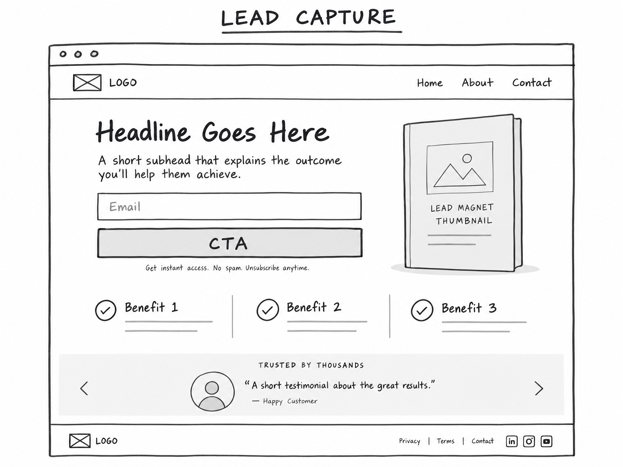
01. Lead-Capture Pages
Main Job: Turn cold or early-interest traffic into an identifiable, contactable lead.
Visitor Mindset: “I want help, ideas, a shortcut, or something useful before I make a serious commitment.”
Traffic Triggers: free, how to, template, checklist, examples, ideas, guide, quiz, beginner
Core Message: “Get a quick win before you make a bigger decision.”
The Lead-Capture page is built for speed and zero cognitive friction. Its singular goal is an exchange of value: the visitor provides their email address or phone number in exchange for an immediate, tangible asset.
Core Variations:
- Opt-In / Lead Magnet: A one-page PDF, cheat sheet, Excel spreadsheet, or swipe file that solves one narrow problem. (Example: “The 5-Point Leaky Roof Emergency Checklist” or “Alternative Retirement Plan Tax Matrix”).
- Webinar / Workshop Registration: A direct registration page for a live or automated training session.
- Interactive Quiz / Assessment: A multi-question diagnostic tool that promises personalized results upon entering contact information.
- Waitlist / Early Access: A minimalist pre-launch page designed to gauge demand and capture hungry prospects prior to an offer going live.
Wireframe Blueprint:
- Clear, Benefit-Driven Headline: Explicitly state the exact payoff of the lead magnet (e.g., “Download the Free 2024 Alternative Retirement Guide”).
- Subheadline: Agitate the pain point and introduce the quick-win mechanism.
- Visual Mockup: A clean graphic representation of the download, checklist, or template.
- Form & Call-to-Action (CTA): A clean, single-field or two-field form (Name + Email) with a high-contrast submission button (e.g., “Send Me The Guide Now”).
- Micro-Proof / Disclaimer: Privacy assurance and mandatory affiliate/earnings disclaimers.
—
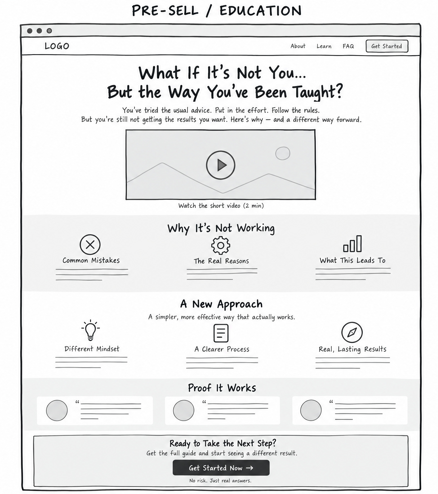
02. Pre-Sell & Education Pages (Bridge / Advertorials)
Main Job: Build understanding, relevance, curiosity, and trust before presenting the commercial offer.
Visitor Mindset: “Why is this happening to me? Why have other solutions failed? What makes this approach different?”
Traffic Triggers: why, mistakes, not working, does it work, different, results, reviews, case study
Core Message: “Here is why the old way falls short—and why this new approach may work better.”
Most affiliate marketers send cold traffic directly to an affiliate sales page and wonder why their conversion rate is zero. Affiliate product pages are designed for warm prospects who already understand the core concept. If your visitor has lingering doubts or misunderstandings, you must bridge that gap yourself using a Pre-Sell page.
As the classic direct-response saying goes: “You can’t just sell; you have to finesse them a little bit.” The Pre-Sell page reframes the problem so that the offer becomes the obvious, inevitable solution.
Core Variations:
- Bridge Page: A short page (often with a 2-to-3-minute video) explaining: “You are searching for X. Here is why X alone won’t work, and why you should look at product Y.”
- Advertorial: An editorial-style story or article that reads like an objective breakdown, deconstructing common mistakes before introducing the tool or method.
- Pre-Sale Video Sales Letter (VSL): A video-centric page focusing on the hidden mechanism behind a persistent problem.
Wireframe Blueprint:
- Editorial Headline: Curiosity-driven and educational (e.g., “Why Traditional 401(k) Plans Are Underperforming in 2024—And The Alternative Savvy Investors Are Using”).
- The Agitation / Old Way Breakdown: Discuss why conventional methods, common advice, or standard tools frequently disappoint.
- The Discovery / New Mechanism: Introduce the breakthrough concept or framework without hard-selling the product brand yet.
- The Recommendation & Bridge: Explain that tool/service XYZ is the premier execution vehicle for this new approach.
- The Transition CTA: A prominent button leading directly to the affiliate or core checkout page.
—
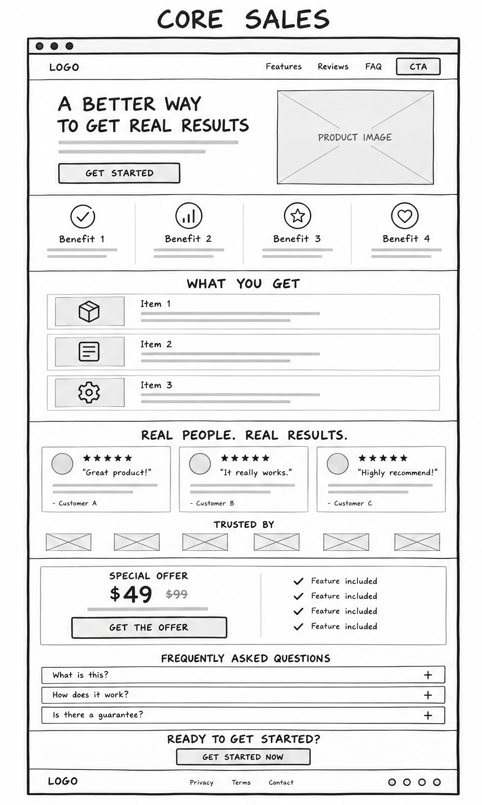
03. Core Sales Pages
Main Job: Turn warm, solution-aware, or purchase-ready traffic into a paying customer.
Visitor Mindset: “What do I get? Is this right for me? What does it cost? Can I trust this vendor?”
Traffic Triggers: buy, price, cost, pricing, best, get started, features, comparison, discount
Core Message: “Here is the result, the proof it can work, and exactly how to start.”
When visitors search for commercial buying words, you must cut straight to the point. Putting educational fluff in front of a buyer ready to purchase only creates friction. Core sales pages lay out the offer terms clearly, eliminate risk, handle objections, and provide a clear checkout pathway.
Core Variations:
- Short-Form Sales Page: Highly effective for low-ticket impulse buys, software tools, or warm traffic already familiar with the creator. Sometimes under 100 words can outperform a massive page if the offer clarity is pristine.
- Long-Form Sales Page: Necessary for higher-priced digital courses, complex consulting, or markets requiring deep proof elements, detailed breakdowns, and extensive FAQ handling.
- Product Detail Page (PDP): Clean ecommerce layout featuring product visuals, specifications, pricing tiers, customer reviews, and immediate purchase buttons.
- Sales VSL: A structured video presentation backed by written summary points, customer testimonials, and an unmissable buy button.
- Tripwire Page: A low-cost offer (typically $7 to $27) placed immediately in front of a new lead to transform them from a freebie seeker into a paying buyer.
Wireframe Blueprint:
- Direct Value Proposition: Clear statement of the offer and core promise.
- Product Features vs. Real-World Benefits: A bulleted list showing exactly what the buyer receives and the specific outcome each component produces.
- Social Proof & Validation: Real results, case studies, or user reviews demonstrating successful implementation.
- Transparent Pricing & Guarantees: Plain explanation of the price, payment options, and the money-back guarantee to reverse financial risk.
- Direct Checkout / Access CTA: Clear, unmissable buy buttons placed strategically above and below the fold.
Want step-by-step guidance on creating high-converting sales and bridge pages? Join Todays Make An Offer Training – In Ai Profit Scoop Elite.
—
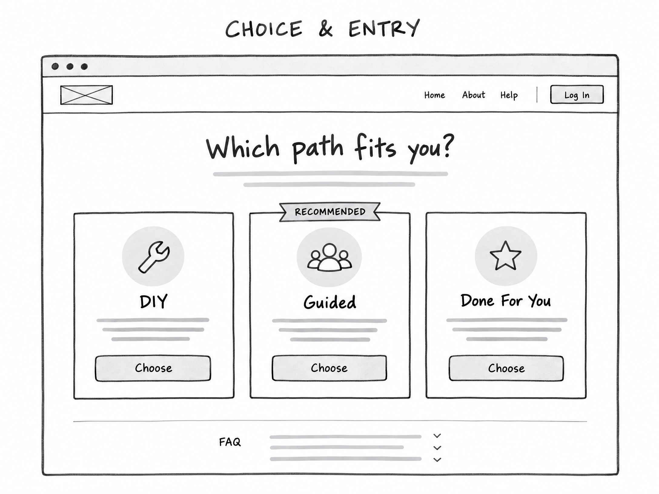
04. Choice & Entry Pages
Main Job: Route mixed traffic to the exact offer, package, or pathway that fits them best.
Visitor Mindset: “Which option is right for me? I have specific needs, goals, budget, or experience level.”
Traffic Triggers: which, best for me, options, compare, DIY, done for you, plans, packages, team
Core Message: “Choose the path that matches where you are right now.”
Choice & Entry Pages are among the most lucrative, under-utilized page styles in the entire marketing landscape. In real-world testing, these pages routinely achieve incredible click-through rates—frequently reaching 99% or higher.
Why do they work so well? Because they avoid pushing an aggressive purchase immediately. Instead, they present the visitor with an interactive choice. The psychological principle is clear: people hate being sold to, but they love choosing their own solution.
Core Variations:
- Choice / Router Page: Presents 2 to 4 interactive boxes or buttons segmenting visitors based on their current stage, budget, or goal (e.g., “I want to do it myself” vs. “I want a done-for-you service”).
- Splash / Welcome Entry Gate: Minimalist entry page designed to route visitors by operating system, geographic region, experience tier, or language before presenting an offer.
Wireframe Blueprint:
- Orientation Headline: A simple, inviting question (e.g., “Which Path Fits You Best?” or “What Type of Retirement Account Do You Currently Own?”).
- Sub-Prompt: Instruct the visitor to click the option matching their situation to view the recommended solution.
- Interactive Option Cards:
- Option A: Path 1 (e.g., DIY / Beginner / Low Budget).
- Option B: Path 2 (e.g., Guided / Intermediate / Moderate Budget).
- Option C: Path 3 (e.g., Done-For-You / Advanced / Enterprise).
- Conditional Redirects: Each card routes directly to an affiliate offer or landing page custom-tailored to that specific selection.
—
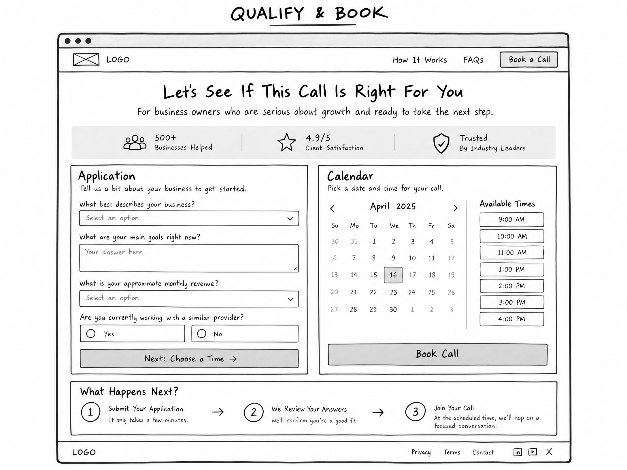
05. Qualification & Booking Pages
Main Job: Turn high-intent traffic into a qualified conversation, structured application, software demo, or closed sales call.
Visitor Mindset: “Can you help me specifically? Do I qualify for this program? Can I speak with an expert?”
Traffic Triggers: apply, book, call, consultation, demo, audit, agency, custom, enterprise
Core Message: “Let’s see whether this is the right fit and identify the best next step for your situation.”
High-ticket consulting, agency services, custom enterprise software, and localized B2B deals are rarely sold through a simple “Add to Cart” button. Buyers in these high-value categories demand personal validation. Qualification pages filter out tire-kickers and ensure your sales team (or your calendar) only interacts with serious prospects who possess the budget and authority to buy.
Decades ago, agency owners generated massive close rates simply by offering a “Free Website or SEO Audit.” The prospect submitted their URL and email, received a customized analysis, and was then presented with an agency service contract. The close rates on these structured applications remain exceptionally high because value is delivered upfront.
Core Variations:
- Application Page: Collects vital business metrics (revenue, team size, primary bottleneck) before allowing a prospect to proceed.
- Booking / Consultation Page: Integrates a calendar scheduling tool directly on the page, allowing qualified visitors to book an immediate strategy session or product demonstration.
Wireframe Blueprint:
- Professional Headline: Focused on mutual evaluation (e.g., “Apply For A 1-on-1 Growth Consultation” or “Request Your Comprehensive 2024 Portfolio Audit”).
- Expectation Framing: Clearly explain who this is for, who it is NOT for, and what will happen during the conversation.
- Multi-Step Form / Qualifying Fields: Questions assessing budget, timeline, and goals.
- Embedded Scheduler: Instant calendar booking interface enabled once preliminary criteria are verified.
- Authority Credentials: Trust badges, executive bios, and industry accreditations.
—
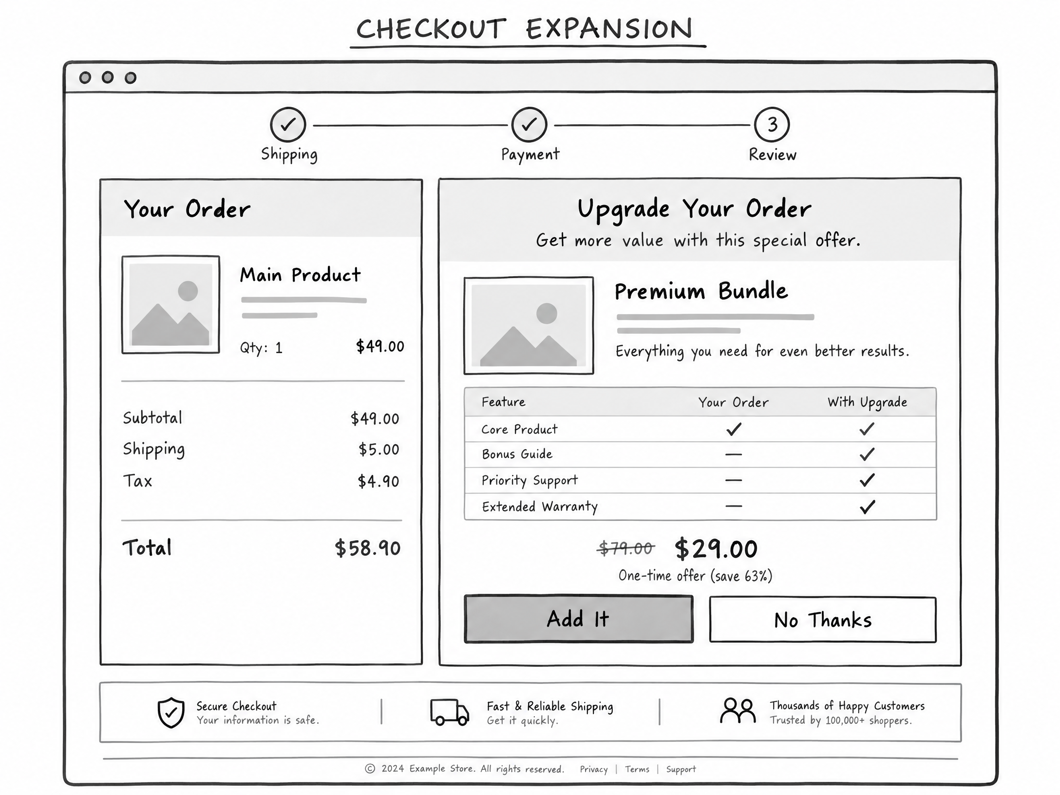
06. Checkout Expansion Pages
Main Job: Give an existing buyer the most relevant, immediate way to improve, accelerate, or extend their purchase.
Visitor Mindset: “What else do I need to get this done? Can I get extra support? Is there an upgraded version that works faster?”
Traffic Triggers: add, upgrade, bundle, more, advanced, bonus, support, annual
Core Message: “Make your result easier, faster, more complete, or more valuable.”
The easiest customer to sell is someone who has literally just pulled out their credit card and verified that they trust you. Amazon built an empire on Checkout Expansion through features like “Frequently Bought Together” and “Add an Extra Memory Card to Your Camera Order.”
Yet, countless online entrepreneurs abandon their buyers the moment the initial checkout form clears. By offering an immediate, logically connected expansion, you can dramatically increase your Average Order Value (AOV) and transform a break-even marketing campaign into a wildly profitable machine.
Core Variations:
- One-Click Upsell (OTO): A complementary software add-on, advanced implementation template, annual licensing discount, or personalized coaching module presented immediately after payment.
- Downsell Page: A lighter, lower-cost, or split-pay alternative offered only if the prospect declines the primary upsell.
- Order Bump: A high-converting check-box added directly on the checkout form itself (e.g., “Check this box to add the complete audiobook and digital flashcards for just $17”).
Wireframe Blueprint:
- Progress Confirmation Notice: State clearly: “Wait! Your order is being processed. Do not close this window…”
- Congruent Value Proposition: Position the upgrade not as more work, but as a speed enhancer (e.g., “Want To Cut Your Implementation Time In Half With Our Pre-Built Templates?”).
- Short Video or Breakdown: Explain why this asset completes the item they just purchased.
- One-Click Billing Button: Clean, frictionless button that charges the existing payment method on file.
- Polite Decline Link: A clear, text-based option to decline (e.g., “No thanks, I prefer to build the templates manually”).
—
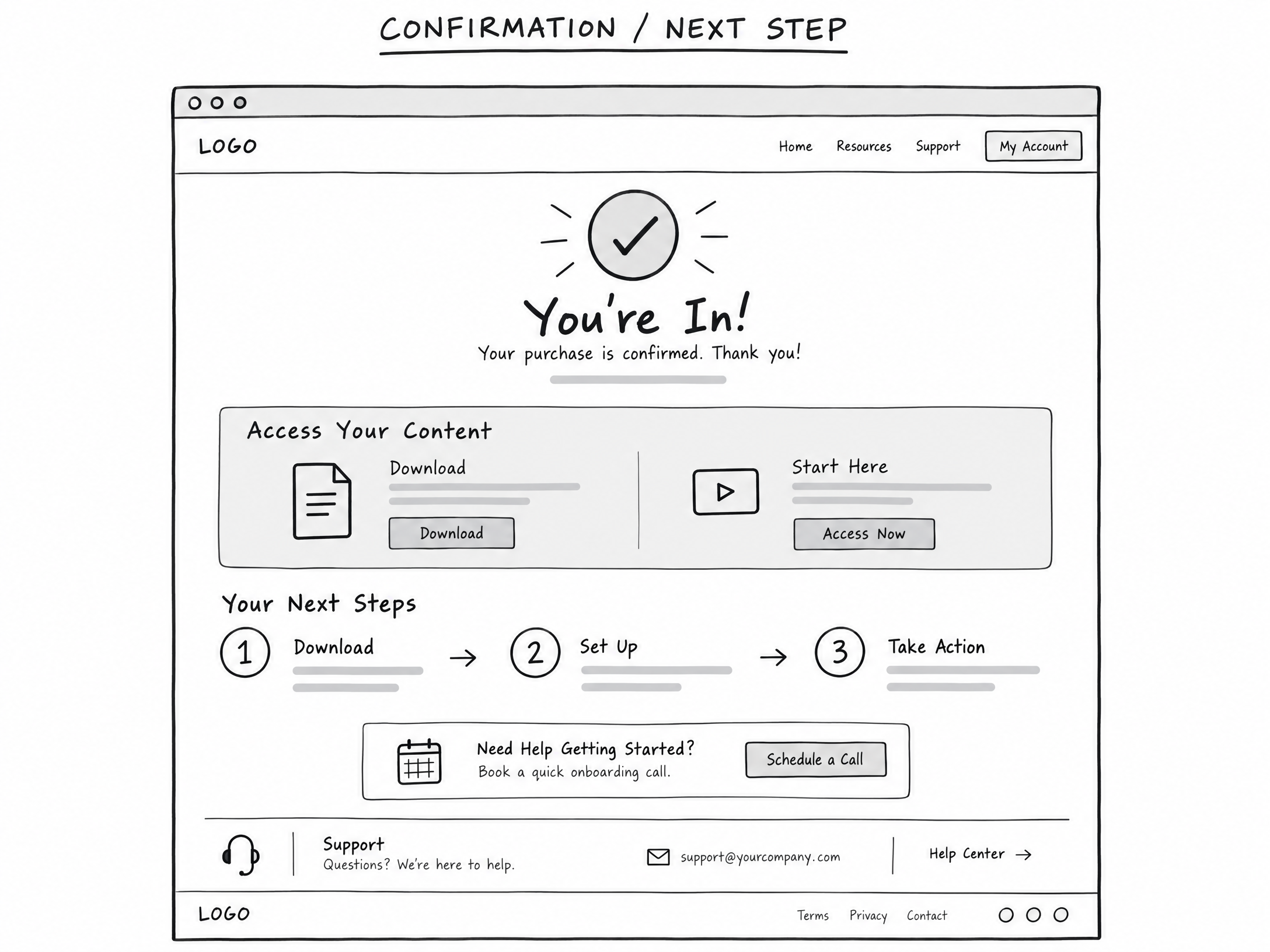
07. Confirmation & Next-Step Pages
Main Job: Confirm the user’s action and tell the new lead or customer exactly what to do next.
Visitor Mindset: “What happens now? Where do I access my purchase? How do I get started right away?”
Traffic Triggers: confirmation, access, download, start, next steps, onboarding, calendar, login, welcome
Core Message: “You are in—here is exactly what happens next.”
The Confirmation or Thank-You page is routinely the most neglected, under-monetized page in internet marketing. When someone opts into your list or completes an order, their attention level is at an absolute peak. They are actively waiting for instructions.
If you simply display a generic message that says “Thank you, check your email,” you have wasted the most attentive moment of your customer relationship. Instead, a well-engineered Confirmation Page verifies the transaction, establishes clear onboarding expectations, and immediately directs the user toward the next logical step (such as joining a community, watching a quick-start video, or reviewing a congruent affiliate tool).
Core Variations:
- Thank-You & Bridge Page: Confirms the free opt-in, delivers the download link, and immediately introduces a related low-cost or affiliate offer on the lower half of the page.
- Confirmation / Resource Access Page: A clean member orientation area delivering access credentials, software downloads, and orientation instructions.
- Post-Purchase Quick-Win Onboarding: A structured checklist guiding the customer to achieve their first tangible success within 15 minutes of purchasing.
Wireframe Blueprint:
- Clear Success Confirmation: Explicitly state: “You’re In! Your registration/order has been successfully confirmed.”
- Access Details: Direct buttons to download the file, join the community, or launch the software immediately.
- The Next Immediate Action: Step-by-step instructions (e.g., “Step 1: Save this URL. Step 2: Watch the 3-minute setup video below. Step 3: Register for our live coaching session.”).
- Secondary Offer Integration: A congruent tool recommendation that complements their recent action.
—
Fast Matching Guide: Connecting Mindset to Architecture
To help you choose the right page style without hesitation, refer to this quick diagnostic matching guide:
| Visitor Thought / Inquiry | Offer Page Solution | Direct Action Taken |
|---|---|---|
| “I need ideas, shortcuts, or help.” | 01. Lead-Capture Page | Deliver free tool, template, or guide. |
| “Why is this not working for me?” | 02. Pre-Sell & Education | Deconstruct old failures; bridge to new way. |
| “How much is it? What is included?” | 03. Core Sales Page | Present direct terms, proof, and buy buttons. |
| “Which option should I choose?” | 04. Choice & Entry Page | Route user through self-selected segmentation. |
| “Can we talk? Is this for me?” | 05. Qualification & Booking | Qualify parameters; schedule call or demo. |
| “What else should I add to my order?” | 06. Checkout Expansion | Provide congruent upsells, downsells, or bumps. |
| “What do I do now?” | 07. Confirmation & Next-Step | Confirm action; deliver immediate quick win. |
—
The Shortest Version: 7 Core Directives
If you want to boil down this entire framework into a single checklist you can review in 30 seconds before launching any campaign, here it is:
- Capture people who are interested, but not yet ready to buy.
- Warm up people who require foundational education or trust-building.
- Sell people who have already decided to solve their problem today.
- Route people who need assistance choosing the right tier or path.
- Qualify people who require a high-touch, customized relationship.
- Expand the order for verified buyers while their wallets are open.
- Guide every new lead or customer directly to their next milestone.
—
Ethical Marketing and Product-Market Congruence
Direct response copywriting is a powerful discipline. When you master the art of identifying exact search triggers and matching them to one-page sites, you can move traffic at scale. With this capability comes direct responsibility.
Every affiliate offer, service package, or digital product you promote must be vetted thoroughly. Ensure that the marketing claims you make are accurate, transparent, and completely compliant with legal disclosures. Include clear earnings disclaimers, privacy policy links, and terms of service across every single-page site you launch.
Remember: lasting, sustainable wealth is built on solving real problems for real people. When you bridge the gap between a consumer experiencing confusion and an authentic solution that relieves that pain, everyone wins. The business owner gets a customer, the customer solves their problem, and you generate healthy profits.
—
Conclusion: Stop Building Websites. Start Making Offers.
The vast majority of marketers struggle online not because they lack passion, intelligence, or technical prowess, but because they expend enormous effort on things that simply don’t generate revenue. They write articles that don’t convert, build funnels that confuse visitors, and hide their offers behind layers of unnecessary technical overhead.
Making money online does not require a sprawling website with hundreds of pages. It requires clarity, intent recognition, and an offer that solves a verified problem. When you identify where your prospects are in their journey, listen to their specific trigger words, and present them with a clean, single-page architecture designed for their mindset, success becomes a repeatable, mathematical process.
Stop overcomplicating your business. Stop spinning your wheels on useless complexity. Identify your traffic trigger, choose one of these seven page types, and launch your offer.
Take action today: Join Todays Make An Offer Training – In Ai Profit Scoop Elite
Leave a Reply
.
.
.
.
One Response to One Page Websites = Big Profit